Dashboards
Dashboards are added to have transparency of AppNavi usage. After clicking the "Dashboards" menu item in the AppNavi menu of the portal, the list of dashboards appears. Each dashboard shows all data aggregated within a tenant.
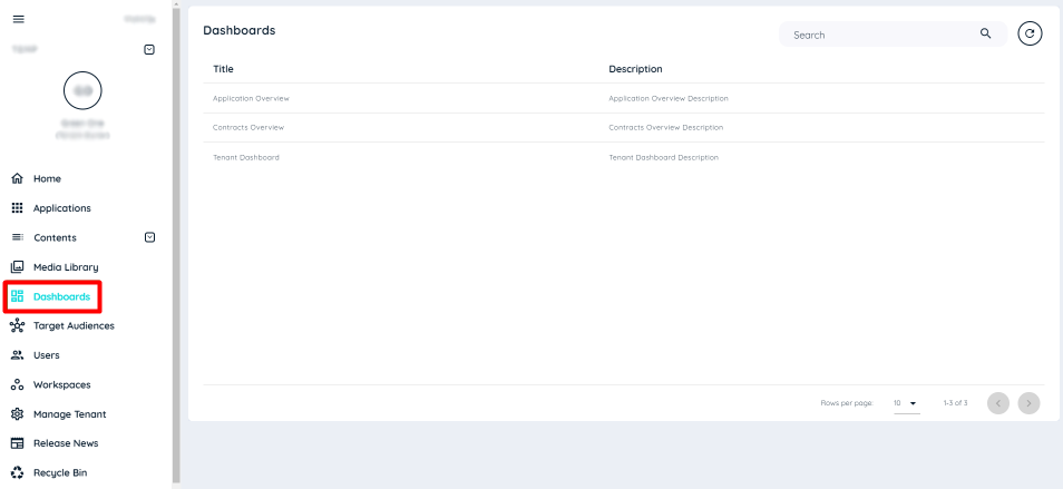
There are three Dashboards implemented,
- Application Overview
- Contracts Overview
- Tenant Dashboard
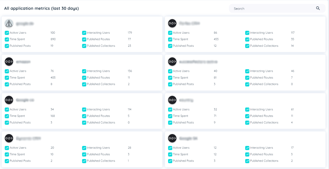
Application Overview
The list of applications will be displayed at the tenant level. Only data from the last 30 days is displayed here. Each application along with its name has a summary overview that contains the following:
- Active Users: The number of active users. Active Users are users who have called up an application at least once in a specified time period (AVATAR_SHOW event). If a user with a unique id (userid) has called up an application several times in the specified time period, the user is only counted as one user.
- Interacting Users: All users who have used AppNavi. Interacting users are unique users who have interacted with Appnavi at least one time. An interaction could be:
- Starting a route
- Proceed a route
- Reading a post/announcement
- Clicking on the avatar
- Play a pin
- Time Spent: The time of all interacting users using the Application. The time spent indicates how long all users have interacted with the system within a period of time. Interaction times include the following:
- The duration of a route run (duration of all step displays within a route)
- The display duration of an article or announcement
- The playtime of a pin of type hint
- Published Routes: The number of published routes in the Application
- Published Posts: The number of published posts including all types of posts (post, post as info, post as announcement) in the Application
- Published Collections: The number of published collections in the Application
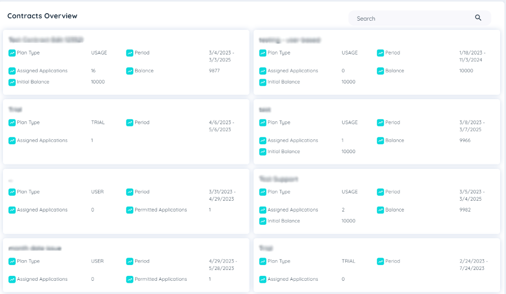
Contracts Overview
The list of contracts will be displayed at the tenant level. Only data from the last 30 days is displayed here. Each contract along with its title has a summary overview that contains the following:
- Plan Type: The plan of a contract is the type of contract that is being used. Currently there are two types of contracts being used:
i. Usage Based: In this contract the applications are not permitted and there are 1000 usages in initial while using the contract and the usages are subtracted according to the applications assigned.
ii. User Based: In this contract the user can select their number of permitted applications to be assigned to this contract and the number of all allowed users to use this contract.
-
Period: It is the duration of the contract when it was started and the end date of the contract.
-
Assigned Applications: The Applications that can be assigned to the Contract.
-
Permitted Applications: Number of applications that are allowed to be assigned to a contract (User based contract only)
-
Opening Balance: The initial balance is the first recharge that was done when the contract was created.
-
Credit: It is for usage based contracts. It shows the remaining balance for the contract.
Contract Overview
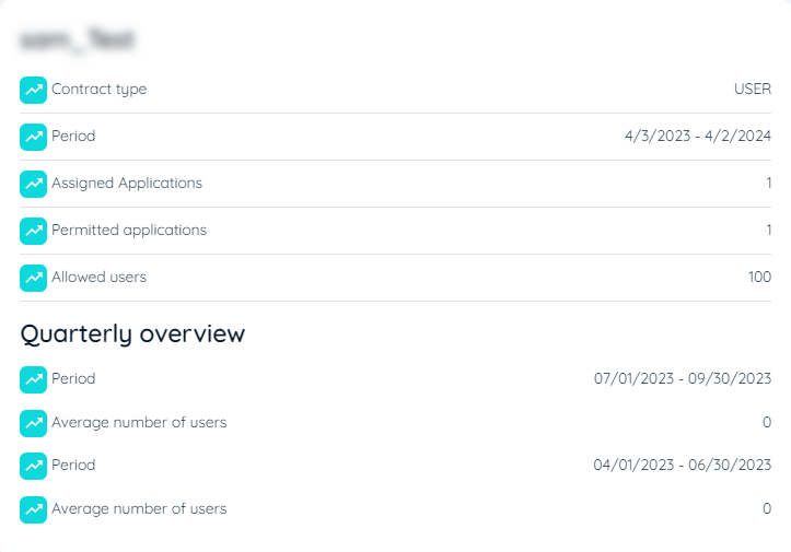
Quarterly Overview of User Based Contracts
- Quarterly Overview: In the contract overview dashboard, the quarterly overview displays the duration of the contract with start and end date and the average number of users in each quarter using this contract.
Tenant Dashboard
The charts displayed in this dashboard are displayed from the whole tenant perspective that contains overall content usage including user, applications, element usage and interaction time.
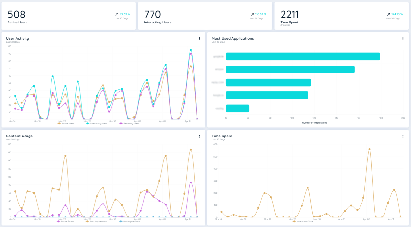
On the top of the charts, there are KPIs shown considering a particular tenant that includes the following,
- Active Users: The number of active users. Active users are users who used the underlying application in the selected time interval. In addition, the change in this key figure over the last 30 days is shown as a percentage change.
- Interacting Users: This figure shows all users who have used AppNavi and the change in this key figure over the last 30 days.
- Time Spent: This figure shows the time of all interacting users using AppNavi and the change in this key figure over the last 30 days.
The "Time spent" is calculated based on the interaction time. Interaction times include the following:
- The duration of a route run (duration of all step displays within a route).
- The display duration of a post or announcement.
- The display duration of a pin item of type hint.
The individual standard chart types are described below. These are available at tenant, application and/or content level. Each chart has the following functionalities:
- Hide/unhide lines: This functionality is for line charts. Click on the line labels in the legend to show or hide the individual lines.
- Time period: Hover on the three vertical dots on the top right corner of each chart to switch between "Last 30 days" or "All Time" to select the appropriate time frame.
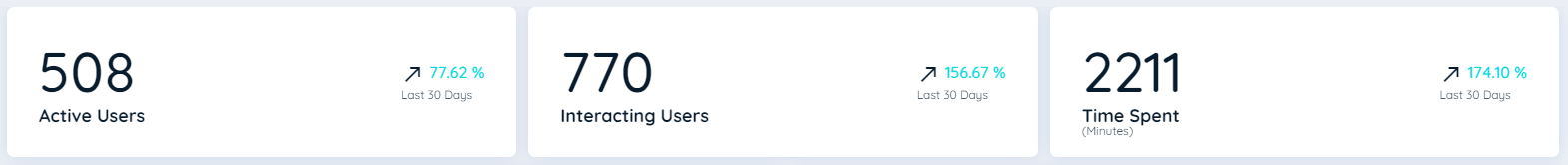
User Activity
This line chart represents the user histories of three different user types:
- Active users
This line shows the active users in the selected time interval. Active users are users who used the underlying application in the selected time interval. - Interacting users
This line shows all users who have used AppNavi. - Recurring users
This line shows users who were active multiple times during the selected time period. - Note
If an application is disabled or no longer exists in the tenant, the data will not be included in the chart.
User Activity
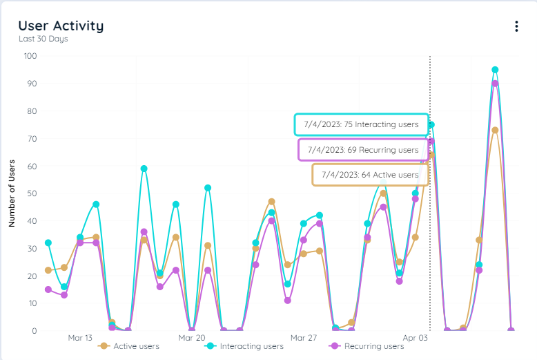
Most Used Applications
This bar chart represents the Top 5 most used applications within the tenant. The ranking is based on the interacting users per application. All active and not deleted applications within the tenant are considered. On hovering the bar, the total number of impressions can be shown of the selected application.
Most used Applications
Content Usage
This line chart represents the usage of three different content types:
- Route Starts
The line shows the frequency with which routes were started in the selected period. The routes that were initiated via hotspots are also counted. - Post Impressions
The line shows the frequency with which post was launched or announcements were displayed in the selected period. The posts or announcements that were initiated via hotspots are also counted. - Hint Impressions
The line shows the frequency with which leads were initiated via hotspots in the selected period.
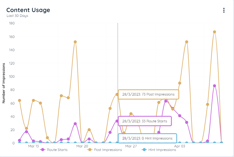
Content Usage
Time Spent
The line shows how much time the users have used content from AppNavi in the selected time period.
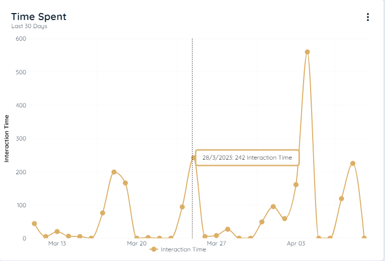
Time Spent
Updated 9 months ago