Charts
AppNavi relies on descriptive charts to visualize analytics. The different chart types are described below.
General
AppNavi uses a hierarchical analytics model: starting from the global level (all data of a workspace within a tenant), data can be viewed more granularly. This includes insights into application-level data but also content-level data within an application.
-
Home I Dashboard
After clicking the "Home" menu item in the AppNavi menu of the customer portal, the dashboard appears. This shows all data aggregated within a tenant and the selected workspace within it. -
Application
The charts displayed in the dashboard can also be displayed at the application level. -
Content element
The charts displayed in the dashboard and on the application level can also be displayed at the content element level (routes, posts,...).
The individual standard chart types are described below. These are available at the workspace, application and/or content level.
For most charts, the time period can be selected:
- Last 30 days: Only data from the last 30 business days are displayed here.
- All-time: This setting visualizes all data since the creation of the workspace, the application or the respective content element.
Key Indicators "Workspace"
The KPIs show key indicators and their changes within the past 30 days.
- Active users
This figure shows the number of active users. Active users are users who used the underlying application in the selected time interval. In addition, the change in this key figure over the last 30 days is shown as a percentage change. - Interacting users
This figure shows all users who have used AppNavi and the change in this key figure. - Time spent
This figure shows the time of all interacting users using AppNavi and the change in this key figure.
The "Time spent" is calculated based on the interaction time. Interaction times include the following:
- The duration of a route run (duration of all step displays within a route).
- The display duration of a post or announcement.
- The display duration of a pin item of type hint.

Key Indicators "Workspace"
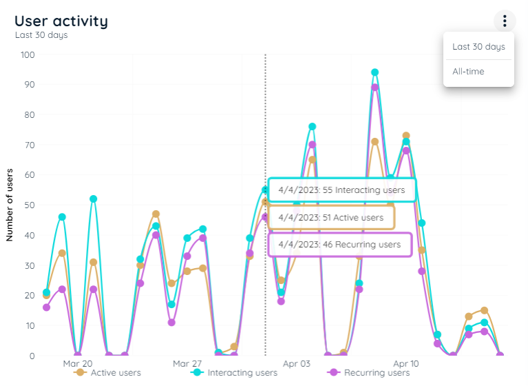
Chart "User Activity"
Content
This line chart represents the user histories of three different user types:
- Active users
This line shows the active users in the selected time interval. Active users are users who used the underlying application in the selected time interval. - Interacting users
This line shows all users who have used AppNavi. - Recurring users
This line shows users who were active multiple times during the selected time period.
Functionality
- Hide/unhide lines: Click on the line labels in the legend to show or hide the individual lines.
- Time period: Click on three vertical dots to select the appropriate time frame "Last 30 days" or "All-time".
Note
If an application is disabled or no longer exists in the tenant/workspace, the data will not be included in the chart.
User Activity
Data level
The table indicates at which level of aggregation the chart is displayed.
| Workspace | Application | Content |
|---|---|---|
| Yes | Yes | Yes |
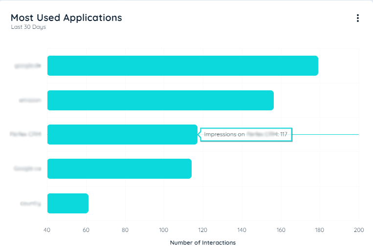
Chart "Most used Applications"
Content
This bar chart represents the Top5 most used applications within the workspace. The ranking is based on the interacting users per application. All active and not deleted applications within the workspace are considered.
Functionality
- Time period: Click on three vertical dots to select the appropriate time frame "Last 30 days" or "All-time".
Note
By clicking on the title of a bar, detailed data about the selected application can be displayed.
Most Used Applications
Data level
The table indicates at which level of aggregation the chart is displayed.
| Workspace | Application | Content |
|---|---|---|
| Yes | No | No |
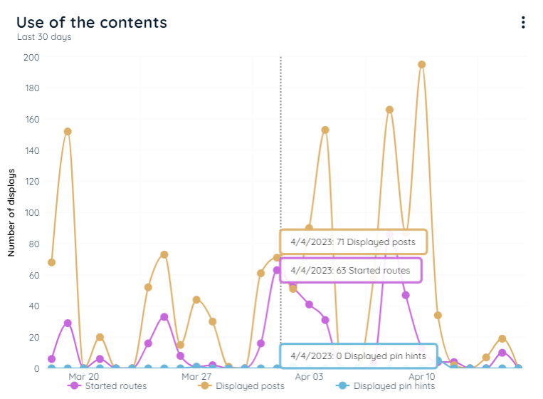
Chart "Use of the Contents"
Content
This line chart represents the usage of three different content types:
- Route Starts
The line shows the frequency with which routes were started in the selected period. The routes that were initiated via pins are also counted. - Post Impressions
The line shows the frequency with which posts were launched or announcements were displayed in the selected period. The posts or announcements that were initiated via pins are also counted. - Hint Impressions
The line shows the frequency with which leads were initiated via pins in the selected period.
Functionality
- Hide/unhide lines: Click on the line labels in the legend to show or hide the individual lines.
- Time period: Click on three vertical dots to select the appropriate time frame "Last 30 days" or "All-time".
Use of the Contents
Data level
The table indicates at which level of aggregation the chart is displayed.
| Workspace | Application | Content |
|---|---|---|
| Yes | Yes | No |
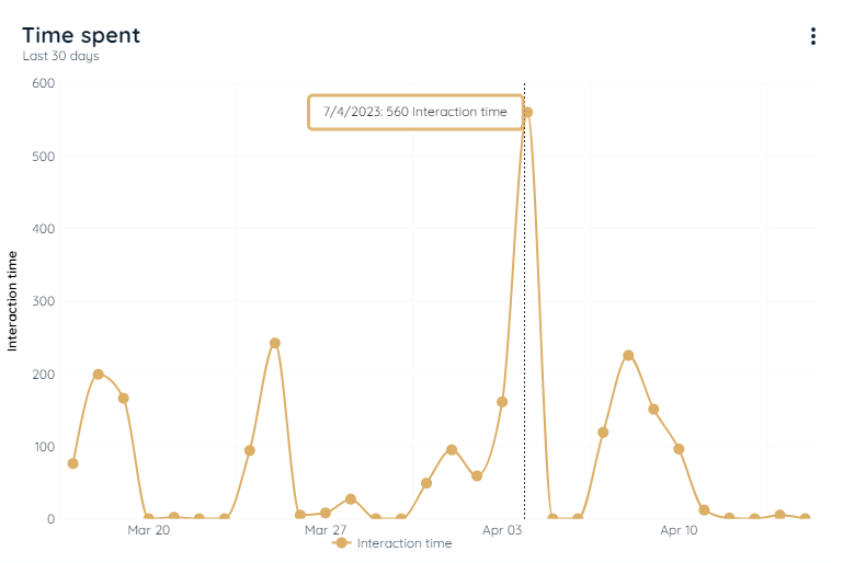
Chart "Time Spent"
Content
The line shows how much time the users have used content from AppNavi in the selected time period.
Functionality
- Time period: Click on three vertical dots to select the appropriate time frame "Last 30 days" or "All-time".
Time Spent
Data level
The table indicates at which level of aggregation the chart is displayed.
| Workspace | Application | Content |
|---|---|---|
| Yes | Yes | No |
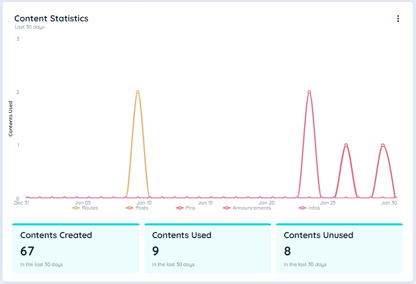
Chart "Content Statistics"
Content
This chart displays statistics for all assigned data within the selected workspace. It includes a pie chart and a breakdown of the total count of all created contents separately from the last 30 days and All Time.
Notably, there is a option to switch to all-time data, the chart is designed to show data from the last 30 days as well as All Time.
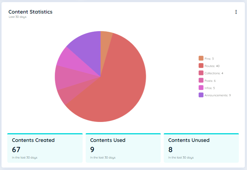
Functionality
- Pie Chart: The pie chart illustrates the total count of all created contents along with their respective percentages. It also provides a breakdown of the total count for Routes, Posts, Announcements, Info, Collections, NPS, and Pins.
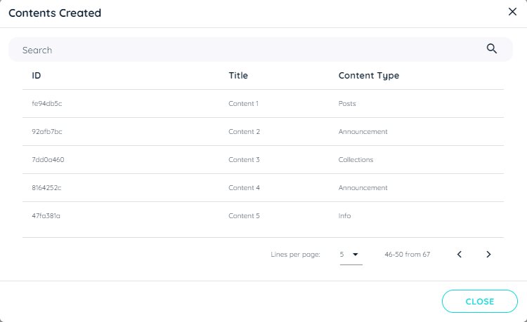
- Contents Created: This represents the count of all contents created within the selected workspace. If user hover, a line chart will appear. And if user click on Contents Created, a dialect appears that will display the details of different type of content being created within a workspace.
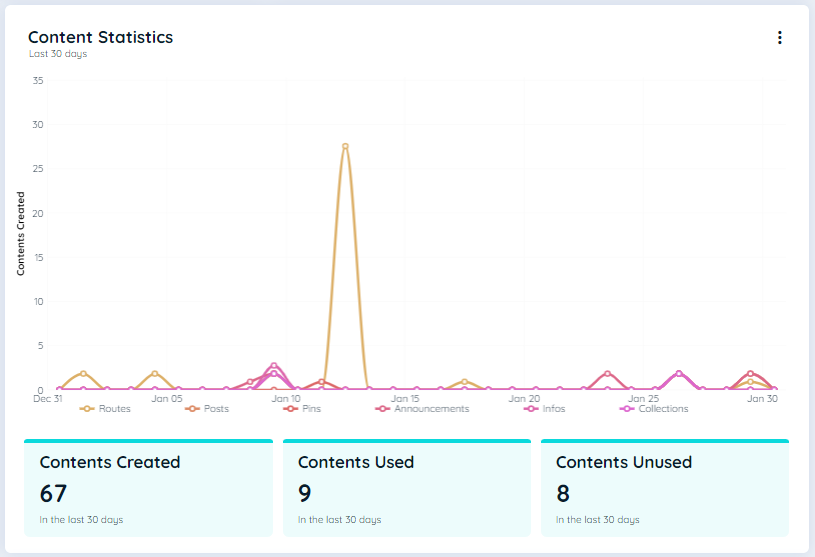
- Contents Used: The count of published contents that have been utilized by guest users, played on the planner at the client side. If user hover, a line chart will appear and if user click on Contents Used, a dialect appears that will display the details of different type of content being used/played within a workspace.
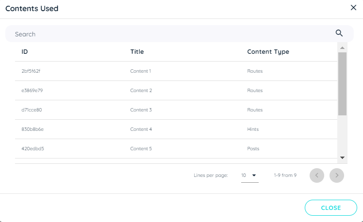
- Content Unused: The count of published contents that have not been utilized by guest users, nor played on the planner at the client side. If user hover, a line chart will appear and if user click on Contents Unused, a dialect appears that will display the details of different type of content that have not been used yet within a workspace.
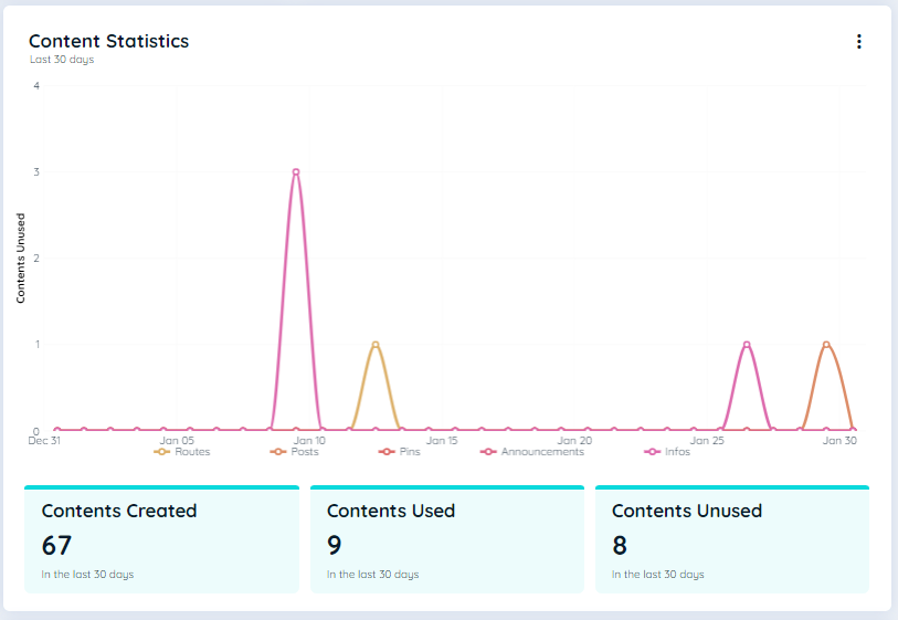

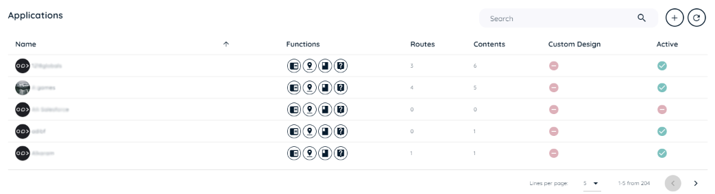
Table "Applications"
Content
The table displays all applications supported by AppNavi within the selected workspace.
- Name: title of the application.
- Functions: used Features in the respective application (routes, posts, collections, pins).
- Routes: number of routes in the respective application.
- Contents: number of contents (posts, announcements, hints) in the respective application.
- Custom Design: shows if the standard dark theme or a customized theme is used.
- Active: shows if AppNavi is enabled or disabled in the respective application.
Functionality
- Search: Enter a keyword to search for the desired application.
- Add new: add additional application(s) to this workspace.
- Reload: Click on this button to synchronize with the AppNavi backend.
List of Applications
Data level
The table indicates at which level of aggregation the chart is displayed.
| Workspace | Application | Content |
|---|---|---|
| Yes | No | No |
Chart "Division by Browser"
Content
The pie chart shows the percentage of application usage by different browsers.
Functionality
- Time period: Click on three vertical dots to select the appropriate time frame "Last 30 days" or "All-time".
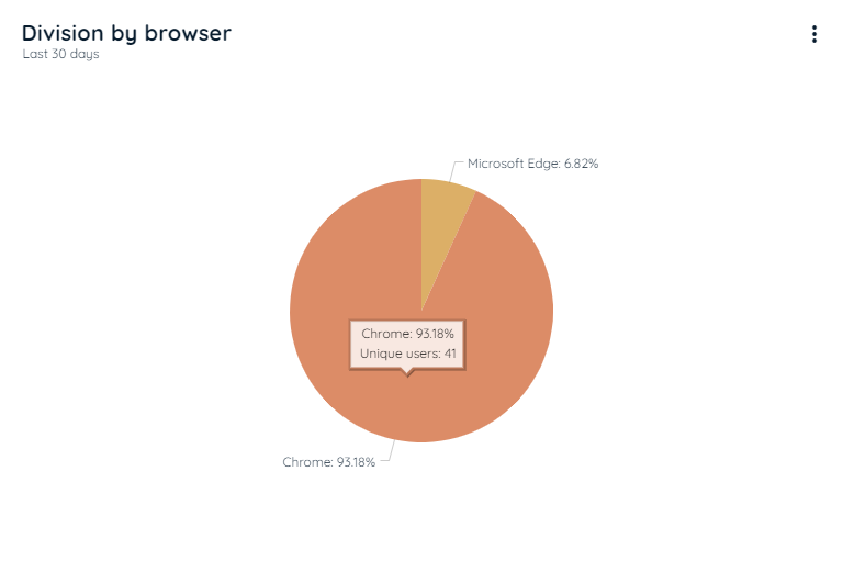
Division by Browser
Data level
The table indicates at which level of aggregation the chart is displayed.
| Workspace | Application | Content |
|---|---|---|
| No | Yes | No |
Chart "Division by Language"
Content
The pie chart shows the percentage usage of the application by different languages.
Functionality
- Time period: Click on three vertical dots to select the appropriate time frame "Last 30 days" or "All-time".
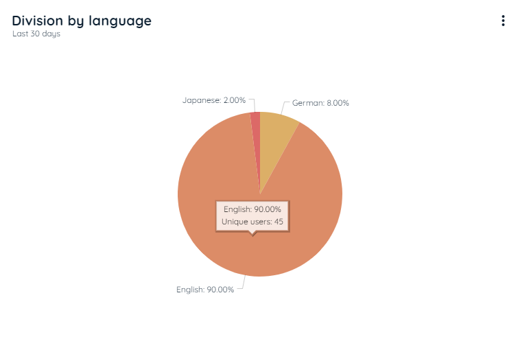
Division by Language
Data level
The table indicates at which level of aggregation the chart is displayed.
| Workspace | Application | Content |
|---|---|---|
| No | Yes | No |
Chart "Target Audience"
Content
The bubble chart shows target groups and describes a set of users for whom content should be visible. There are rules that are summarised as target groups Users can select these target groups while publishing individual elements. For more details on target audience refer to the Target Audience
Functionality
- Time period: Click on three vertical dots to select the appropriate time frame "Last 30 days" or "All-time".
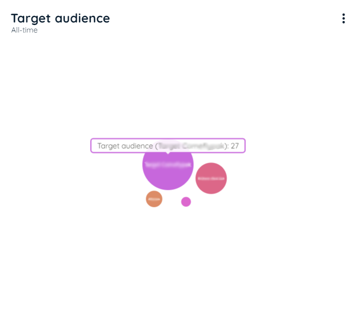
Target Audience
Data level
The table indicates at which level of aggregation the chart is displayed.
| Workspace | Application | Content |
|---|---|---|
| Yes | Yes | Yes |
Chart "User Role"
Content
The bubble chart shows the recorded role of users on which the contents were displayed. This chart will only be shown if the extended analytics are activated and the "Record User role" is set to true. Each bubble represents a role. The larger the bubble, the more often content was executed in a particular role. For more details refer to the Record User Role
Functionality
- Time period: Click on three vertical dots to select the appropriate time frame "Last 30 days" or "All-time".
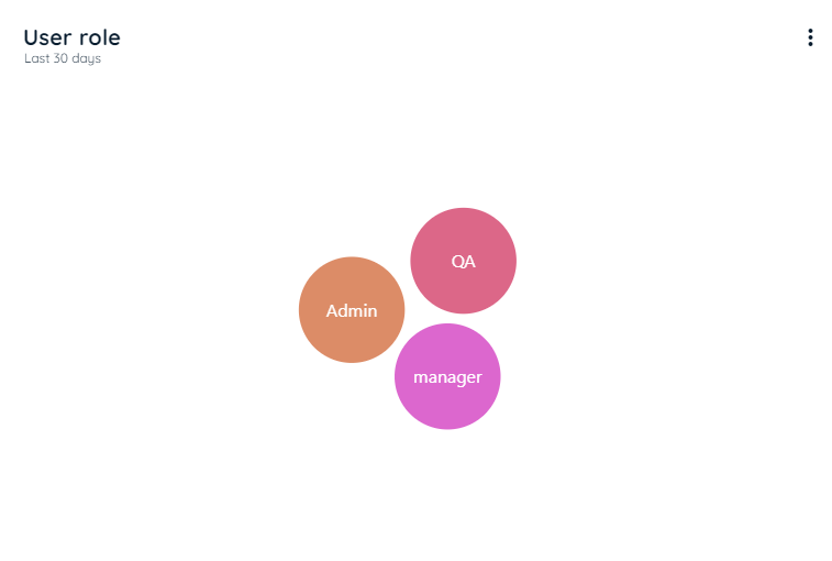
User Role
Data level
The table indicates at which level of aggregation the chart is displayed.
| Workspace | Application | Content |
|---|---|---|
| No | No | Yes |
Table "Interactions"
Content
This table provides information about potential route impairments. Authors can use it to get a quick overview of which routes may need to be inspected.
- Title: title of the content element.
- Interaction type: type of the content element (route, posts,...).
- Interactions: Number of interactions with the content element in the selected period.
Functionality
- Search: Enter a keyword to search for route issues.
- Time period: Click on three vertical dots to select the appropriate time frame "Last 30 days" or "All-time".
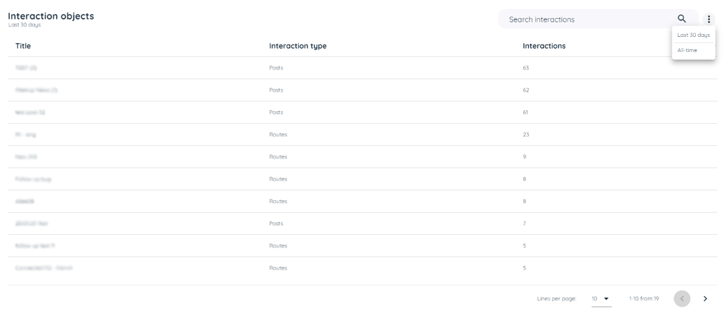
Interactions
Data level
The table indicates at which level of aggregation the chart is displayed.
| Workspace | Application | Content |
|---|---|---|
| No | Yes | No |
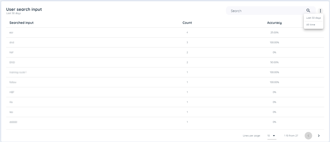
Table "User Search Input"
Content
This table shows what users have searched for in the avatar. The number of times a term has been searched for will be displayed. It is only for logged out users.
- Searched input: Text that a user has searched. A term is only ever considered once per SessionId
- Count: Number of times the user has searched for a specific term.
- Accuracy: The accuracy can never be greater than 100% and cannot be less than 0%. For example, users have searched for "invoice approval" 5 times and 2 routes have been started as a result, the success rate is 40%
Functionality
- Search: Enter a keyword to search for searched input.
- Time period: Click on three vertical dots to select the appropriate time frame "Last 30 days" or "All-time".
Data level
The table indicates at which level of aggregation the chart is displayed.
| Workspace | Application | Content |
|---|---|---|
| Yes | Yes | Yes |
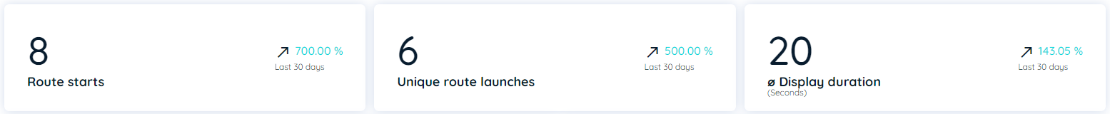
Key Indicators "Routes"
The KPIs show key indicators and their changes within the past 30 days.
- Route starts
This figure shows how often the selected route was displayed and the change in the figure in the past 30 days. - Unique route starts
This figure shows how often the selected route was displayed by different users and the change in the figure in the past 30 days. - Avg. Display Duration
This figure shows how long individual steps of the route were displayed on average and the change of the figure in the past 30 days.
Key Indicators "Routes"
Data level
The table indicates at which level of aggregation the chart is displayed.
| Workspace | Application | Content |
|---|---|---|
| No | No | Yes (routes) |
Table "Steps"
Content
This table provides information about steps in a route and potential route impairments. Authors can use it to get a quick overview of steps within a route that may need to be inspected. This chart shows how many users actually complete a route to the end, or at which point users get off.
- Step Title: title of the route step.
- Display Duration (Seconds): number of seconds a step is displayed in average.
- Display Frequency: Percentage of display of this step over all route passes. 100% Means that all route users have viewed this step.
Functionality
- Search: Enter a keyword to search for route steps.
- Time period: Click on three vertical dots to select the appropriate time frame "Last 30 days" or "All-time".
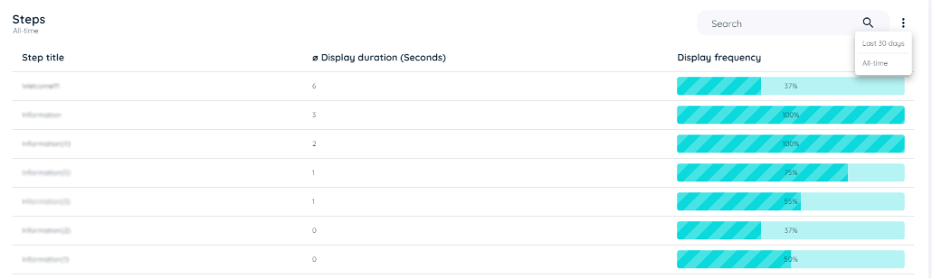
Table "Steps"
Data level
The table indicates at which level of aggregation the chart is displayed.
| Workspace | Application | Content |
|---|---|---|
| No | No | Yes (routes) |
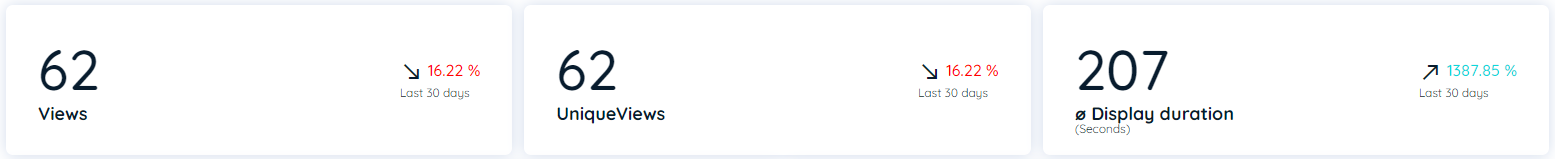
Key Indicators "Posts & Announcements"
The KPIs show key indicators and their changes within the past 30 days.
- Views
This figure shows how often the selected post or announcement was displayed and the change in the figure in the past 30 days. - Unique views
This figure shows how often the selected post or announcement was displayed by different users and the change in the figure in the past 30 days. - Avg. Display Duration
This figure shows how long posts or announcements were displayed on average and the change in the figure in the past 30 days.
Key Indicators "Posts"
Data level
The table indicates at which level of aggregation the chart is displayed.
| Workspace | Application | Content |
|---|---|---|
| No | No | Yes (posts and announcements) |
Chart "Posts Impressions"
Content
This line chart represents the number of posts or announcement impressions in the selected period:
- Impressions
This line shows all impressions of posts and announcements by all users. - Unique Impressions
This line shows all impressions of posts and announcements by unique users.
Functionality
- Hide/unhide lines: Click on the line labels in the legend to show or hide the individual lines.
- Time period: Click on three vertical dots to select the appropriate time frame "Last 30 days" or "All-time".
Note
If an application is disabled or no longer exists in the tenant/workspace, the data will not be included in the chart.
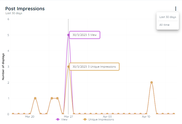
Post Impressions
Data level
The table indicates at which level of aggregation the chart is displayed.
| Workspace | Application | Content |
|---|---|---|
| No | No | Yes (posts and announcements) |
Chart "Weekly Use"
Content
This Weekly Usage chart represents the number of routes, pins and posts or announcement impressions in the selected weekday and at a particular time slot:
Functionality
- Weekday Time Slot Tile: Click on the tile in the weekday and particular time slot to show individual routes, pins, posts or announcement impressions at that time of the week.
- Time period: Click on three vertical dots to select the appropriate time frame "Last 30 days" or "All-time".
Note
If an application is disabled or no longer exists in the tenant/workspace, the data will not be included in the chart.
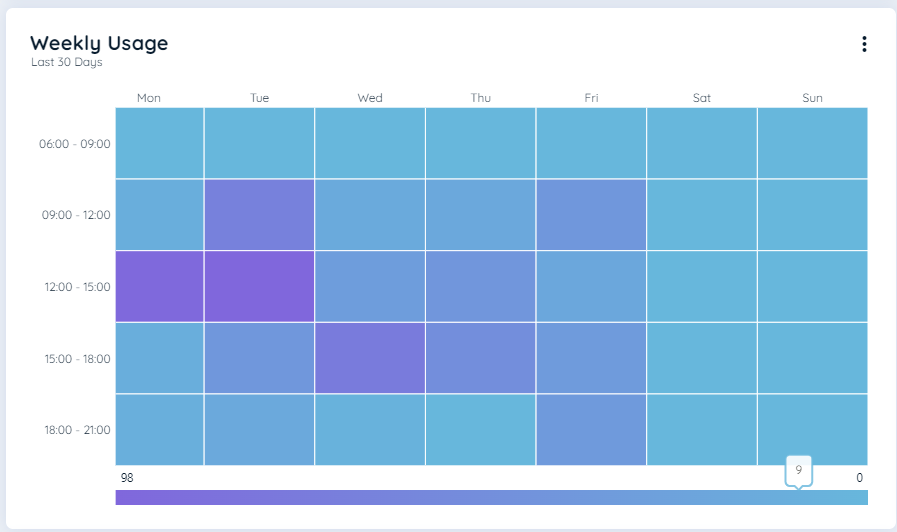
Weekly Usage
Data level
The table indicates at which level of aggregation the chart is displayed.
| Workspace | Application | Content |
|---|---|---|
| No | Yes | No |
The weekly chart is the same for contents except for functional click on tile is not applicable for contents.
| Workspace | Application | Content |
|---|---|---|
| No | No | Yes (routes, pins, posts or announcements) |
Updated 8 months ago