Visualizations for Insights
The graphical visualization for the Insights is present in the Insights tab
The Insights Analytics page provides users with a comprehensive view of all recorded events for their application. This feature enables users to monitor and analyze application events in detail. Users can record up to 3 million Insight events per month, ensuring robust tracking and analysis of application activity.
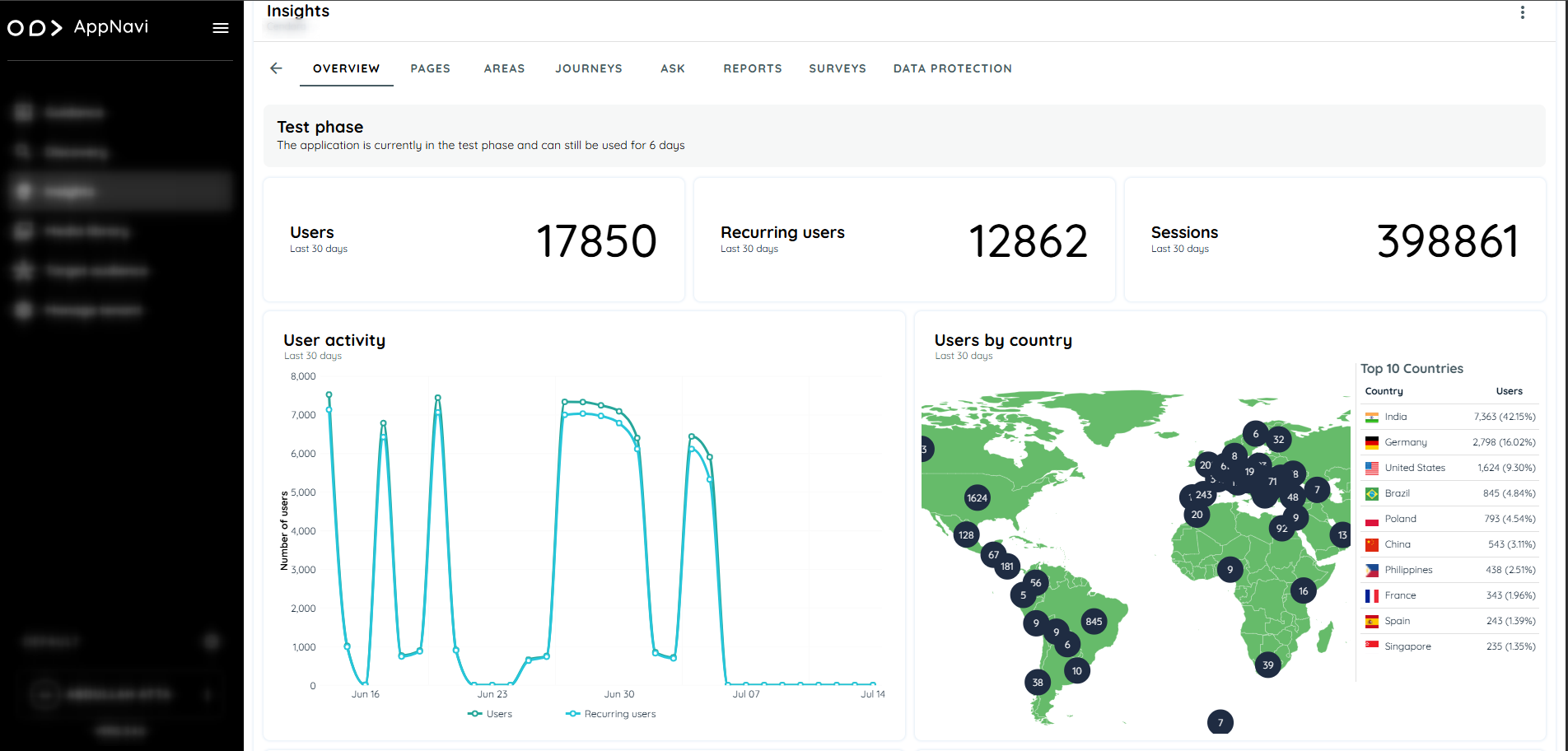
The graphical representation consists of the number of users, the number of recurring users, the sessions carried out by users, the country bubble chart, the activity by role chart, and the activity by area.
Users Activity Chart
This Line chart represents the number of users that appeared on the application. The Y-axis displays the total number of users, and the X-axis displays the dates on which the user has made interactions. This cart shows data for the last 30 days and for all time.
This line chart also illustrates the count of recurring users within the application. The Y-axis depicts the cumulative number of recurring users, while the X-axis indicates the dates corresponding to user interactions. This chart presents data for both the last 30 days and reading for All time.
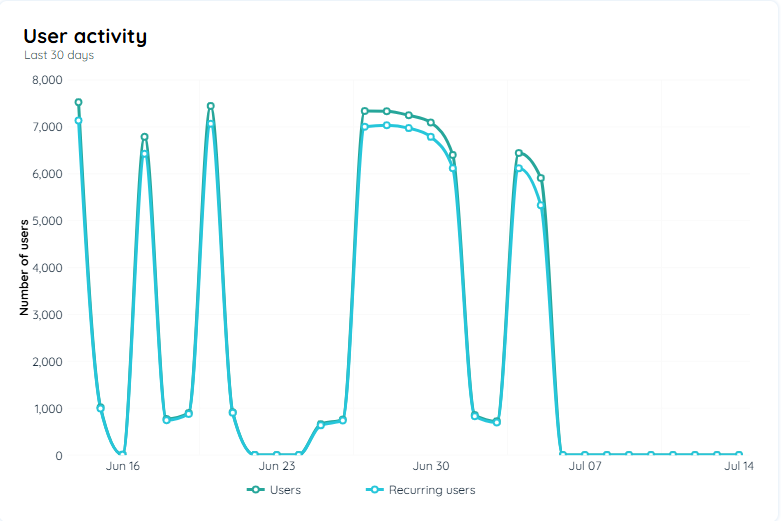
User Activity Chart
Users by Country Map Chart
Country bubble charts offer an innovative and visually engaging way to display data on a geographical map. This interactive chart type combines mapping with bubble visualization, creating a dynamic representation of information. Each bubble represents a country, displaying the number of users from that region, with data available for both the last 30 days and all time. Users can click on any country to zoom in on its location, adding an extra layer of interactivity and depth to the map.
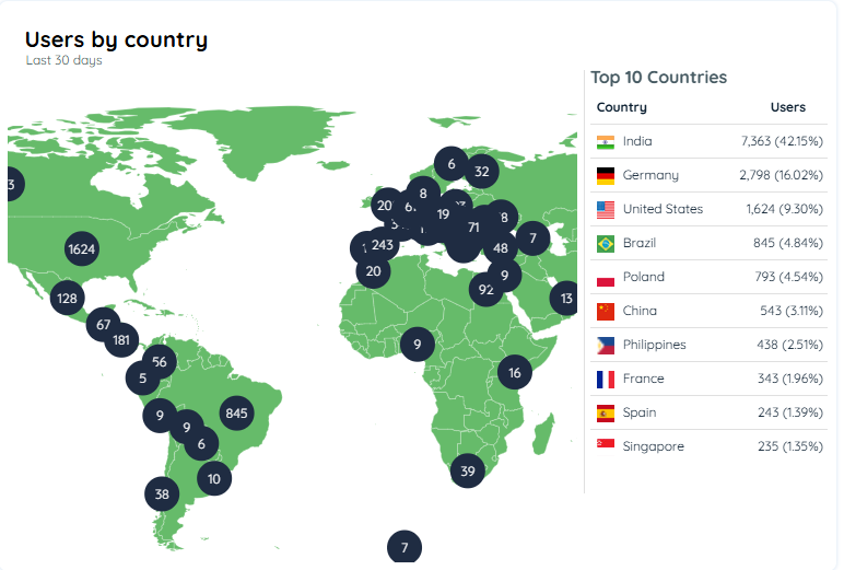
Users by Country Chart
Weekly Use heat map Chart
The Weekly Use Heat Map chart provides a clear visual representation of user activity patterns over time. This heat map captures the frequency and intensity of user interactions on a weekly basis, with data points color-coded to highlight peaks and low points in activity. Darker shades indicate higher engagement, while lighter shades show reduced user activity. This chart offers a quick, intuitive overview of usage trends, helping to identify patterns and potential areas for improvement.
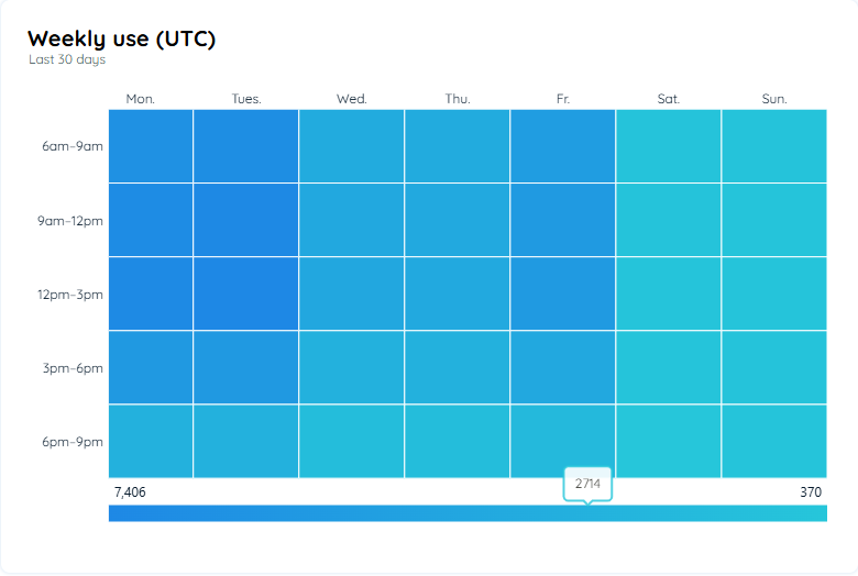
Weekly use Chart
Intent Analytics
This table displays the keywords that are mostly clicked by users where the UBM is enabled within the trackable area. The keywords are selected on some rules like the word should have at least three consecutive letters, no special characters and numbers are included and also no tokenized words would be used. The percentage displays the no of occurrences of the keyword that has been clicked divided by the total no of keywords that have been clicked in that particular session. Data can be filtered by the browser language in which the keywords were recorded. The table displays data in all time or in the last 30 days duration. The words being recorded in the intent analytics will only be relevant words according to the analytics, no stop words will be recorded which are unnecessary for the analytics.
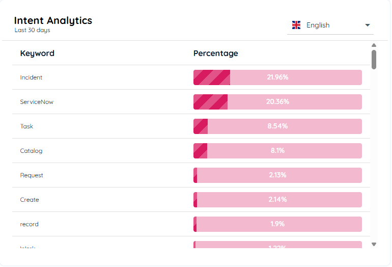
Intent Analytics
Copy Paste Events
The Insights Analytics page features a line chart titled ‘Copy Paste Events.’ This chart displays two lines: one representing copy events and the other representing paste events. Users can easily switch between viewing data for the last 30 days or the entire historical dataset All time.
The chart provides valuable insights into user interactions, allowing users to analyze copy and paste behavior.
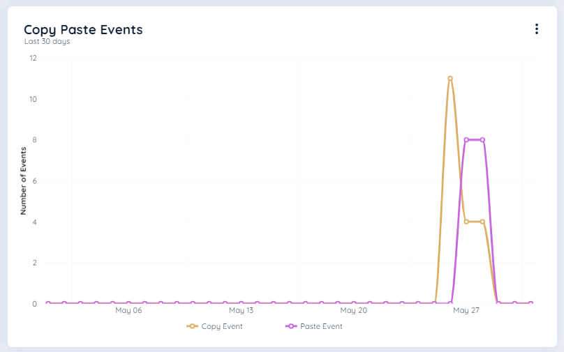
Copy paste Events
Recorded Events
This line chart displays the number of recorded events within the application over time. The Y-axis shows the dates, labeled with the month and day (e.g., Oct 07), while the X-axis represents the total count of events. This chart provides insights into event frequency, with data available for the last 30 days and for all time, helping to track trends and identify peak activity periods.
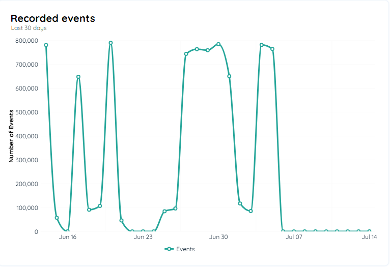
Recorded Events
Pages Section
The Pages section provides insights into page usage and performance, specifically through the Page Usage and Slow Pages charts, along with the Page Overview table.
Page Usage Bar Chart
This chart displays data on user interactions with pages in the application. The Page Usage chart includes interaction metrics over three time ranges: the last 30 days, the last 90 days, and all-time data. The Y-axis shows the count of user interactions, while the X-axis displays the time intervals. This view helps users understand how frequently each page is accessed over time, revealing trends and popular pages.
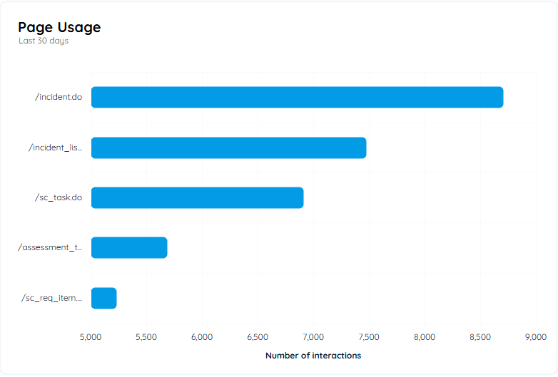
Page Usage Bar chart
Slow Pages Chart
The Slow Pages chart is a horizontal bar chart that showcases the top 10 slowest-loading pages within the application. Each bar represents a specific page, with the length indicating the average loading time. Users can toggle between data for the last 30 days, the last 90 days, and all time. This chart provides valuable insights into performance bottlenecks, helping users identify which pages may need optimization for improved load times and user experience.
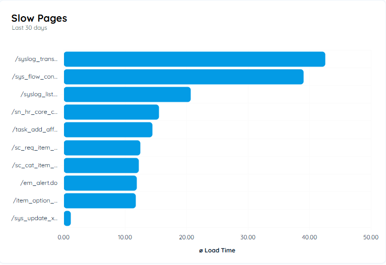
Slow Page Bar chart
Page Overview
The Page Overview section presents detailed metrics for each page in a tabular format, giving insights into various aspects of page performance and user interactions. The table includes the following columns:
URL: The URL of the page being analyzed.
Area: The specific area or section within the application.
Elements: Number of elements that users interact with on the page.
Copy-Paste Events: Total count of copy-paste actions performed by users on the page.
Load Time: Average loading time for the page.
Time Spent: Total time users spend on the page.
Users: Number of users who have visited the page.
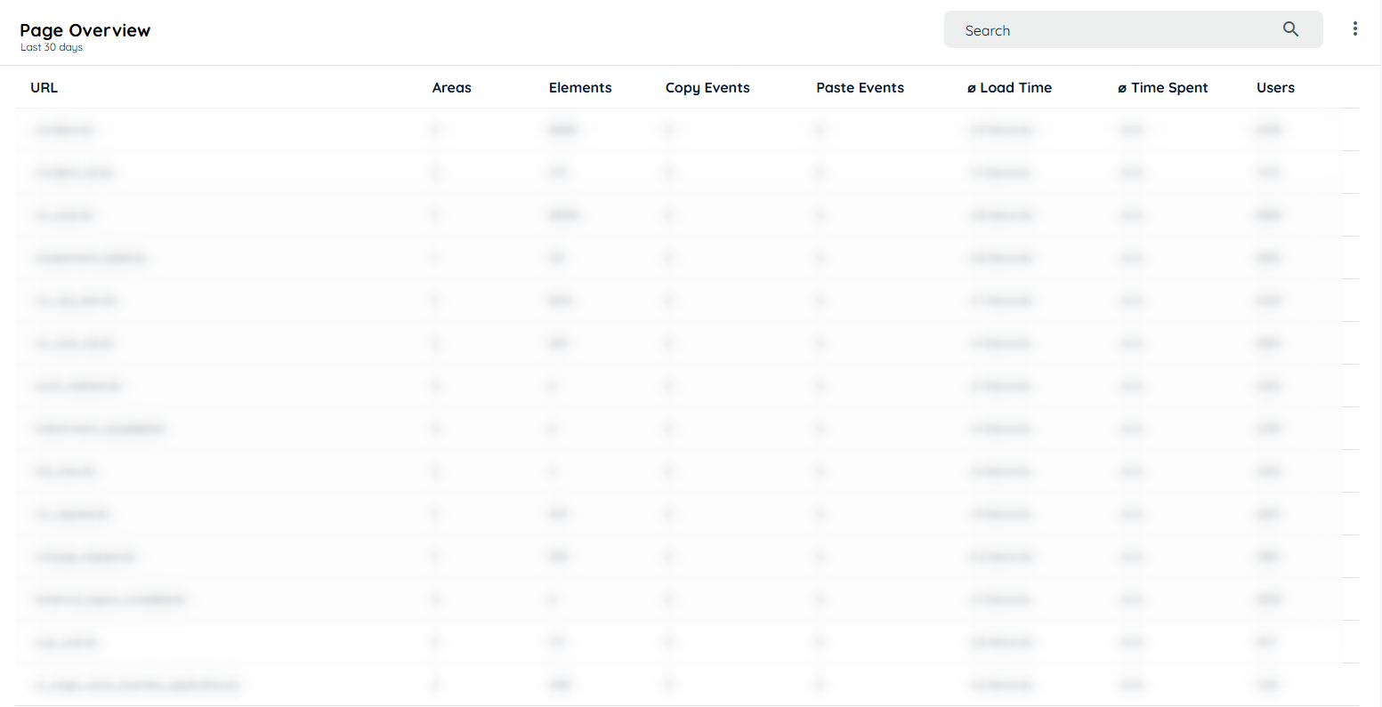
Page Overview
Clicking on a page URL in the table opens a detailed analytics view specific to that page. This view includes graphical data representations, such as:
Users: Number of users who have visited the page.
Load Time: Average loading time for the page.
Time Spent: Total time users spend on the page.
Interacting Users: A line chart displaying the trend of user interactions over time.
Users by Country Map Chart: A geographical bubble chart representing the number of users per country, with bubbles sized by user volume.
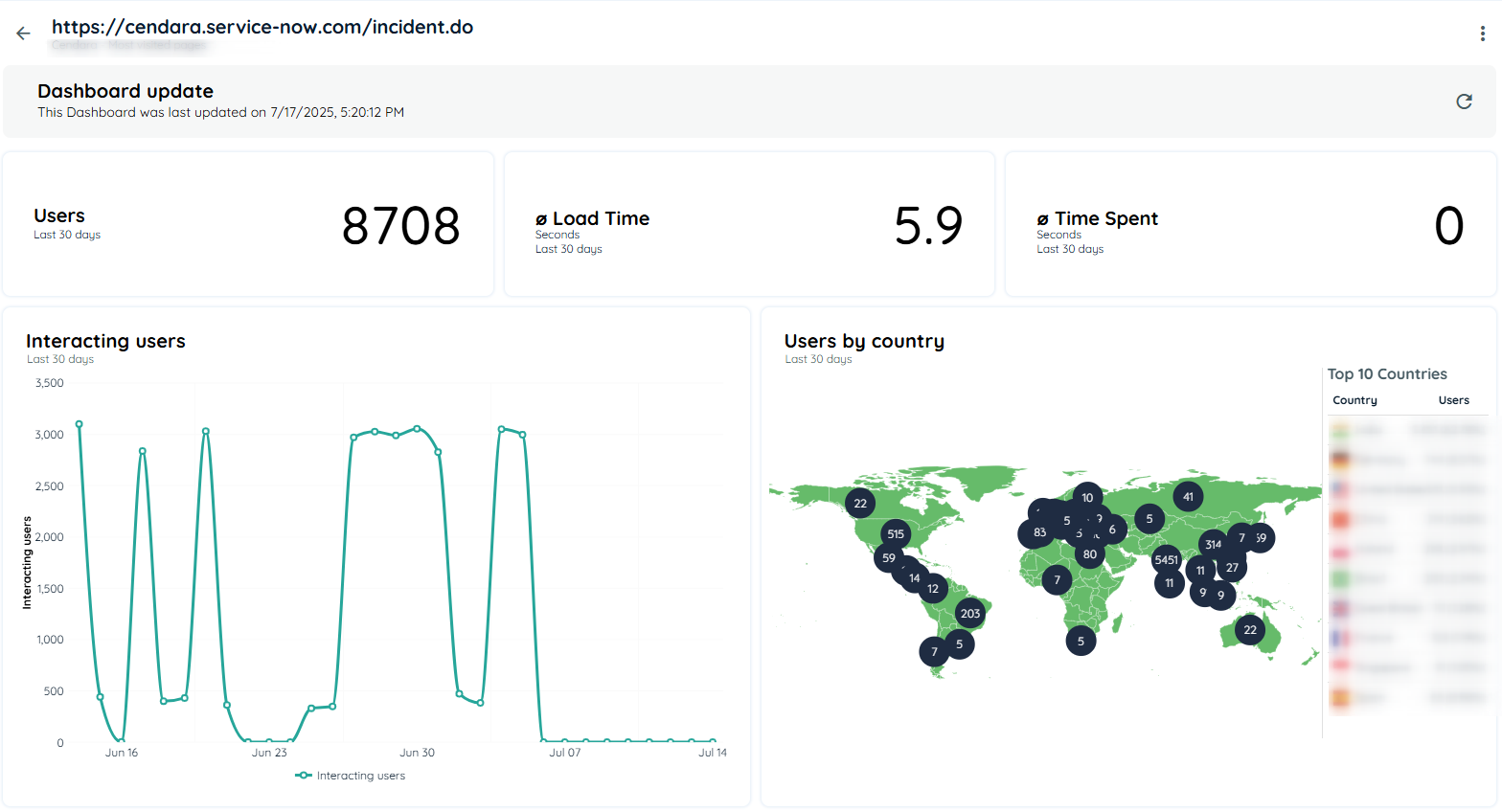
Page Analytics Overview
Elements: A table listing page elements with metrics for user interactions.
Element Label: Name or label of the element (e.g., "Submit Button").
Label Area: Page section where the element is located (e.g., "Header").
Tag Type: tag or component type (e.g., container, table).
Language: Language used in the element (e.g., "EN").
Interactions: Count of user interactions with the element.
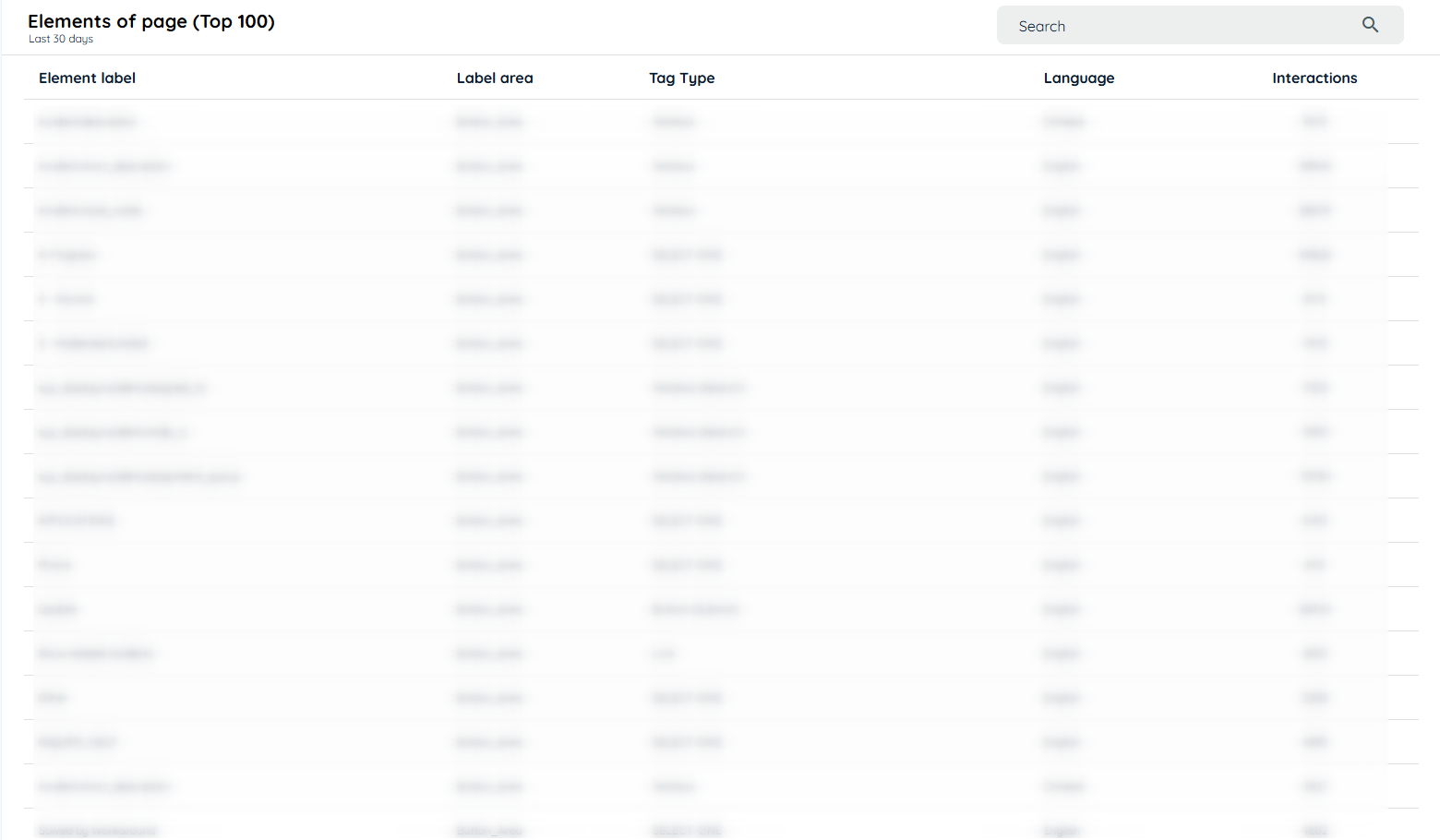
Elements of Page
Area Section
The Area Section table provides a summary of distinct areas on each page:
Title: Name of the area (e.g., "Main Content", "Sidebar").
ID: Unique identifier for the area.
Type: Category or type of area (e.g., "Navigation", "Content").
Occurrences: Frequency of user interactions within the area.
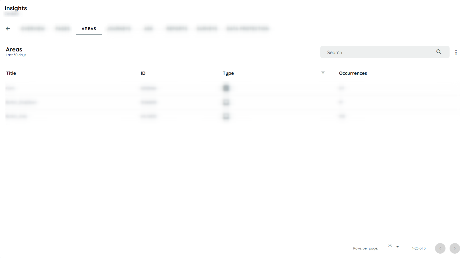
Area Section
Clicking on an area in the Area Section table opens the Area Overview Page, which provides detailed insights for that specific area:
URL: The direct URL of the page containing the area.
Left Click: Count of left-click events within the area.
Right Click: Count of right-click events within the area.
Copy Paste Events: Number of copy and paste actions performed within the area.
Users: Total number of users interacting with the area.
Activity Time: The total time users have spent interacting with the area.
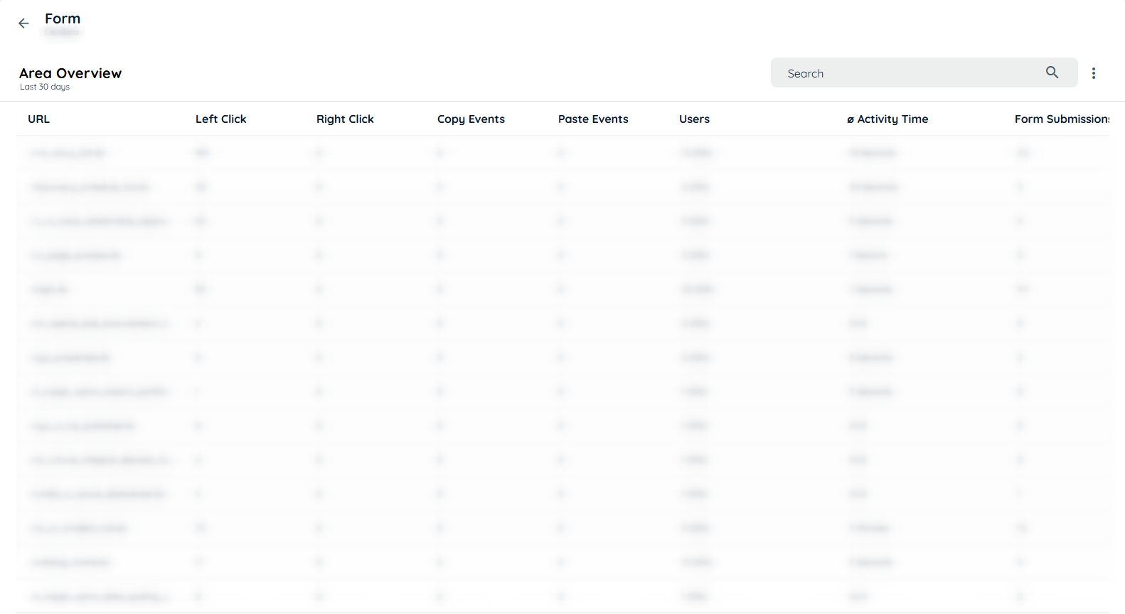
Area Overview
Clicking on any URL in the Area Overview Page opens a detailed analytics view for that specific page, providing in-depth metrics:
Users: Total number of users who interacted with the page.
Activity Time: Total time users spent on the page.
Countries: List of countries where users are accessing the page.
Users by Country Map Chart: A geographical bubble chart representing the number of users per country, with bubbles sized by user volume.
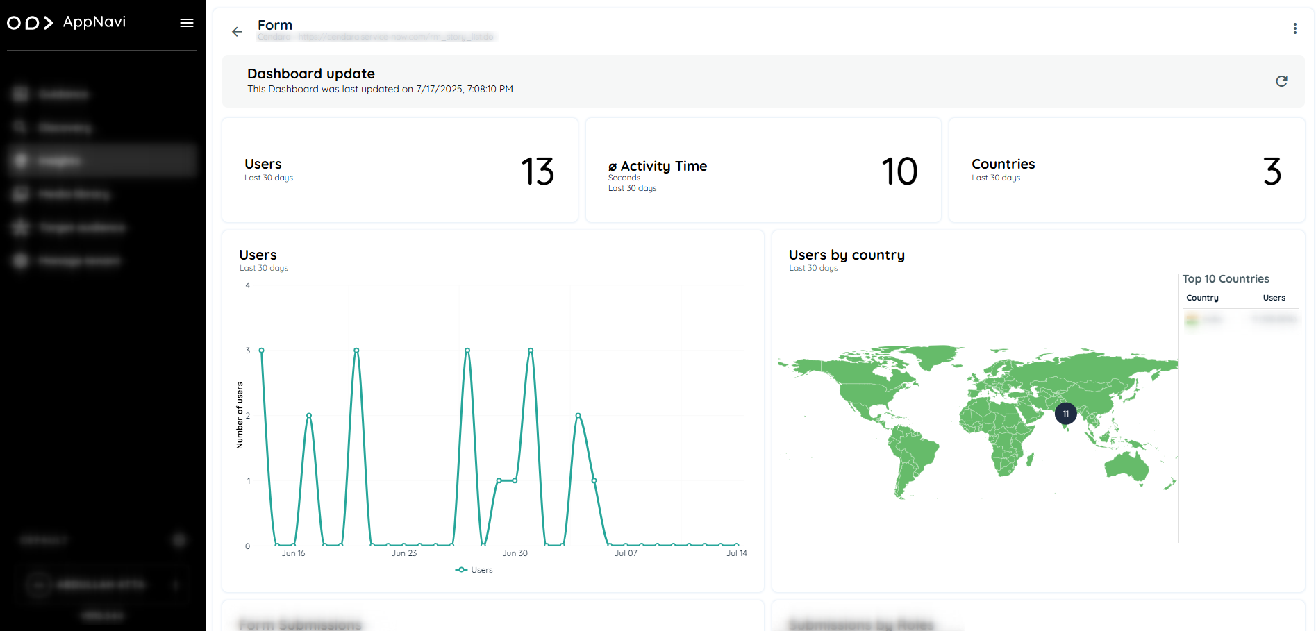
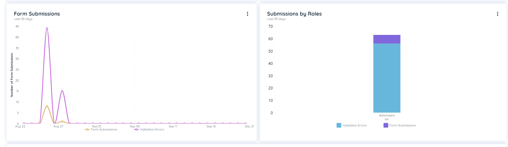
In case its a form two additional charts will also displayed
- Form Submissions: This line chart shows how often its submitted and whenever validation errors occur.
It shows separate lines, one for Form Submissions and other for Validation Errors. - Submissions by Role This Stacked bar chart shows the roles that have submitted the form and how often along with the number of errors per role.