Create your first Application
Purpose
This document outlines the process for creating a new application in the AppNavi portal. Applications in AppNavi serve as containers for avatars, routes, and guided content. By setting up an application, guidance can be targeted, personalized, and deployed across specific environments.
Navigation Path
To begin the application creation process:
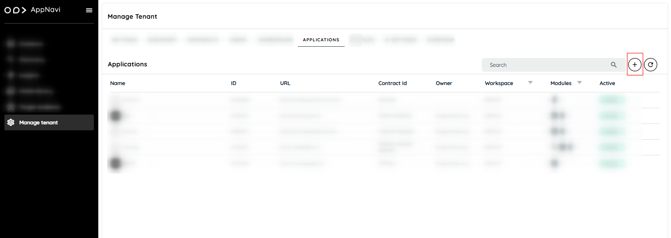
- Navigate to the Manage Tenant page.
- Go to the Applications section.
- Click the Add icon (➕) to start creating a new application.
Creating a New Application
Upon clicking the add icon, the Application Creation page will open. The following fields must be filled to complete the application setup:
General Information
| Field | Description |
|---|---|
| Upload Image | Click the pencil icon to upload a custom image for the application. |
| Application Name | Enter the name of the application. |
| Workspace | The workspace is selected by default. A different workspace can be chosen if needed. |
| Application URL | Enter the main URL of the application. |
| Pattern | Define the URL pattern where AppNavi should appear. Wildcards (e.g., *) can be used to cover multiple paths. |
| Owner | Select the application owner from the list of active users. |
| Language | Choose the language in which AppNavi content should appear. Defaults to the browser language. |
| Avatar Position | Defines where the avatar appears in the application interface. Default: Bottom-Left. |
| Avatar Visibility | 1. Visible (default) 2. Restricted Mode – Enables Restriction Keys (up to 5). In Restricted Mode, the avatar appears only when a matching key is present in the app’s localStorage under appnavi_visibilityRestrictionKey. |
Code Execution Mode
| Option | Description |
|---|---|
| Dynamic | Default. Bypasses most Content Security Policies (CSP). Recommended. |
| Inline | CSP-sensitive mode; may be blocked depending on application restrictions. |
Avatar Guide Size
| Option | Description |
|---|---|
| Minimized | Avatar guide appears collapsed by default. Users can expand it manually. |
| Maximized | Avatar guide is expanded by default. Users can manually minimize it. |
Note: The avatar guide size resets on page refresh; user preferences are not saved.
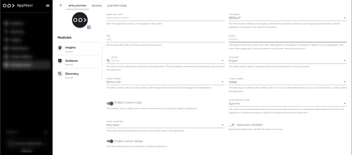
Application Disabled
- When enabled, the avatar will not load on the configured application.
- When disabled, the avatar is active and visible based on pattern match and restrictions (if applied).
Enable Advanced Analytics
- Activates extended tracking and usage metrics.
- Enables additional toggle: Record User Role for role-specific insights.
Module Section (Left Panel)
On the left side of the application creation screen, a Modules Section displays the active modules licensed for the tenant.
- Modules such as Guidance, Insights, and Discovery will be highlighted when enabled.
- Only enabled modules will be available for use in this application.

Additional Toggles and Advanced Options
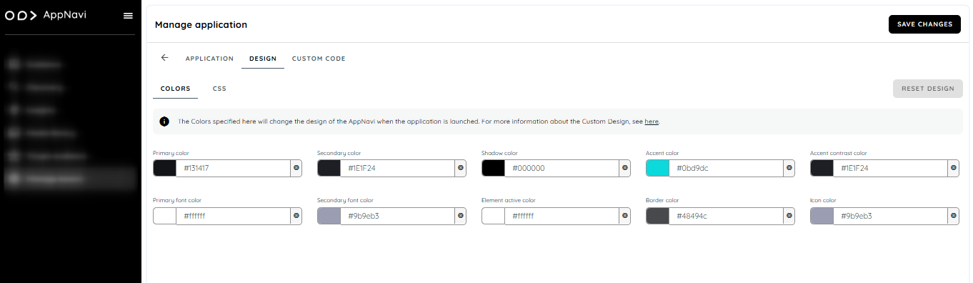
Enable Custom Design
When enabled, a Design section becomes visible.
This section allows customization of avatar appearance including:
- Colors: You can customize your avatar design by setting colors that can be selected by a color picker or added by entering a hex value.
- CSS: You can add CSS to a custom theme by changing the image and text of the Avatar Icon.
Enable Custom Code
- When enabled, a Custom Code section is displayed.
- This section allows insertion of custom JavaScript or styling snippets.
- Custom code can be used to extend avatar behavior or styling beyond default capabilities.
- If custom code toggles is disabled then the custom code page will not be available and if there is any custom code saved in the editor then it will not be executed for that particular application.
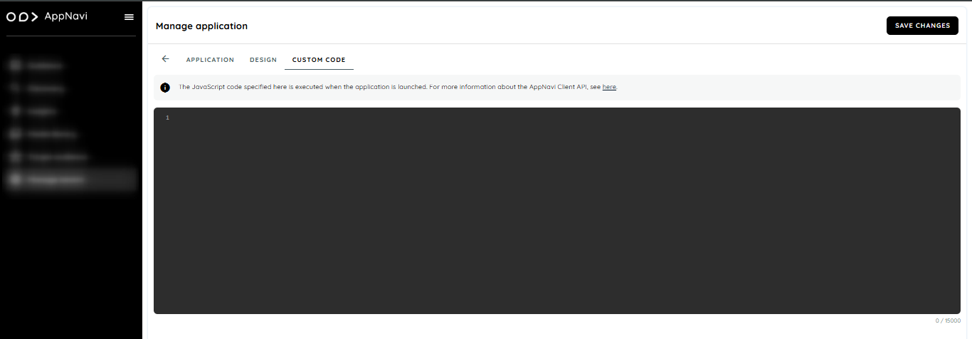
Use with caution. Ensure all custom scripts follow security and CSP compliance guidelines.
Save Changes:
After adding all the details, click "Save Changes" to save your application.