Custom Theming
Customise AppNavi to your corporate design
The acceptance of software largely depends on its functionality and usability. An important factor is how well solutions integrate into the overall application landscape. With the "Custom Theme" option, AppNavi can be seamlessly adapted to the corporate design’s colour scheme for each individual application.
Step 1: Edit the Application
Since custom theme is to be done at the application level, the relevant application must be opened in edit mode.
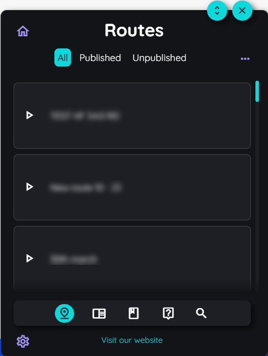
- Open the portal.
- Select the "Manage tenant" section in the left navigation menu.
- Go to Applications tab.
- Click on the button with the 3 dots in front of the application and select the "Edit" option.
Step 2: Enable Custom Theme
In the next step, you need to enable custom theme for the selected application.
- Enable the Custom Design toggle.
- Go to Design tab appearing on the top menu.
Step 3: Setting the colour values
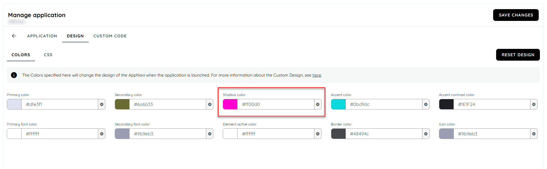
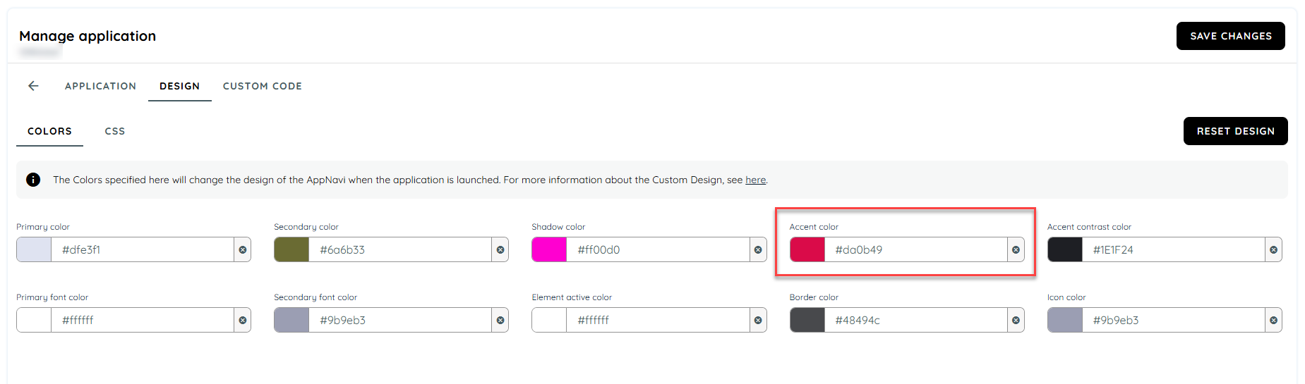
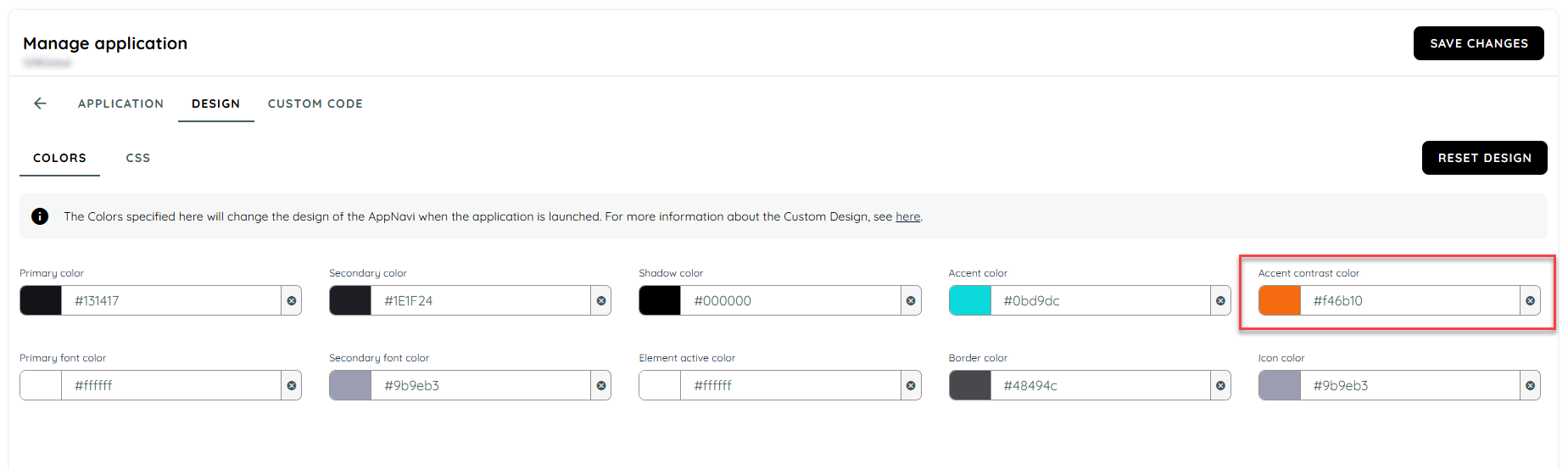
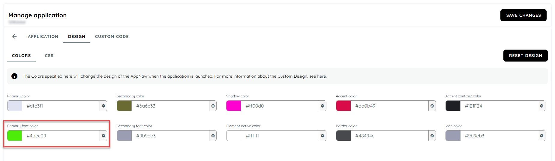
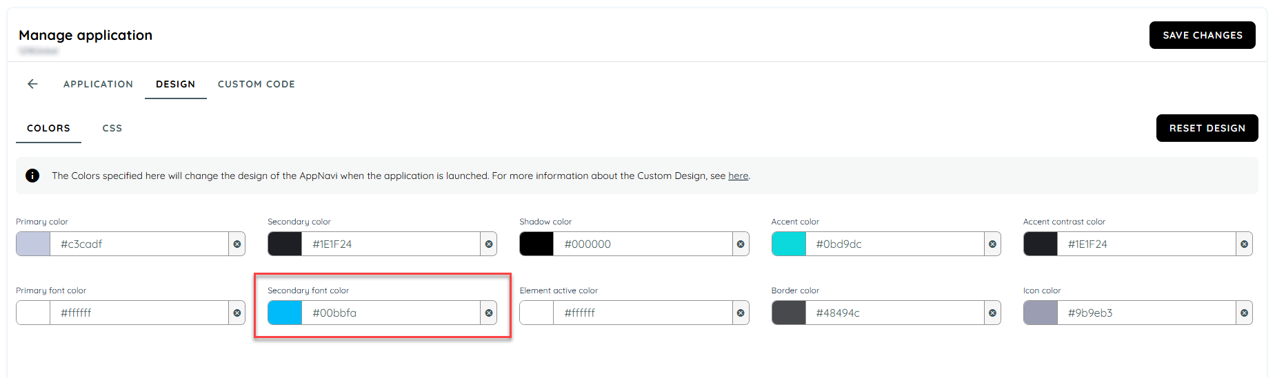
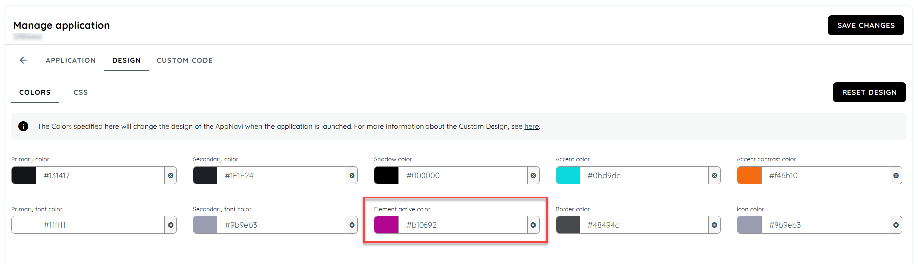
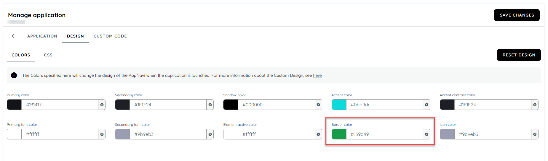
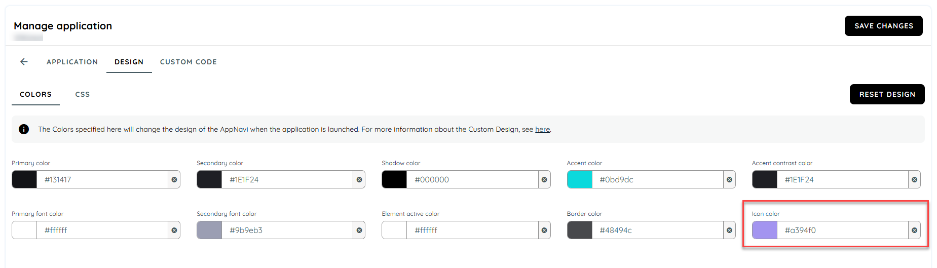
The colours can now be customised for 11 different areas. The colours can be entered via HEX codes or specified via a colour picker.
- First check which colour you want to change.
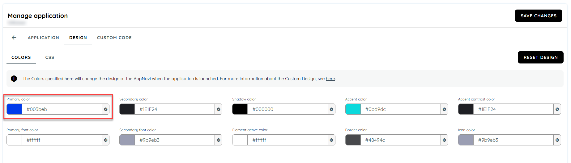
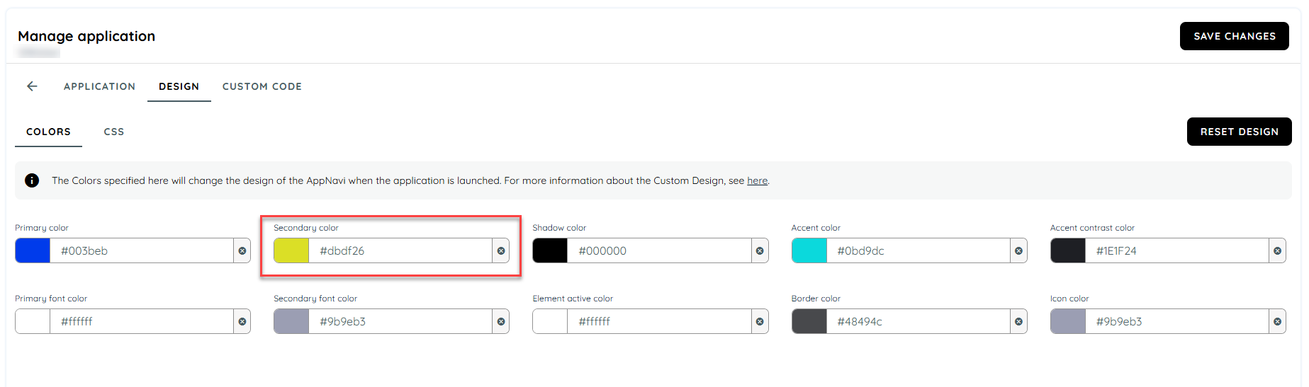
- Then click on the colour field to open the colour picker and select a colour or enter a HEX code (preceded by a "#").
- Now save the changes and go to this application in another browser window to view your changes.
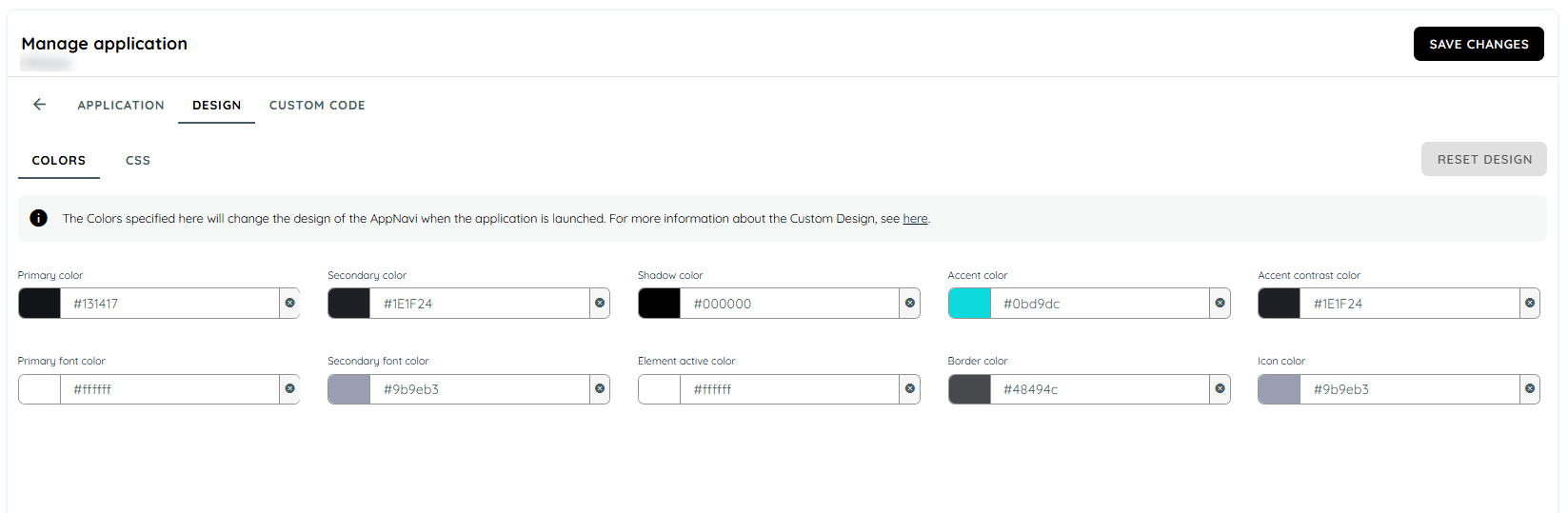
Colour Designations and Their Appearance in AppNavi
A total of 11 colour ranges are available for customisation.
- Primary Colour
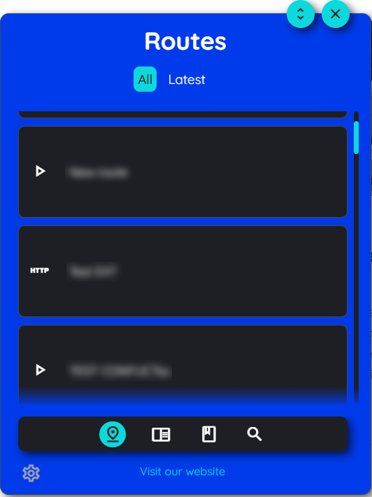
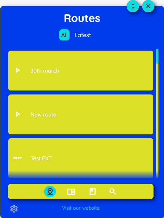
The primary colour affects the basic appearance of the AppNavi menu background as well as the background of the tool tips, hotspots, news and announcements.
- Secondary Colour
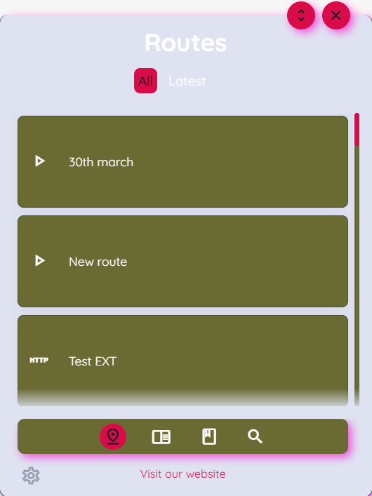
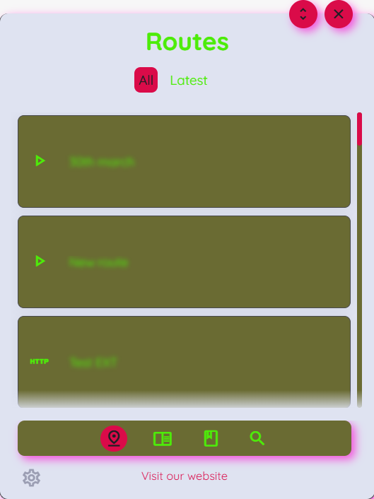
The secondary colour affects the basic appearance of the AppNavi route tiles.
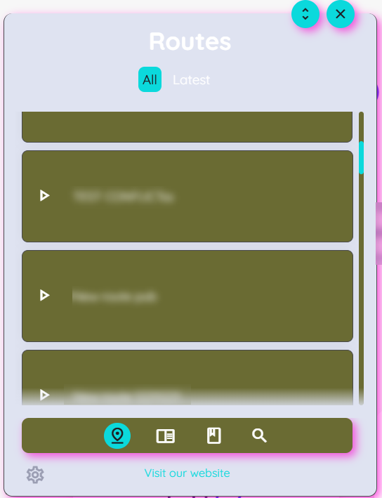
- Shadow Colour
The Shadow Colour affects all shadows within AppNavi. For example, the shadows for the route tiles, borders of the avatar and border of the menu beneath.
- Accent Colour
The accent colour - as the name suggests - sets accents in AppNavi. It influences the colour of buttons (e.g. in tool tips, in the route planner or in the AppNavi menu) and other highlighted elements.
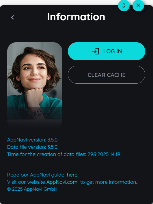
- Accent Contrast Colour
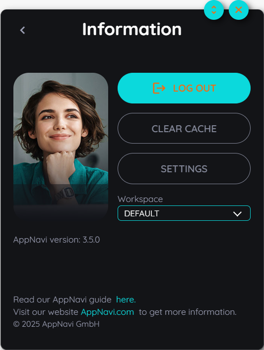
The accent contrast colour creates a standout from the accent colour. It is reflected in the text of many places like the logout button and other buttons.
- Primary Font Colour
The primary font colour is usually used on areas with the primary colour, e.g. on the route tiles, in the AppNavi menu.
- Secondary Font Colour
The secondary font colour is usually used in all other areas like the info of the avatar version etc.
- Element Active Colour
The element active colour is used to highlight active or selected elements like hovering on the icons etc.
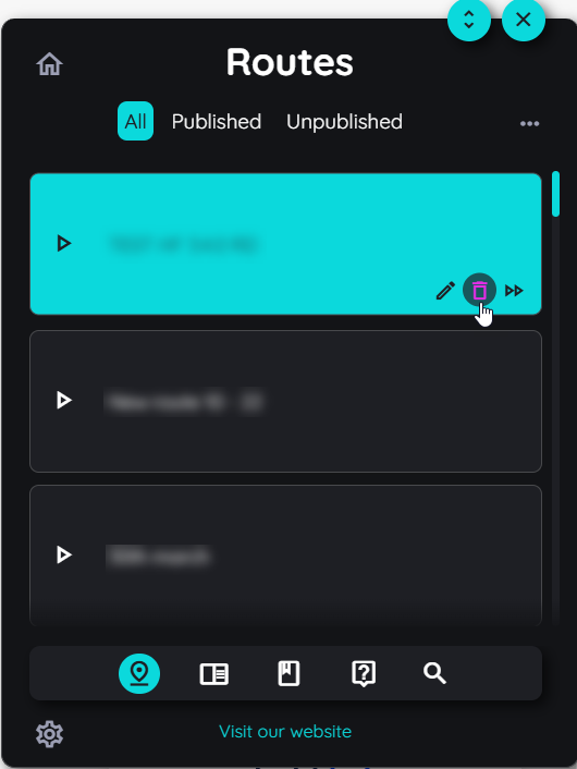
- Border Colour
The border active colour is used for all borders.
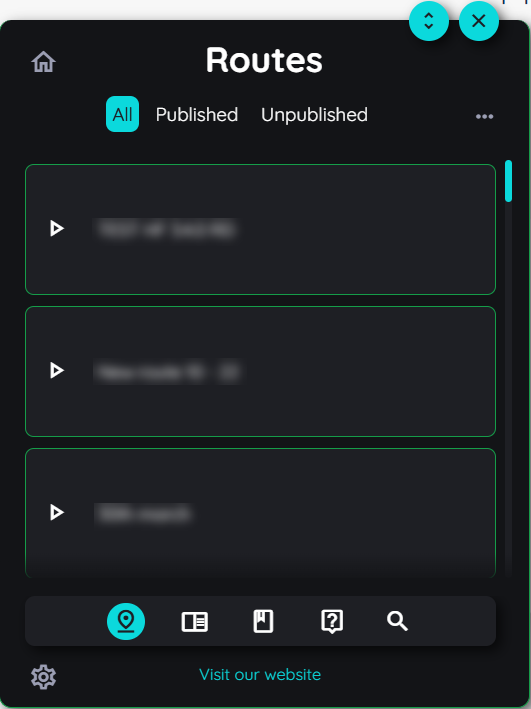
- Icon Colour
The Icon Colour affects the appearance of all icons in AppNavi, for example the icons of the home and setting button etc.
Custom CSS:
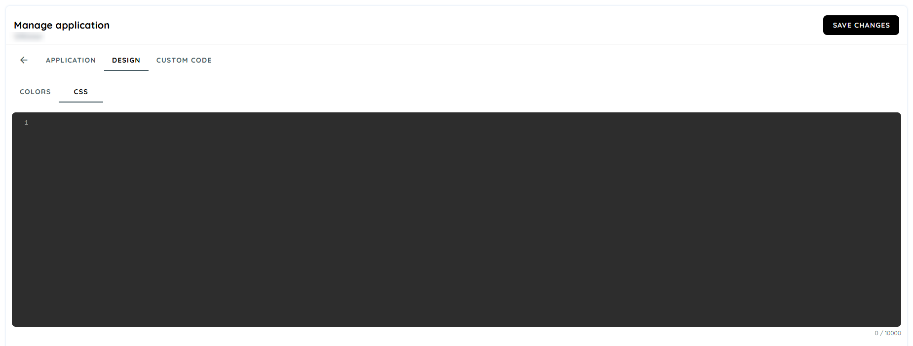
CSS added here will be used to design and customise AppNavi components. Please note that use of '!important' is required with every CSS property.
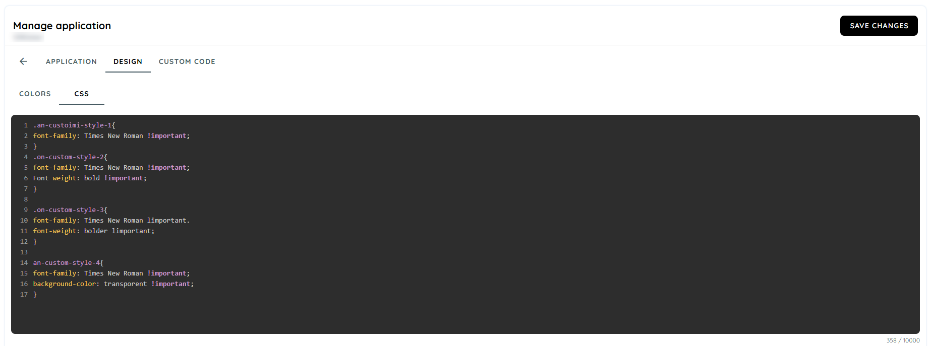
.an-custoimi-style-1{
font-family: Times New Roman !important;
}
.on-custom-style-2{
font-family: Times New Roman !important;
Font weight: bold !important;
}

.on-custom-style-3{
font-family: Times New Roman limportant.
font-weight: bolder limportant;
}

an-custom-style-4{
font-family: Times New Roman !important;
background-color: transporent !important;
}
If a user wishes to customize the appearance of a tooltip or the borders used to highlight the element, they can do so by applying CSS on the following CSS class names:
- For borders: .an-custom-overlay-border-class
- For the tooltip: .an-custom-tooltip-class
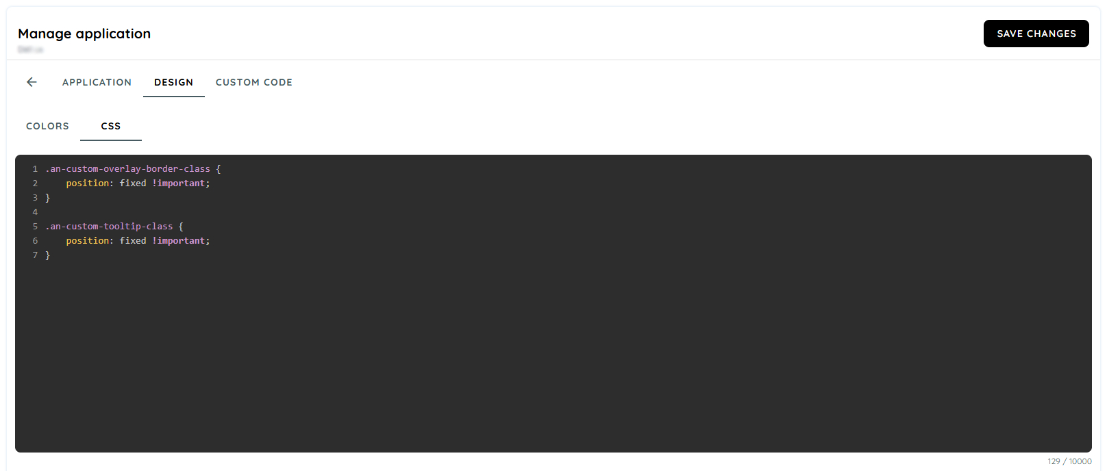
.an-custom-overlay-border-class {
    position: fixed !important;
}

.an-custom-tooltip-class {
    position: fixed !important;
}
Browser Compatibility
It is compatible by the given browsers mentioned below. The technology applied on custom colours is CSS variables and CSS variables are not supported by Internet Explorer.

Updated 3 months ago