Overview
The Guidance Overview Page provides a centralized summary of user engagement and application activity across your organization. It offers powerful analytics to help understand how users interact with applications, which content is most effective, and where time is being spent.
This page is especially useful for monitoring adoption trends and evaluating the impact of guided content provided through AppNavi.
Date Range Filter
The Guidance Overview Page includes a central switch that allows you to filter analytics based on different time ranges. This helps in analyzing trends over specific periods.
Available Time Filters:
- Last 30 Days – View recent activity and short-term user engagement.
- Last 90 Days – Analyze medium-term usage patterns and content performance.
- All Time – Get a complete historical overview of all tracked data since the tenant's activation.
Charts
The Overview page includes the following insights:
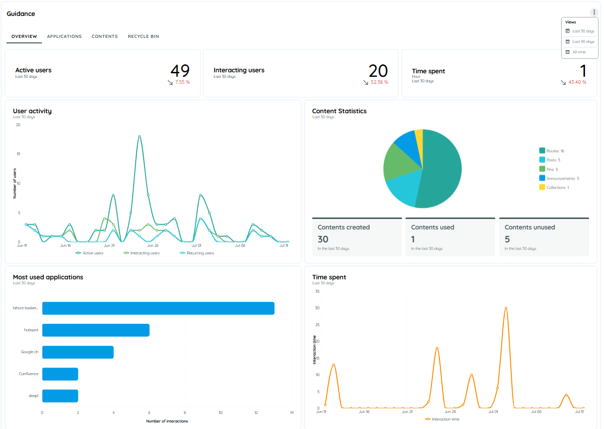
User Activity Chart
Displays trends in user engagement across all AppNavi integrated applications. This chart shows how frequently users are interacting with guidance content over time.
Content Statistics
The Content Statistics section provides a detailed overview of all content types created and used within AppNavi. It helps track content engagement and identify unused content for potential optimization.
This section includes both a line chart and a pie chart for visualizing the data.
Line Chart (on Hover)
- When hovering over “Content Created” or “Content Used”, a line chart appears.
- This chart shows daily trends, indicating when content was created and when it was actively used by users.
Pie Chart (Default View)
- By default, a pie chart is displayed.
- It shows the distribution of different content types, including:
- Routes
- Announcements
- Pins
- Posts
- Collections
Each segment in the pie chart displays the percentage share and total count of the respective content type, giving a clear snapshot of content usage across the platform.
Most Used Applications
This chart shows a bar chart that displays the number of interactions per application.
It provides a ranking of applications based on user activity, helping users quickly identify which applications are most actively used and engaged with by users.
Time Spent
It is a Line Charts for user activity over time.
It Shows how much time users are spending in different applications, giving you a clearer view of user behavior and software adoption.
Updated 10 days ago