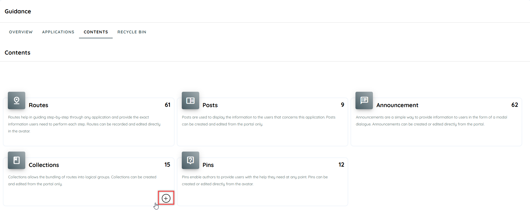
Contents
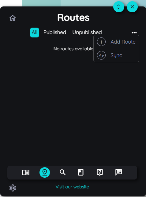
Routes
Use any application immediately. Without training, without questions. With routes! Imagine that is sitting in front of an application for the first time - or the application has changed significantly. How can you operate it effectively and efficiently without training or asking colleagues or the help desk? The answer: by means of routes. Routes guide you step-by-step through the application and provide you with exactly the information you need to perform each step. AppNavi guides you through apps as safely as a navigation system guides you through the city.
Typical use cases for "Routes" Routes typically support in the following scenarios:
- Onboarding: Introduction of new employees
- SW rollout: Provision of new software / major release
- Infrequent UseCases: support for infrequently performed operations.
- Automation: acceleration in the execution of tasks (RPA)
Creating a Route
-
Open AppNavi widget (Avatar) First, open the application for which you want to create a route. Please note that this application has also been added to the customer portal, and the AppNavi widget appears on the application, widget position can be changed. Now click on the AppNavi widget to open the AppNavi menu.
-
Log in to the widget
- Click on the Guide logo in the opened AppNavi menu.
- To login, click click setting Icon.
- Now click on the "Login" button.
- Enter your login "Email address" and "Password'' in the login screen.
- Confirm with "Login".
-
Start the route creation
• After you are logged in, click on the route icon in the AppNavi menu bar. • Now click on the "..." and "+" icons to initiate the route planner.
- Fill basic details
- Language: User can select preferred language from language section, so the route will appear in that language (languages are added and selected from portal side according to the requirement of user)
- Icon: Choose a speaking icon for the route.
- Title: Give the route a very short, meaningful title. This title will appear on the front of the route tile.
- Start Mode: User can select mode to play route, by default it will be in learning mode. Learning mode means that user will play route manually and Automation mode means route will be played automatically once done automation setting on each step.
- Publication Status: Routes have two status type i.e. Publish and unpublish, it will be displayed here.
Now give the route a meaningful description. This description appears as soon as a user moves over the route tile (back side of the tile).
-
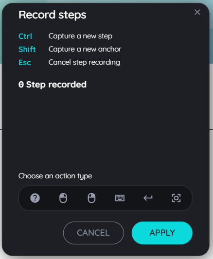
Initiate the step recorder
If you want to add steps to your route, you can choose between two step types:
- Capture step:
- click on + icon
- click capture steps
- A step recorder dialog will open
- Capture step:
-
Select the appropriate type in the step recorder
User can drag-and-drop the step recorder to any place in your application so that it does not interfere with the recording of your route. Select any action type from the menu by clicking on the appropriate step type icon.
- Show:
This highlights an element on the screen to explain it. No direct interaction is made with the application. Via "Next" in the tooltip, the user gets to the next step. - Left Click:
With the "Left Click" option, the user is prompted to perform a left click on the selected element directly within the application in order to proceed to the next step. There is no "Next" option in this case. - Right Click:
Analogous to the "Left Click" option, the "Right Click" option prompts the user to perform a right click on the selected element directly in the application in order to proceed to the next step. There is no "Next" option in this case. - Edit:
The "Edit" option prompts the user to enter an input or make a selection from a list or table. - Press Enter:
The "Enter" option prompts the user to press the "ENTER" key. This may be necessary, for example, after entering a search term in a search field. - Hover:
With the "Hover" option, it is sufficient for a user to hover over an element to get to the next step.
Capture a step means AppNavi records exactly which element a step refers to. Its smart algorithm ensures the element can still be found even if it moves or changes, reducing maintenance to a minimum.
You can capture elements in two ways:
- CTRL key (default): Quickly captures the step without extra adjustments.
- SHIFT key: It fine-tune the step by choosing from a detailed path.
Capture with CTRL:
Select the step type in the step recorder.
Move your mouse over the application to the element you want to record.
As soon as the colored frame appears around the desired element, capture the element by pressing the CTRL key.
The recorded element now appears directly on the step recorder. Assign a meaningful title to this element directly to simplify editing in the planner.
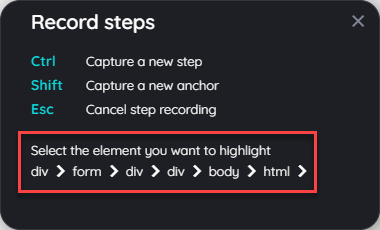
Capture with SHIFT:
Select the step type in the step recorder.
Move your mouse over the application to the element you want to record.
As soon as the colored frame appears around the desired element, capture the element by pressing the SHIFT key.
A dialog appears with the different elements of the selected area: Select any element that you want to capture.
- click on the img tag to capture an img element only, or
- click on the div tag to capture a specific division of that element, or
- click body to select the whole page, or
- click html to select the whole html of that specific page.
- The recorded element now appears directly in the step recorder. Assign a meaningful title to this element directly to simplify editing in the planner.
- Cancel, Save, or Discard Steps
While creating or modifying a route, you can manage steps at any time:
Cancel Step Capturing:
- Start the step recorder and select a step type.
- Move your mouse to the element you want to capture. A colored border appears.
- To cancel the capture, press ESC. AppNavi will return to the step recorder without saving the element.
Save or Discard Captured Steps:
- After capturing a step, it appears in the step recorder.
- Click Apply to save the steps and add them to the route planner.
- Click Cancel to discard the captured steps without saving.
-
Adding and Editing Steps
You can add, edit, delete or reorder steps using the step recorder or route planner.
To Add a Step in the Route Planner:
- Hover over the line between two steps until the “+” appears.
- Click the “+” and choose:
- Capture Step: Opens the step recorder to capture more steps
- Inform Step: Adds a step with an empty tooltip in the Details section.
-
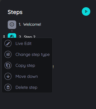
Step options
- Live Edit:
It will display the step in the play mode, so the user may edit it similarly to how it's done in the route planner. - Copy step:
It will copy each detail of that step, including text, images, videos, links, connected routes, etc. It will also copy it in all the selected languages. - Delete step:
The step can be deleted. Please note that the step is deleted directly after selecting the delete option without a confirmation prompt. - Move up:
To change the order of the steps, the selected step can be moved upward. - Move down:
To change the order of the steps, the selected step can be moved downward.
- Testing Routes and Automation
User can test the steps in your route in two ways:
Test Route: Runs the captured steps in normal mode. Each step and its tooltip are displayed in the application.
Test Automation: Runs the captured steps in automation mode with the same behavior.
For Automation, user has to activate toggle of Automation enabled from step settings.
-
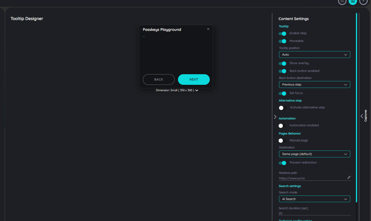
Tooltip Designer
In the Route Planner, the Tooltip Designer allows you to add details for each step. Using the Froala editor, user can include text, media (images or videos), links, and even connect other routes, making it easy to provide clear instructions and rich information for every step in your route.
Increase Route Reliability
It happens from time to time that a web page/application lacks unique identifiers for an element. Even though AppNavi's algorithm is very intelligent and uses various attributes and criteria to identify an element, it may be necessary to increase the reliability by adding additional attributes. The following picture shows a typical scenario. All form elements have identical CSS classes and no additional unique identifiers, except for the label.
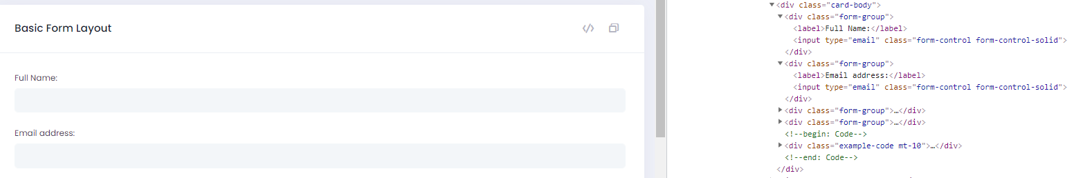
If, however, the label is not to be highlighted in a route step, but the parallel input field element, this can lead to problems. It is necessary to provide the input element with an additional unique attribute. In this case, AppNavi Application Custom Code can be used to ensure that the input elements are provided with an additional attribute.
var element = window.appnaviApi.utils.findElementsByText('Full Name:')[0];

window.appnaviApi.anQuery(element).closest("input").attr('anUniqueId', 'fullName');
With these two lines of code, the element is equipped with the custom attribute anUniqueId and is now reliably identifiable.
Working with Captures
Captures are a simple way to specify alternative display elements for a step. If the main element captured for a step is not found, the AppNavi algorithm searches for an alternative element. This mechanism is very suitable for pages with a responsive function, for example. On these pages, the design, i.e., the arrangement of the elements, often changes as the screen resolution changes. With AppNavi captures, the same route can be used for different design arrangements on a page.
How captures work
Follow the steps to learn about how captures work.
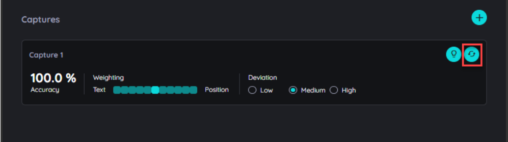
On Route Planner, click on Step and then on Search under the Details section
Scroll down and find a section named "Captures"
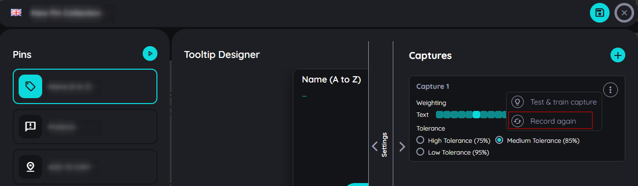
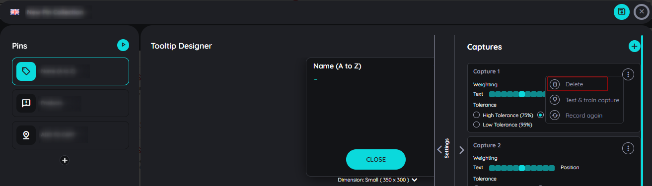
Here you will see the already captured step along with three options: the "Add Capture" (plus icon), “Test & Train Capture”, and the "Record Again" icon.
1. Add captures
Clicking on Add captures (plus icon) will add an optional capture to the already captured element.
In the event that the element is not found, it will move to the newly added capture element.
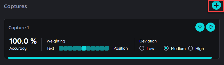
If the element structure of a page is adapted to different resolutions (responsive website), certain elements may no longer be found by AppNavi or are simply no longer present on the page. In this case, the same route can still be used by adding additional captures to the steps. AppNavi then searches the list of captures one by one and checks whether the element can be found.
To know about Deviation and Weighting, click here Deviation and Weighting
2. Record Again
Recording the same elements helps the user improve the element identification mechanism on dynamic pages.
Case 1: The user has selected the wrong element and wants to overwrite it with a different one.
Record Again will help authors capture page elements again and replace the previous capture.
If an author captures an element on the page but decides to change it, use the "Record Again" option to capture a different element on the same step.
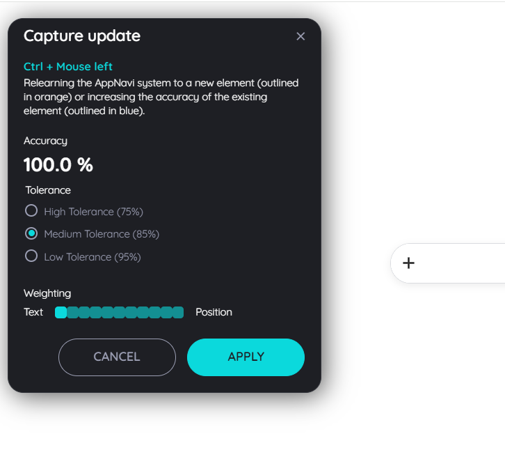
Case 2: The user wants to improve the search mechanism on dynamic pages.
If the user captured an element before and added details on that step, but because of the dynamic page, the captured page element is changed, it will not be able to find that again.
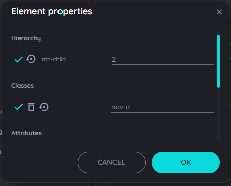
For this purpose, the user can record the element without losing the added details from that step. The AppNavi Engine then automatically adjusts the attributes so that they work in both cases. You can check the change in the Element Properties window.
To know more about Test and Retrain capture, click here Test and Retrain
The following table shows how an element property changes when it is re-recorded.
| Initial Attribute Value | Rerecorded Attribute Value | Adjusted Attribute Value |
|---|---|---|
| title="loremIpsum" | title="loremIpsumABC" | loremIpsum* |
| title="loremIpsum" | title="ABCloremIpsum" | *loremIpsum |
| title="loremIpsum" | title="lorem" | lorem* |
| title="loremIpsum" | title="psum" | *psum |
| title="loremIpsum" | title="loresum" | lore*sum |
Attributes that disappear completely from the dome remain as attributes in the list of element properties but are deactivated.
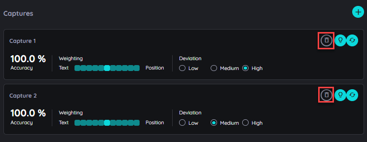
3. Delete Capture
If there are more than one capture, user has an option to delete any capture which is no longer required.
Step Settings
Each step within a route has different settings. By using AppNavi most of the settings are predefined for you already. Settings vary with step type.
-
Enabled This setting is available for all types of steps. It allows a user to activate or deactivate a step within a route. By default, it is "On" (enabled) but on switch "Off" (disabled), the step will be deactivated and it will be skipped when the route is processed.
-
Tooltip Moveable This setting is available for all types of steps. If this option is active your end users will be able to drag your tooltips around.
-
Show Overlay This setting is available for all types of steps. By default, it is set as "On" to show the page overlay on the step. A user can decide if the page overlay on a step is to be shown or not.
-
Back button enabled This setting is available for all types of steps except the first and last steps. In some situations, a back button doesn't make sense. This is the case when the UI element for the previous step is not on the screen anymore. Just imagine the user was inside a modal dialog, which is now closed. In this situation, you can deactivate the back button because clicking "Back" won't take you anywhere. a user can specify the target step on the back button. By default, it will be the "Previous Step". A user can update it to any step except the last step.
-
Set Focus This setting is available for all types of steps except the "inform" step. It focuses element being shown. If set focus is enabled on a text field, a cursor will be shown indicating a focus on the other hand, If we disable set focus, it will not show a cursor.
-
Alternative Step This setting is available for all step types. By default, it is "Off". When enabled, the end user can select an alternative step, which will be executed if the original step element is not found. In certain situations, an element may be missing due to dynamic content changes, conditional visibility, or navigation differences. Enabling this setting ensures that the workflow continues smoothly by executing the alternative step instead of failing due to a missing element.
-
Automation This setting is available for all types of steps. By default, it is "Off". Switch "On", to reload the page before the next step will be searched. In some situations, screens can have different states: A menu can be open or not, a tab can be visited or not, etc. If you want the screen to be more predictable a reload of the page can be helpful before the next step is searched. In such a case you can use this setting.
-
Reload page This setting is available for all step types except the "Inform" step. By default, it is "Off". when enabled, a delay field will appear, allowing the end user to set a time duration before automation starts. Once the duration is set, clicking the "Automation" button will trigger the route to automatically play through all the steps without manual interaction.
-
Prevent Redirect When a step is captured, AppNavi stores the URL of that step. On processing the route, there is a mechanism to check the current URL and compare it with the one where the step was captured. In this case if the "Prevent Redirect" is enabled or On the route will start immediately - no matter if both URLs match or not whereas if the "Prevent Redirect" is disabled or Off, there will be a redirection if the URLs do not match.
-
Prevent PointerDown event This setting is available for all types of steps except the "inform" step. By default, it is set as "Off". In case you do not want a click inside your tooltip to be considered as a click inside the page, just switch it to "On". A very common example is when you are showing some element inside a menu that is hidden when the user clicks "somewhere" inside the page. Also a click on "Next" would be a click on "Somewhere".
-
Check Overlap During route run, if anything overlaps target element, AppNavi would consider that the target element has been hidden and it has to find the element again. However there are times when the target element is overlapped by the non-visible element which for the eyes of the user nothing is overlapping the target element.
Therefore to overcome this issue, we have added a new option (Check Overlap, by default set to true) that allows user to disable overlap check, so that AppNavi will allow target element to be overlapped.
-
Destination Our search algorithm is hustling a lot. As soon as the route is continued, it searches for the next step. However, in some situations, you may not want it to do so. For example, if the next step is on the next page, you can tell AppNavi to wait until the page is loaded again before proceeding with the search. This setting will be available to all step types except the last step. There are two options,
- "Same page" (default): AppNavi will start searching immediately after proceeding from the last step
- "New page": AppNavi will wait until the new page or tab has loaded
-
Event binding For click steps, AppNavi will bind an Event on the highlighted element. If clicking this element won’t proceed with the Route, three other bindings can be used.
- Element (jQuery)
- Element (Javascript)
- Document (jQuery)
- Document (Javascript)
-
Relative Location This setting is available for all types of steps. In this field, the user can define the precise URL path for this step. This can be used in connection with the "Prevent redirect" option.
-
Tooltip position AppNavi is checking the space for the tooltip on the screen before it is rendered. Doing so checks the position of the found element and checks if the tooltip with its size will fit on certain positions considering the screen's top, right, bottom and left edges. However, there might be situations in which you want to precisely put a tooltip in a certain position.
This setting is available for all types of steps except the "inform" step. By default, "Auto" is selected, In case you are not able to find a position that will always (in all screen resolutions etc.) make sense, you can make the tooltip movable.
Add media, iframes & more to your tooltips.
Design tooltips with the editor
Steps can be designed in many ways: Text can be entered and formatted. Links, images, and videos can be integrated to use additional, possibly already existing content and put it into the context of the process, or just to make the routes as appealing as possible. In addition, iframes can be integrated that, for example, display knowledge items from a central knowledge database or integrate survey solutions or chat bot solutions already used in the company.
The possibilities in the editor
The editor provides you with numerous options:
Edit and format text
After you have selected a step in the route planner, it appears in the detail area on the right side. Here, you can enter the text according to your ideas. As soon as you click on the tooltip, the available options appear in the editor.
- Undo / Redo
Reverse the steps if you did them by mistake or if you are not satisfied with the result, or repeat them again. - Inline Class
An "Inline Class" refers to a custom CSS class that can be applied to a selected element within the editor's content, which helps to customize text. - Clear formatting
Remove all formatting that was applied to copied and pasted text from the original source. - Text formatting
Select the text and then choose from the Bold, Italic, Underline, and Strikethrough options. - Paragraph formatting
Select the desired paragraph and choose from the options: ordered list, unordered list, left-aligned, centered, or right-aligned. - Insert icons
Choose icons from an extensive icon library.
Embed and format text
The most commonly used content type is text, which describes the action to be performed on the given element.
- Open the desired route in the Edit mode.
- Select the desired step in the "Flow" section.
- Click headline or text in the tooltip that appears in the "Details" section.
- Enter text, select it and format it as desired (bold, italic, lists,...).
Several options to format text in a tooltip
Embed links
Very often, content already exists that can be used. Sometimes these lead a shadowy existence in knowledge databases and can be made available to the user - without a search - directly in a tooltip suitable for this purpose.
- Open the desired route in the Edit mode.
- Select the desired step in the "Flow" section.
- Click in the text in the tooltip and select the option "Insert Link".
- Enter a text to be displayed and the respective URL.
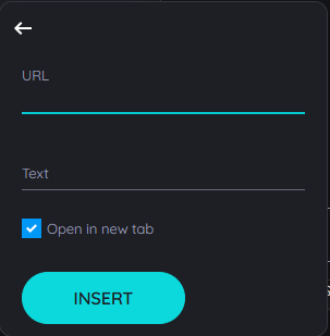
Add a link to your tooltip
If a description and the URL were entered, the link will appear in the tooltip for the user as follows:
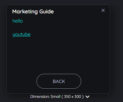
How an embedded link looks like for end users
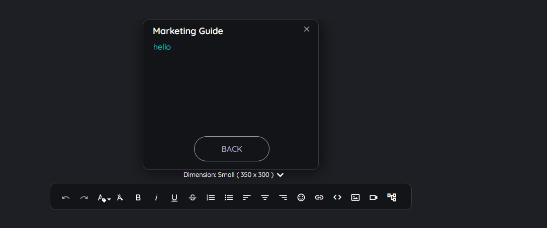
Embed an image
Images can be embedded to support a message - or simply to make the content as engaging as possible. This has a significant impact on end-user acceptance.
- Open the desired route in the Edit mode.
- Select the desired step in the "Flow" section.
- Click in the text in the tooltip and select the option "Image".
Via URL
- Select the tab "Remote" (default).
- Enter a URL and the image will be shown as preview.
- Select the image size in % or pixels (px)
- Confirm with "OK" - or select "Cancel" to discard the changes.
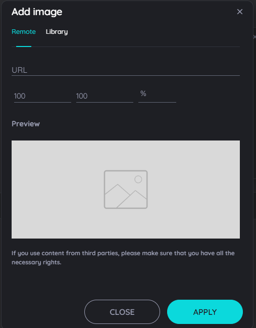
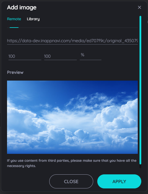
Dialog to add an image to a tooltip - empty and filled
Via Library
- Select the tab "Library".
- Select an image.
- Confirm with "OK" - or select "Cancel" to discard the changes.
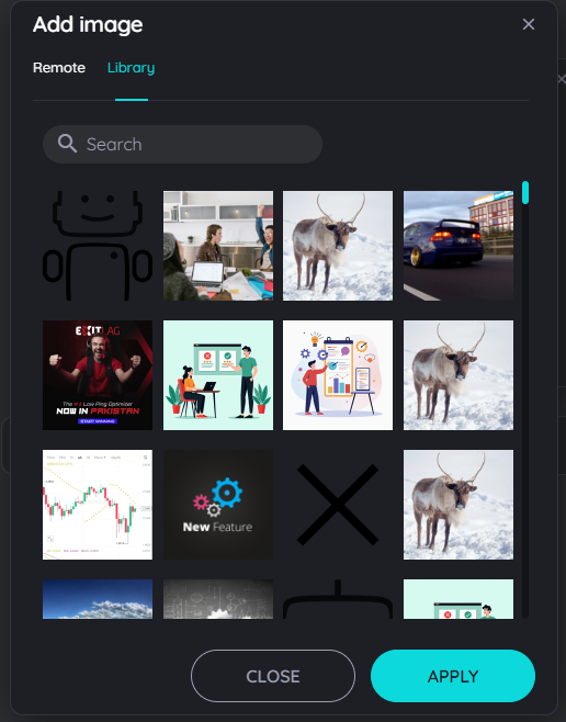
Add an image from the media library
Note: image formats
Images in .jpg and .png formats are uploaded to the media library when you insert them, are virus-checked, and are available for your content until you delete them from the media library. Other file formats may be used, but will not be uploaded to the media library. If the provider of an external link no longer makes the object available (under the path entered), the graphic will no longer be displayed in your content.
Note: copyrights
Please note that AppNavi does not check for any copyright infringements. Therefore, only upload content that can be used by you without any doubt without committing a copyright infringement.
Embed a video
Videos are also an important content type for communicating particularly explanation-intensive issues in a simple way.
- Open the desired route in the Edit mode.
- Select the desired step in the "Flow" section.
- Click in the text in the tooltip and select the option "YouTube Video".
- Enter a URL and the video will be shown as preview.
- Select the video size in % or pixels (px)
- Confirm with "OK" - or select "Cancel" to discard the changes.
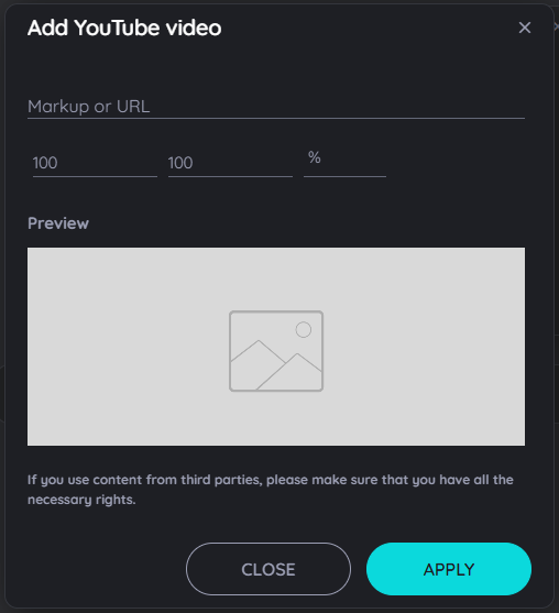
Embed a video in your tooltip - empty and filled
Embed an iframe
The integration of iframes in tooltips represents a particularly powerful functionality. Among other things, they allow the integration of content from knowledge databases, the use of surveys or even the integration of chat bot solutions. AppNavi thus offers the possibility to integrate mostly already established software solutions with low effort instead of additive solutions.
-
Open the desired route in the Edit mode.
-
Select the desired step in the "Flow" section.
-
Click in the text in the tooltip and select the option "iframe".
-
Enter a URL an the iframe will be shown as preview.
-
Select the iframe size in % or pixels (px)
-
Confirm with "OK" - or select "Cancel" to discard the changes.
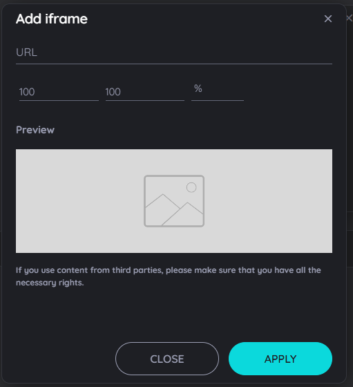
Embed an iframe für Surveys, Chat-Bots and many more ....
Conditions
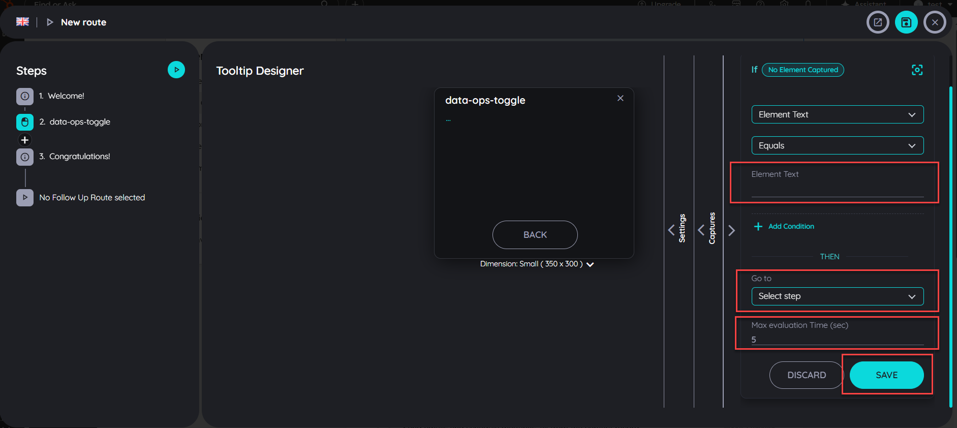
UI Conditions allow Route Authors to control route flow dynamically based on the current UI state without writing any code. Route Authors can define conditions that, when met, automatically redirect (jump) the route to a specific step.
- Add Conditions:
Edit the Route in the route Planner and navigate to the step where you want to apply the condition. On the right-side panel, click on the Conditions tab.
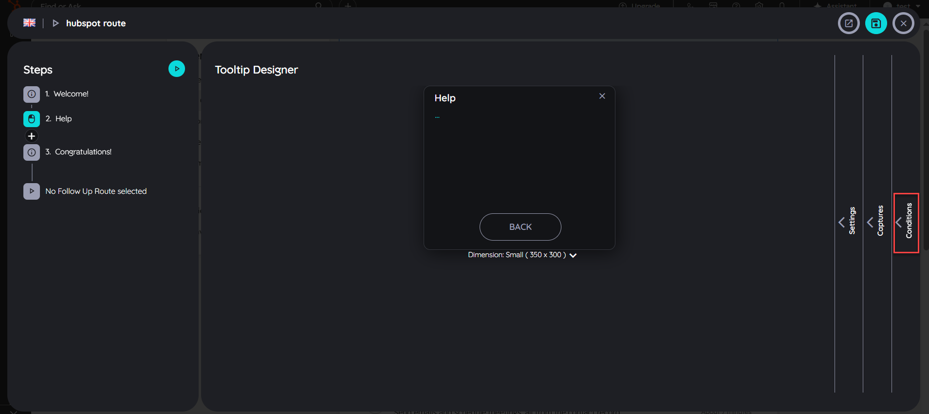
Once the UI Conditions panel opens, click on the Add button to create a new condition.
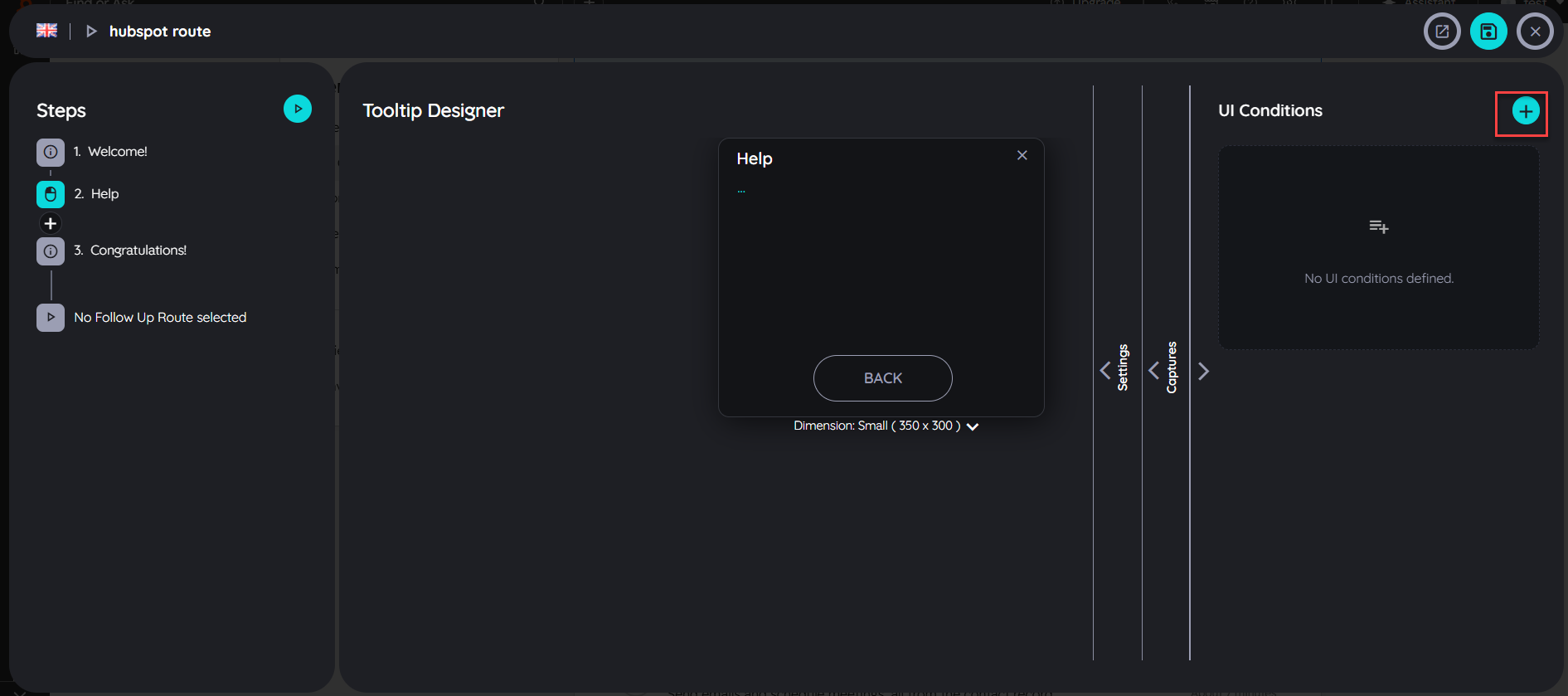
Capture the element where you want to to apply the UI condition. Once the element is captured then you have to select the element state and text.
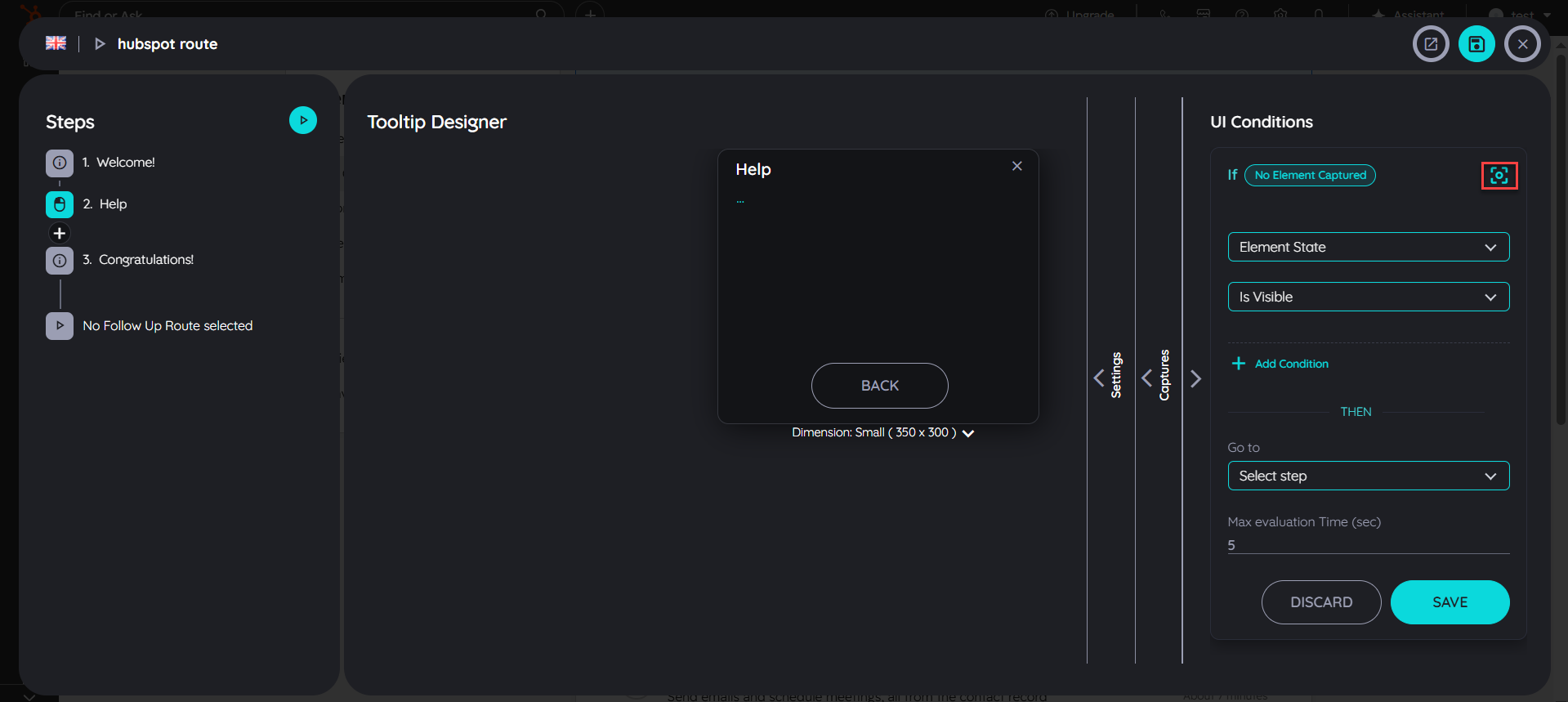
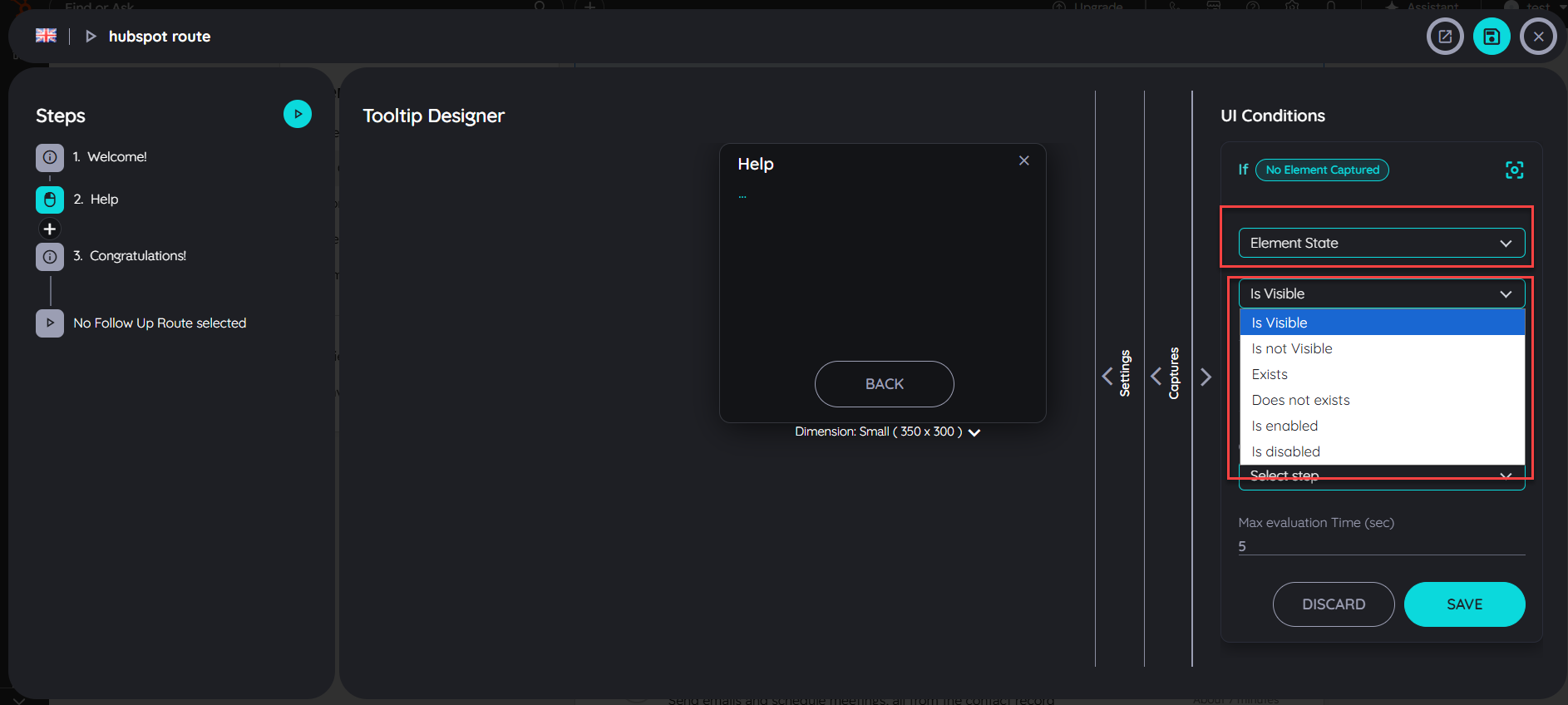
- Element State:
Element State refers to the current status or condition of a UI element at a given moment. It defines how the element is behaving or appearing on the screen.
- Is Visible means the element is displayed on the screen.
- Is Not Visible means the element is not displayed on the screen.
- Exists means the element is available in the DOM.
- Does Not Exist means the element is not available in the DOM.
- Is Enabled means the element (e.g., a button) is active and can be interacted with.
- Is Disabled means the element is inactive and cannot be interacted with.
- Element Text:
Element Text refers to the text content of the selected UI element and checks whether it matches the specified condition.
- Equals means the element text exactly matches the specified value.
- Not Equal means the element text does not exactly match the specified value.
- Contains means the element text includes the specified value.
- Does Not Contain means the element text does not include the specified value.
- Starts With means the element text begins with the specified value.
- Does Not Start With means the element text does not begin with the specified value.
- Ends With means the element text ends with the specified value.
- Does Not End With means the element text does not end with the specified value.
- Is Empty means the element has no text content.
- Is Not Empty means the element contains some text.
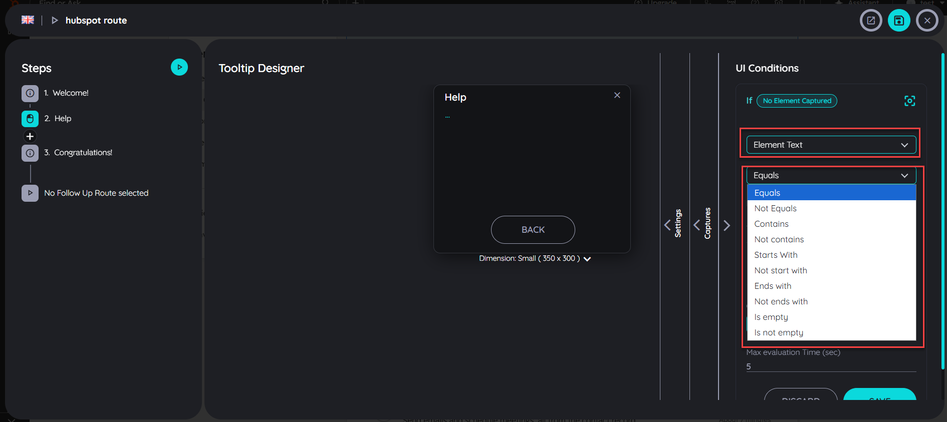
- Element Text Field is used to enter the text value that will be used to validate the condition against the selected UI element.
- Once the condition is met, the user is automatically redirected to the configured step.
- The evaluation time can be configured between 0 to 5 seconds. During this time, the system continuously checks for the defined condition, and once the specified time is reached, the evaluation stops.
- Click on the Save button to successfully save the condition.
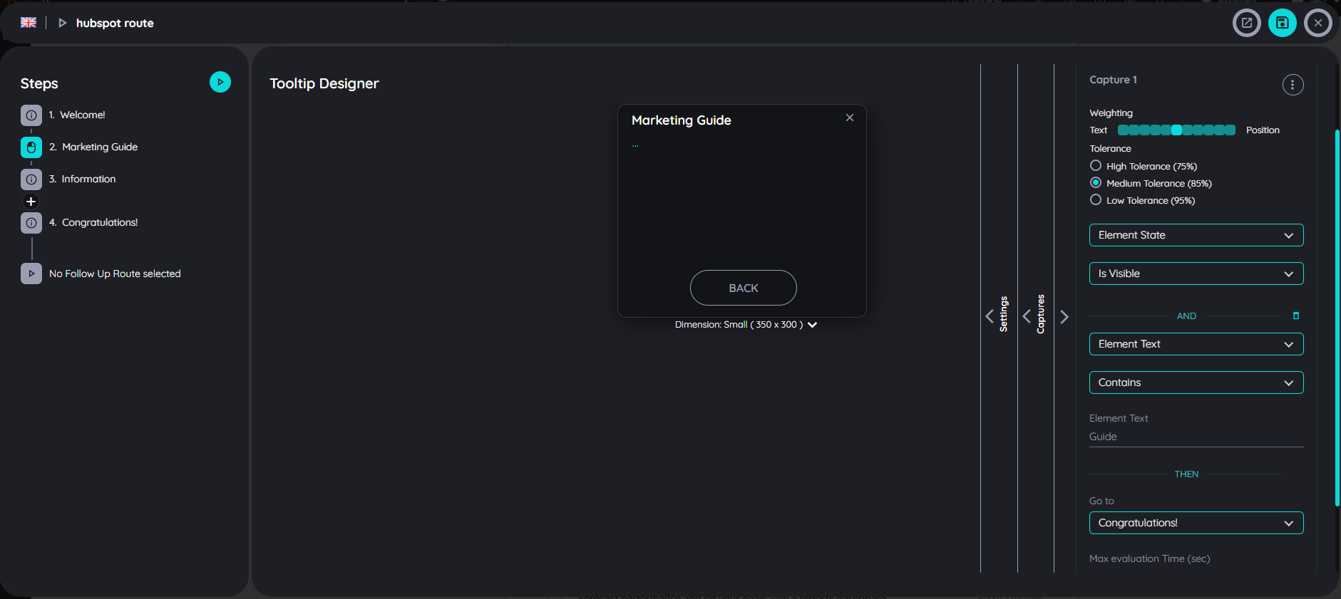
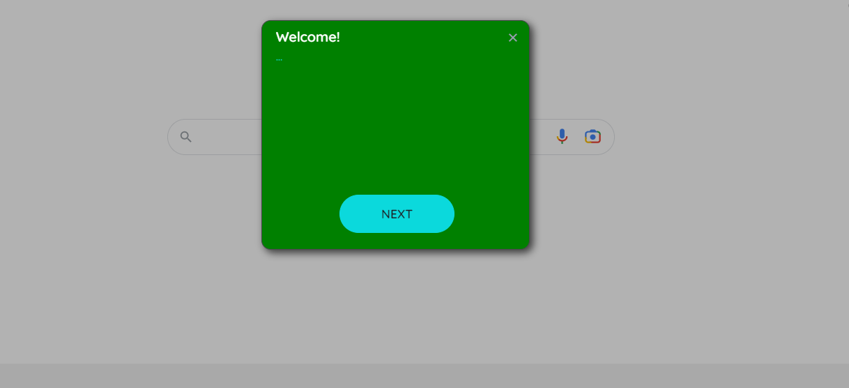
UI Condition Example:
In this example, the UI condition is configured on Step 2 based on the element state and the element text. The condition verifies whether the target element is visible and whether its text contains the expected value.
If the condition evaluates to true, the user is automatically redirected to the Congratulations step, as Step 2 is configured with the rule “On True Condition → Go to Congratulations Step.” This allows the user to skip Step 2 entirely without entering or executing any of its actions.
If the condition evaluates to false, Step 2 is executed normally, and the user continues with the actions defined in that step.
Start routes with URL parameters
AppNavi offers the possibility to start a route directly via URL parameters. This can be helpful if a route is to be started via a link, for example. The user then simply clicks on the link or another object and the route starts. AppNavi offers two parameters for controlling the route behavior via URL:
- anRouteId: This parameter specifies the Id of the route to be started.
- anStepId: This parameter specifies the Id of the step to be started.
The following example shows how a route can be started using the URL parameter.
<a href="https://www.google.com?anRouteId=27bb3723&anStepId=42f3a5c1">Start my route</a>The route to be started must of course be published so that it can be started by an end user.
Segmentation
So that every user only sees what is relevant to him
By using AppNavi you have the option to segment your contents. This can be done while publishing them.
The concept is that for each user who is unsing a target application and hence AppNavi, there will be a set of criteria which is true for this user. When some author on the other side is publishing a route or a news, he can label this piece of content. In case the criteria of the user is matching the labels of the content, the content is shown.
So we have to aspects. First we can setup a segmentation logic which is retrieving the criteria for the user and second we can publish the contents using the set of available labels which we have defined.
Creating a segmentation logic
For example a user is from "Germany", works in the "Finance Department" and within the target application he has the role of "Admin". So for this user three criteria are true: "Germany", "Finance Department", "Admin".
Within the Custom Code module you have the chance to define a JavaScript array which contains all the criteria which should apply for this user. This array can then be passed to the window.appnaviApi.application.setCustomLabels() method. As the creation for this array is done by the help of JavaScript you can define whatever logic you like. This makes AppNavi's segmentaion one of the best in the market.
Typical sources for information about a user are:
- Reading the UI: "When there is a little pencil icon, then it must be an admin"
- Reading a JavaScript variable from the target application
- Getting information from an internal or external API
Doing so you AppNavi knows all labels which are true for this user when the user first visits the target application. To keep this information, the labels will be saved within the browsers localStorage.
Labeling your contents
As an author you can Publish, republish or unpublish a route. By doing so, you can provide a list of labels which characterize this piece of conent. For the labeling you can use all the labels which were made available within the custom code.
When is a content shown or hidden?
At the end a content is shown when one of its labels is matching at least one (or more) criteria of the user. We can distinguish different cases:
- A content does not have any labels: All users can see this content
- A content has a label, but the user's criteria is not matching: Content will remain hidden
- A content has a label and it matches one of the criteria: Content will be shown
- A content has a label and it matches multiple criteria: Content will be shown
Working with connected routes
Add connected routes to a step
Connected routes can be used to connect routes with each other. Within each step the author can integrate possible connections to other existing routes.
End users get the option to select from one or more routes they can jump to. Doing so it is not only possible to connect routes from within the same application – users can also jump to routes within other systems. This allows to provide a set of sub routines which can be combined in an intelligent way.
- Open the respective route in edit mode by hovering the route tile and clicking on the "Edit" icon
- Select any of the steps
- Click in the tooltip text area of this step in the "Details" tab
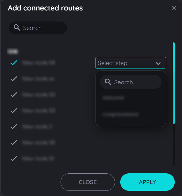
- Now click on the option "Connected routes"
- In the dialog that opens, the available routes are now displayed (grouped into the available apps).
- Select one or more routes. You can recognize the selected routes by the colored "Check" icons.
- Click on "OK" if all appropriate routes are selected - or cancel the process by clicking on the "x" icon.
Open the dialog for connected routes
Select appropriate connected routes
Connected routes are displayed to end users

Sorting order for Connected Routes
The routes can be sorted according to any order using the drag and drop function present in the planner view above. Once the user has added the connected routes in a listing manner then they can drag and drop the connected routes in any order in the planner view and the same order will be displayed to end users once the route has been published.
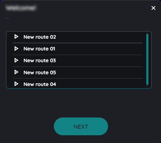
For example the above connected routes added in this dialogue can be saved as New route 01 to New route 05 in ascending or descending order just by dragging the connected route upwards or downwards according to the users requirement of sorting.
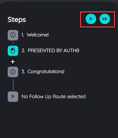
Follow Up Routes
In complex scenarios it is helpful to create sequences of routes which can then be connected. This allows to reduce the number of different routes to a minimum and reuse the overlapping parts multiple times. AppNavi provides the option to connect routes in two different ways:
- Connect routes from within a route via “connected routes”
- Connect them at the end of a route
In case of a follow up route the end users won’t even perceive that they are processing two different routes in a row. End users also do not have to select or choose a follow up route, it will simply start. It is even possible to select routes from different applications so that you can seamlessly connect use cases end to end.
Within the route planner do the following steps to create a follow up route:
- Select the last step of your route
- Click “Settings”
- Select “Follow up route enabled”
- Select the app, route and step you would like to connect
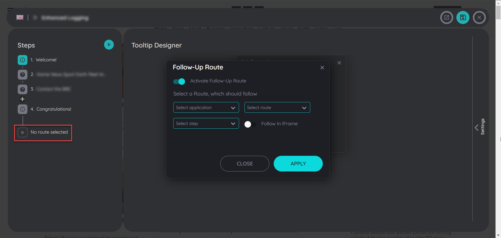
Play Routes in iFrames
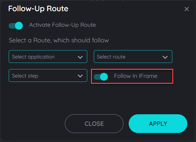
It is now possible to play routes in an iframe, while activating a follow-up route the users can activate the toggle button to follow in Iframe and the avatar can be opened in the iframes as seperate applications which can help users to follow any route in the iframes. The routes can be continued in multiple iframes existing on a single application. It can work as a route being followed from main window to an iframe then the route being followed from an iframe to another iframe and then being continued to a main window and also from an iframe to main window and again to other iframes.
Note: The "Follow in Iframe" option will only be functional if there will be an iframe found for the followup route, if an iframe is not found then the followup route will not be played.
Route Steps
What is Route Steps
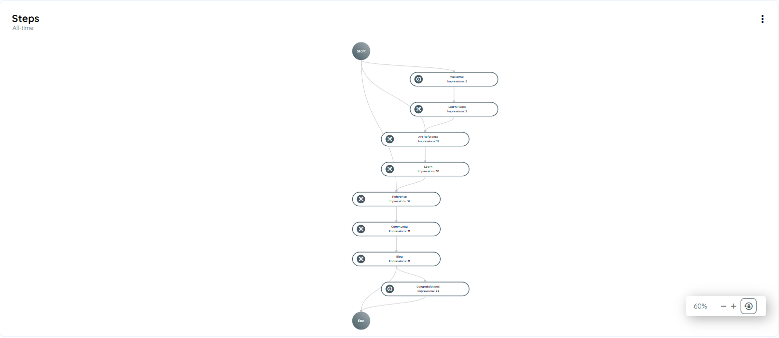
The Route Journey provides a dynamic, visual representation of how users interact with each step in a Route. Unlike traditional linear displays, Route Journey reflects actual user behavior—including custom entry points, repeated steps, and real-time dropouts. It helps you optimize your Routes based on real usage patterns.
How to Access Route Steps
Follow these steps to explore Route Journey in your application:
- Log into the Portal
- Go to the Guidance section from the left navigation menu.
- Click on the Applications tab.
- Select your desired application.
- Click the three-dot menu on the top-right of the application card.
- Select Open Analytics.
- Find the route in the Most Content Used chart or from Interaction Objects.
- Click on the route name to open Route Analytics.
- Scroll to the bottom to find the Route Step Journey chart.
You’ll be taken to the Analytics Dashboard.
What You’ll See in Route Steps
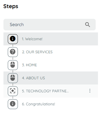
Route Steps Journey provides a visual flow of how users move through the steps of a Route. Simple hover to the step of the route the tooltip will appear and display the following information
Each step shows:
- Step Title: The name of the step (long titles will be truncated).
- Drop-off Rate: How many users leave the route from this step.
- unique Users: Total number of unique users reaching this step.
- Transition Arrows: Shows how users move from one step to another.
- Average Time Spent: Time users spend on this step.
- Search Issue Rate (if applicable): Highlights how often users face search problems on this step.
- Search Duration: How long time spend searching to finding that step.
- Impressions: How many times the step is displayed to users.
- Display Time: How long the step was visible to users.
- Route Type: Shows interaction type, such as:
- Hover
- Left Click
- Right Click
- Enter
- Show
- Edit
These interaction types will appear directly on the step node for easy identification.
Tooltip Details
When you hover over a step, you’ll see a tooltip showing important analytics:
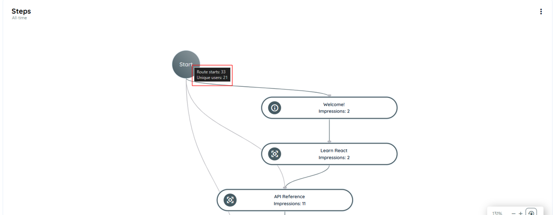
For the Start Node:
- Route Start: how many users start the routes
- Unique Users: Total number of unique users start the routes
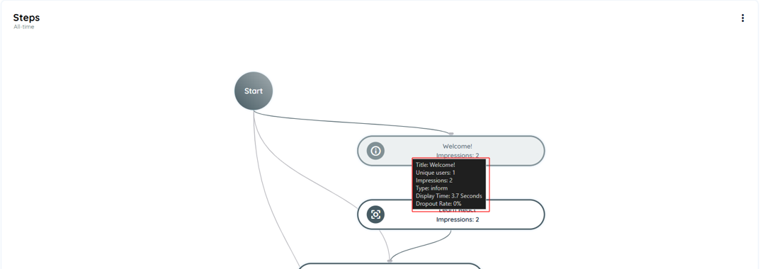
For Welcome Step:
- Title
- Unique Users
- Impressions
- Type: Inform
- Display Time
- Drop-off Rate (%)
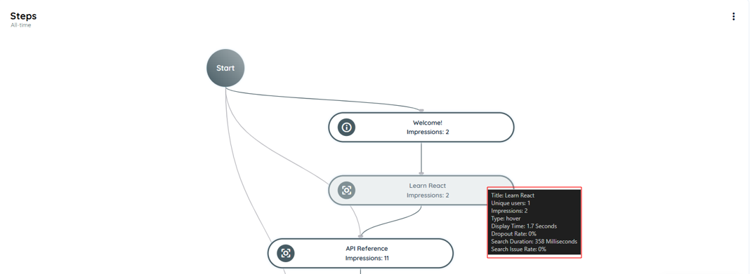
For Regular Steps:
- Title
- Unique Users
- Impressions
- Type: Hover
- Display Time
- Drop-off Rate (%)
- Search Duration
- Search Issue Rate
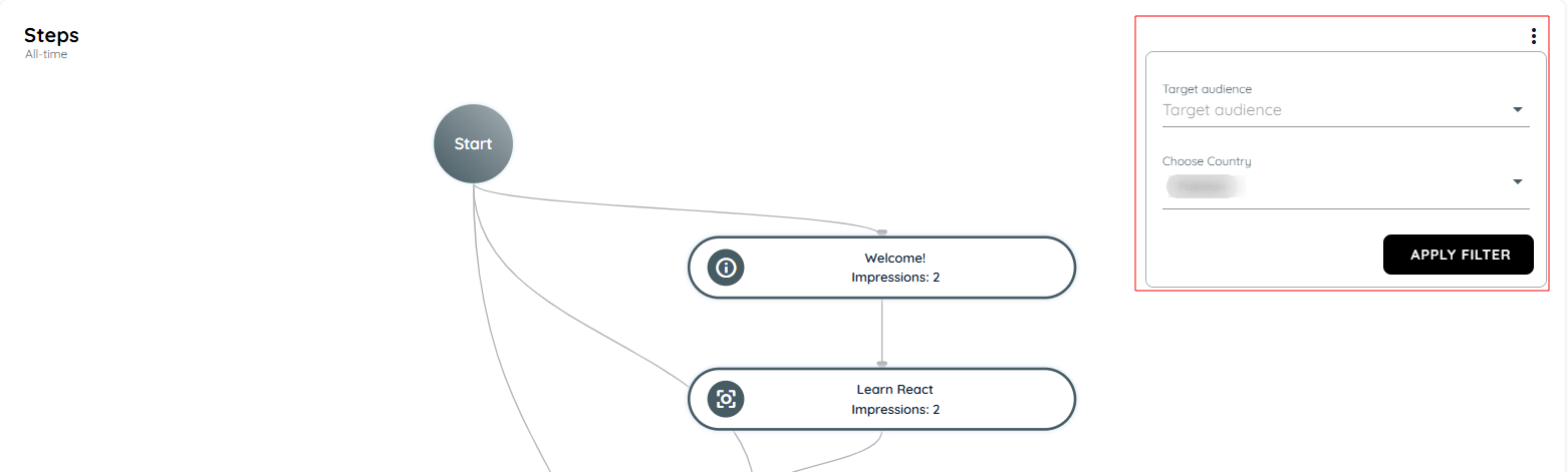
Filter Options
Click on three-dots button on the right side of the Route Step chart
You can filter the data by:
- Country
- Target Audience
Note: By default, the Route Journey displays all data. Applying filters dynamically updates the chart based on selected criteria and the global time range.
Why Use Route Steps?
The Route Journey helps you analyze how users interact with your Routes. It gives you deep insights like:
- Where users start the route
- Which steps they complete
- Where they drop off
- How long they spend on each step
This helps you:
- Improve user onboarding
- Spot confusing steps
- Optimize the route for better engagement
- Understand user behavior without guessing
What Route Steps Journey Helps You Achieve
The goal of the Route Journey is not just to track numbers—it’s to understand behavior.
When you add a Route in AppNavi, you're creating a guided experience. Users follow your steps to learn the application. The Route Journey view lets you see if your guide is working.
If users are dropping off at a certain step, you know where to improve. If a step takes too long, maybe it needs clearer text. If the tooltip isn’t shown, users may miss important information.
This feature helps product teams, trainers, and support teams build smarter onboarding and improve app usability without guessing.
Summary
Route Journey is a powerful feature in AppNavi that helps you understand how users interact with your guided routes inside an application. It visually shows the flow of each user step, highlights where users are dropping off, and helps you identify common patterns, delays, or confusion. This insight allows you to improve user onboarding, reduce friction, and make your guidance more effective.
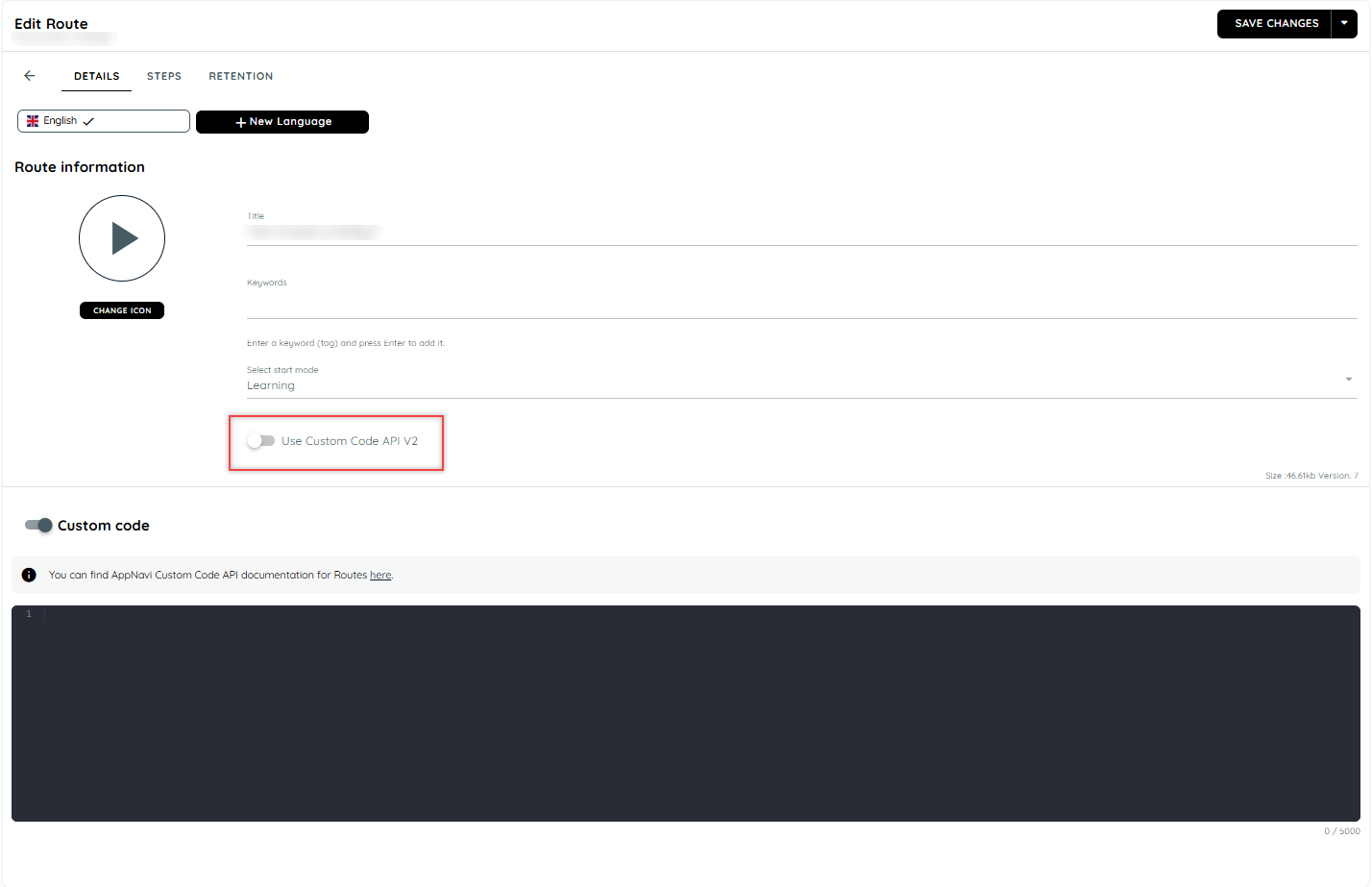
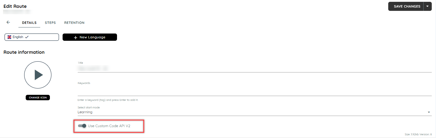
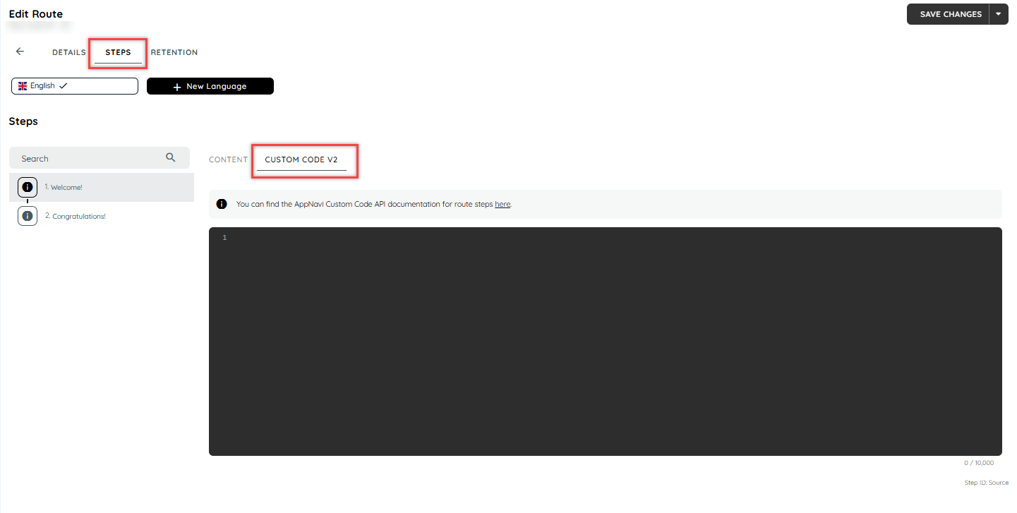
Custom Code on Step Level
AppNavi offers custom code capabilities on the step level as well. The option to use either the Custom Code or the updated Custom Code V2 can be toggled in the route edit, Please note that Custom Code V2 is enabled by default but for old routes custom code is enabled
Advantages of Step Custom Code
Step Custom codes are designed to help businesses or organizations tailor their Steps to their specific needs. They add customization to a particular Step, making it more efficient and effective in achieving desired goals.
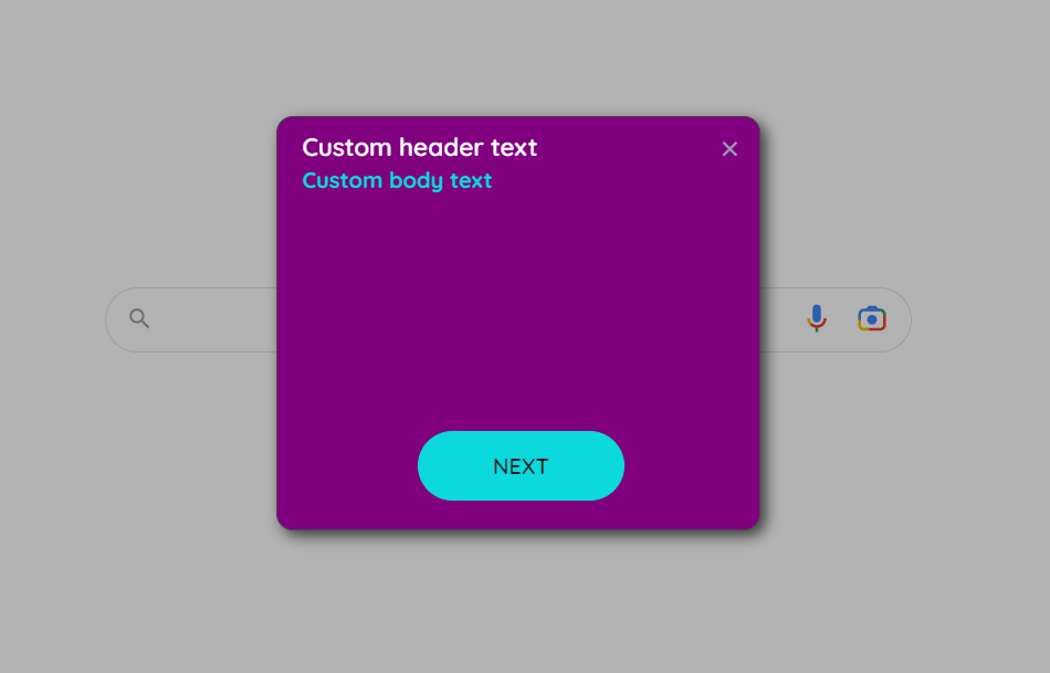
For example, custom code can allow a user to do different things like playing a new route or stopping a route during the render step. During the after-render step, custom code can help a user find an element using the "getCurrentElement" tool. Additionally, with custom code v2, users can also customize the tooltip body, header, text, and hide or show buttons of the tooltip using the "onBeforeRender: event".
Differentiate between custom code and custom code v2
| Feature | Custom Code | Custom Code V2 |
|---|---|---|
| Support | methods only | methods and events |
| Execution time | BeforeRender and AfterRender | BeforeRender |
| Flexibility | Limited | More flexible |
| Notification | No notification system | A clearer way to receive notifications about Step events |
Custom Code
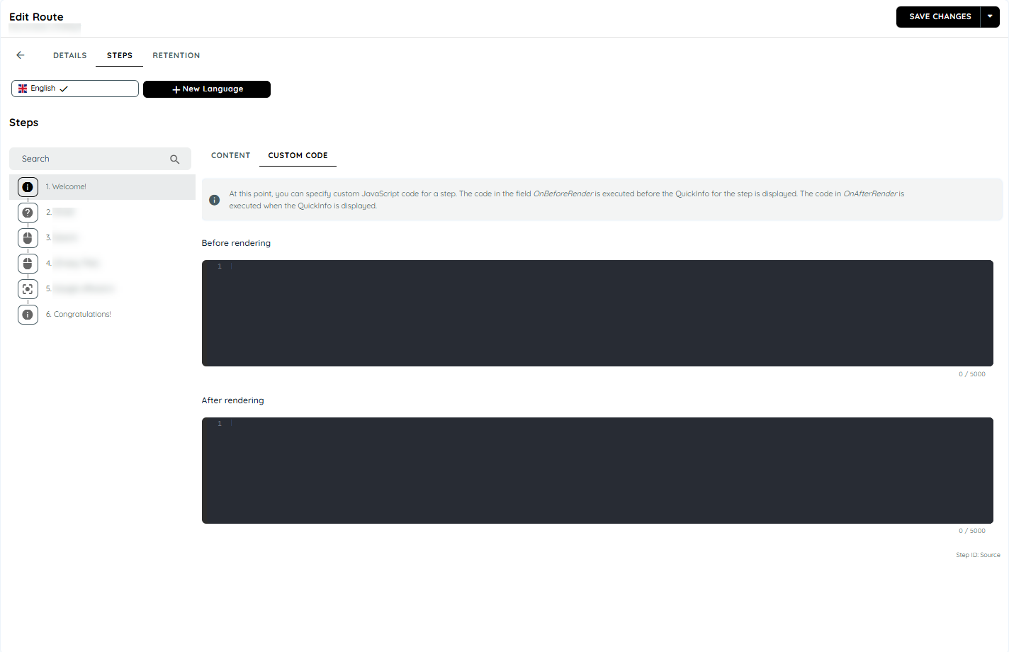
When using custom code, two different events can be assigned code using separate rich code editors: BeforeRender and AfterRender.
- BeforeRender code is executed before the step is rendered, even before the step's search begins.
- AfterRender code is executed after the step has been fully rendered and displayed to the user.
Supported Methods
| Methods | Description |
|---|---|
| skipAutomation :method | This method skips the automation of the current step |
| playStep: method | The play step method can start any step of the current route. |
| stopRoute :method | This method stops the execution of current route. |
| getCurrentElement :method | This method returns the currently found HTML element |
| getTooltipContainer :method | This method returns the current tooltip container dom object |
| getActiveRouteId :method | This method returns the Id of the currently started route |
| getCurrentStepId : method | This method returns the current step id of the currently executed route |
| getStartMode :method | This method returns mode in which the route is executed (learning / automation) |
for more details about Custom Code click here
Switching to Custom Code V2
To switch to Custom Code V2, simply enable the switch, which will allow custom code to be added to every step using the single rich code editor.
Supported Methods
| Methods | Description |
|---|---|
| skipAutomation :method | This method skips the automation of the current step |
| playStep: method | The play step method can start any step of the current route. |
| stopRoute :method | This method stops the execution of current route. |
| getActiveRouteId :method | This method returns the Id of the currently started route |
| getCurrentStepId : method | This method returns the current step id of the currently executed rout |
Supported Events
| Event Name | Description |
|---|---|
| onBeforeSearch | Executed before the search is started. |
| onElementFound | Executed after the element is found. |
| onElementNotFound | Executed after the search is timed out and no element is returned by the search. |
| onBeforeRender | Executed right before the tooltip is rendered and shown to the user. |
| onElementLost | Executed when the element's tracking is lost. |
for more details about Custom Code V2 click here
Custom Code on Route level
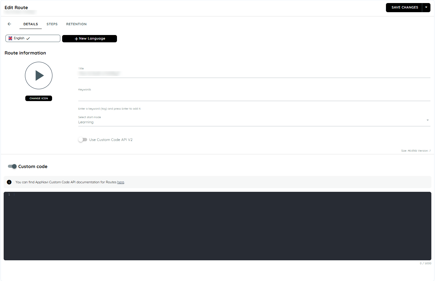
Appnavi supports custom code on the route level also. The code can be executed within the context of the corresponding route initiated and can register for events such as "routeStart", "routeStop", and "playStep , etc". For more details on custom code events refer to the Custom code. However, the custom code feature is only available if it has been enabled at the tenant, application, and route levels. Users with portal access can modify and save custom code for their applications. The maximum size of the custom code should not exceed 5000 characters.
The API methods are made available through the following object: window.appnaviApi.route
Note
- It is important to avoid including sensitive information like passwords or email addresses in the custom code, as it is not protected.
- Non-logged-in users may experience delays of up to one minute in accessing modified code due to caching and user settings
Route Custom Code for client side
On the portal after saving and publishing the route custom code for an application, the guest user can reload the page to experience the impact of modified or saved custom code.
Advantages of Route Custom Code
Custom codes are designed and built to meet the specific needs and requirements of a business or organization. It helps to add customization to the particular route to make it more efficient and effective in achieving the desired goals.
For instance, if a user wishes to modify the tooltip of a specific route of an application. This custom code method getToolTipContainer can be added to a route. This method will help to modify the current tooltip container dom object. A user can add a background color on the tooltip like below
The user can also take advantage of adding custom codes on the specific step of a route. For the details refer to the Step level Custom Code
Skip steps in a route
It often happens that steps in a route are to be skipped if the user has already reached a certain step in a process and starts the route from there. A good example of this is the process for creating a new lead in Salesforce. The process normally runs as follows:
- User clicks on Leads button
- User selects the action "Create new lead"
- The modal dialogue for lead creation opens
However, if the user now starts the route after having already opened the modal dialogue, the route still starts in the first step of the process. This often results in the corresponding UI element not being found. AppNavi provides various API actions for this purpose, which can be used to react to dynamic changes. The problem can be solved in two steps.
1. Searching for a feature to determine route step
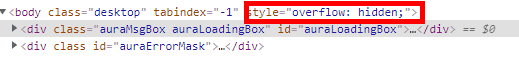
First, you need to check what change you can use in the web page to identify that the user is in a different process step than the one he or she is in. In the case of our lead creation process in Salesforce, we can assume that when the modal dialogue is open, the user is not in the first process step. If a modal dialogue opens, the overflow of the body element changes from none to hidden.
2. Implementing the custom code
Since we want to jump directly from step 1 to step 4 when the modal dialogue is open, we have to implement the custom code in step 1.
The following code must be implemented in the onBeforeRender event hook of the first step. The code checks if a modal dialogue is open and jumps directly to the fourth step if this is the case.
var configuration = {stepId:"2009b561"}
window.appnaviApi.route.playStep(configuration);
Route Flow Continuation
Tips to continue route in main window after its done in the popup window
The problem scenario
Often we have a requirement to make to route continue in the main window after route has finished its steps in the popup window. For example consider the following scenario.
- User clicks a link on the page.
- A popup window opens.
- Route starts to run in the popup window.
- After doing several route steps, user closes the popup window.
- The flow of route will break here since AppNavi won't be able to know when the popup window was closed.
The workaround
We have a workaround that can potentially mitigate the above issue. You can use custom code to detect the closure of the popup window and call the playStep API of the main window. Here are the steps:
- Detect when the popup window closes. You can use either the button click event that closes the window or the beforeunload event of the window.
- Get a reference to the appnaviApi object of the main window. You can use window.opener.appnaviApi.
- Call the playStep method on window.opener.appnaviApi and provide it with the next step ID that should run in the main window.
Sample code
Here is an example of custom code that can be added in the BeforeRender customCode of the step thats the last step done in the popup window.
// Attach beforeunload handler
window.addEventListener('beforeunload', e => {
const opener = window.opener;

// Double check if we got a reference to appnavi object of main window
if (opener && opener.appnaviApi) {

var configuration = { stepId: "1267297d"};

// Continue the route in main window
opener.appnaviApi.route.playStep(configuration);
}
});
Route Tags
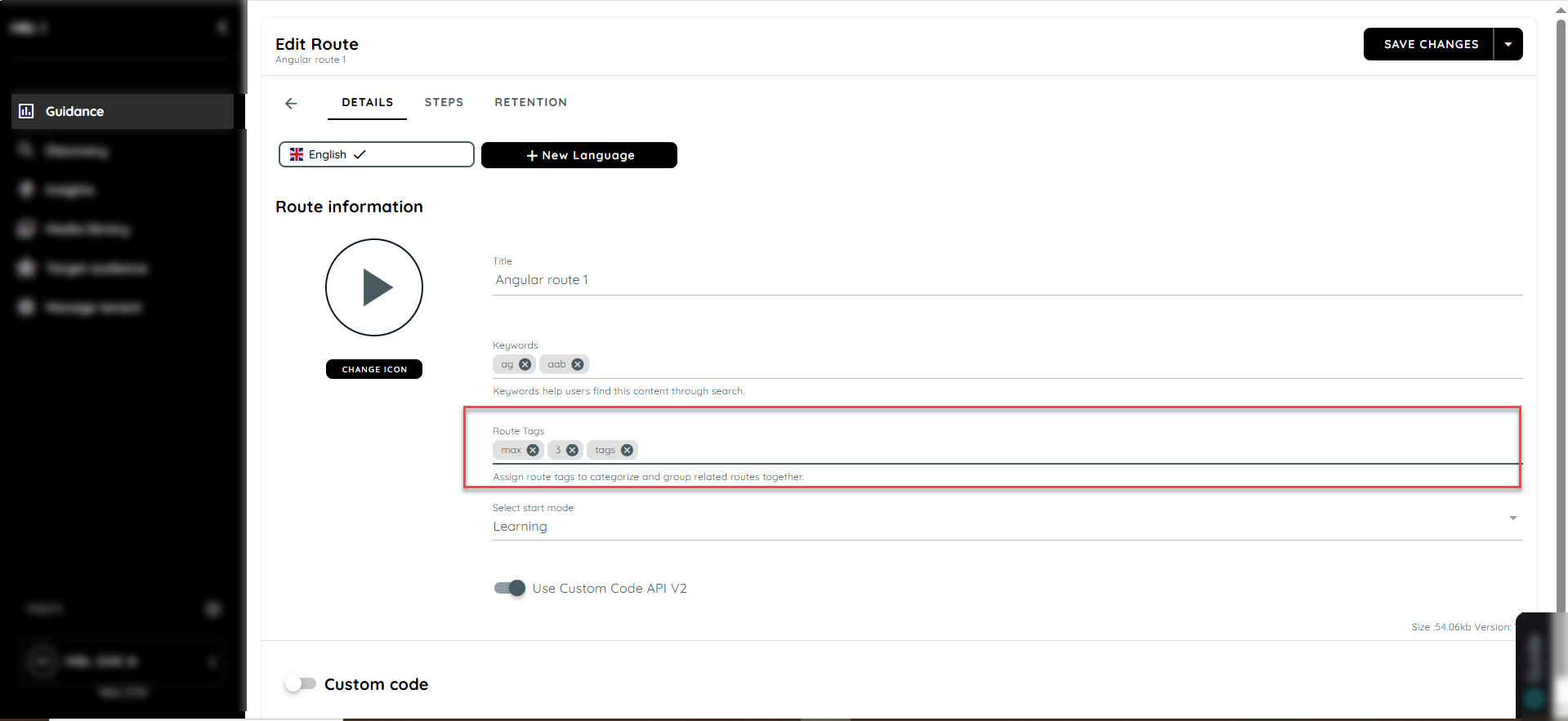
The Route Tags feature improves the organization and filtering of Routes within a workspace by allowing Route Authors and Administrators to assign up to three optional tags to each Route. These tags help group related Routes. Users can then easily filter and find relevant Routes through the Avatar interface for faster access to guidance. This enhancement improves navigation, workspace management, and the overall user experience.
Workspace-Scoped Tag
Tags are managed at the Workspace level and function as a shared suggestion pool across all Routes within the same workspace.
When a user creates a new tag on any Route, that tag is automatically added to the workspace’s tag vocabulary. This allows the same tag to appear as an autocomplete suggestion when creating or editing other Routes in that workspace.
This approach helps maintain tagging consistency, reduces duplicate or similar tag creation, and improves the overall user experience during Route management.
Each Route can have a minimum of 0 tags and a maximum of 3 tags. Tags are optional, allowing Route Authors and Administrators the flexibility to add relevant classifications only when needed.
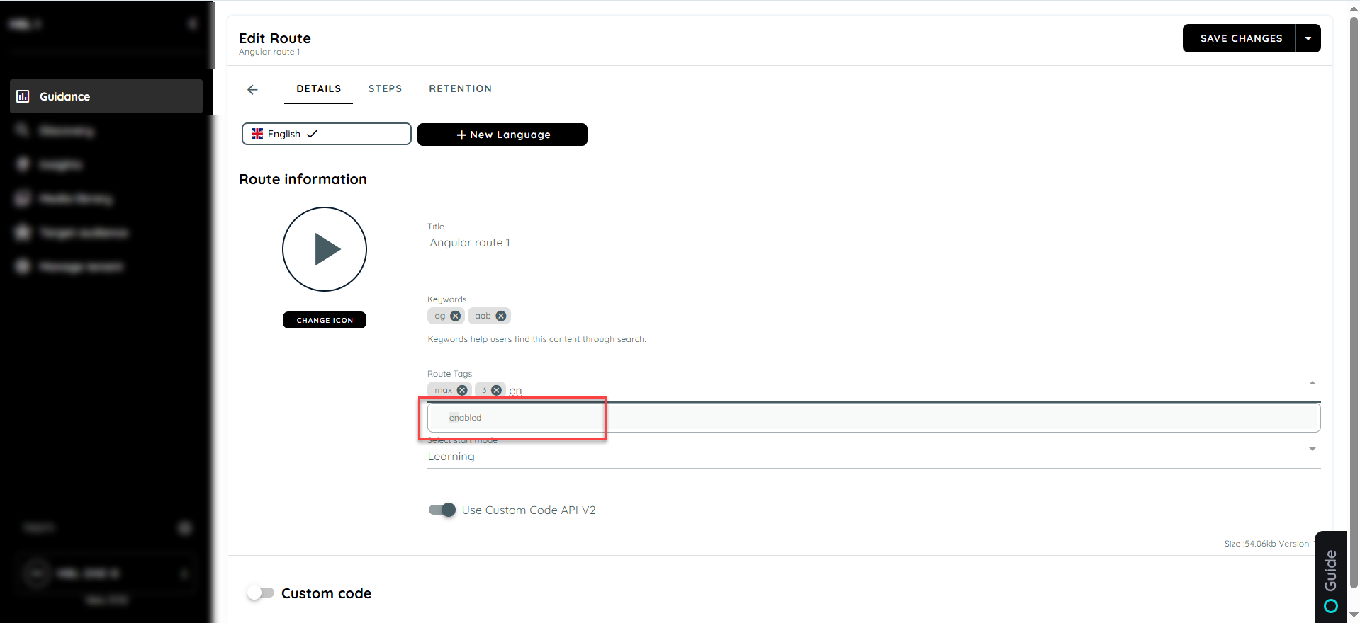
Tag Suggestions (Autocomplete)
While editing a Route:
- When the user starts typing a tag name, the system should display autocomplete suggestions.
- These suggestions should come from existing tags already used within the same workspace.
Example:
If the tag “Onboarding” is already used in Workspace A, it should automatically appear as a suggestion when editing another Route in Workspace A.
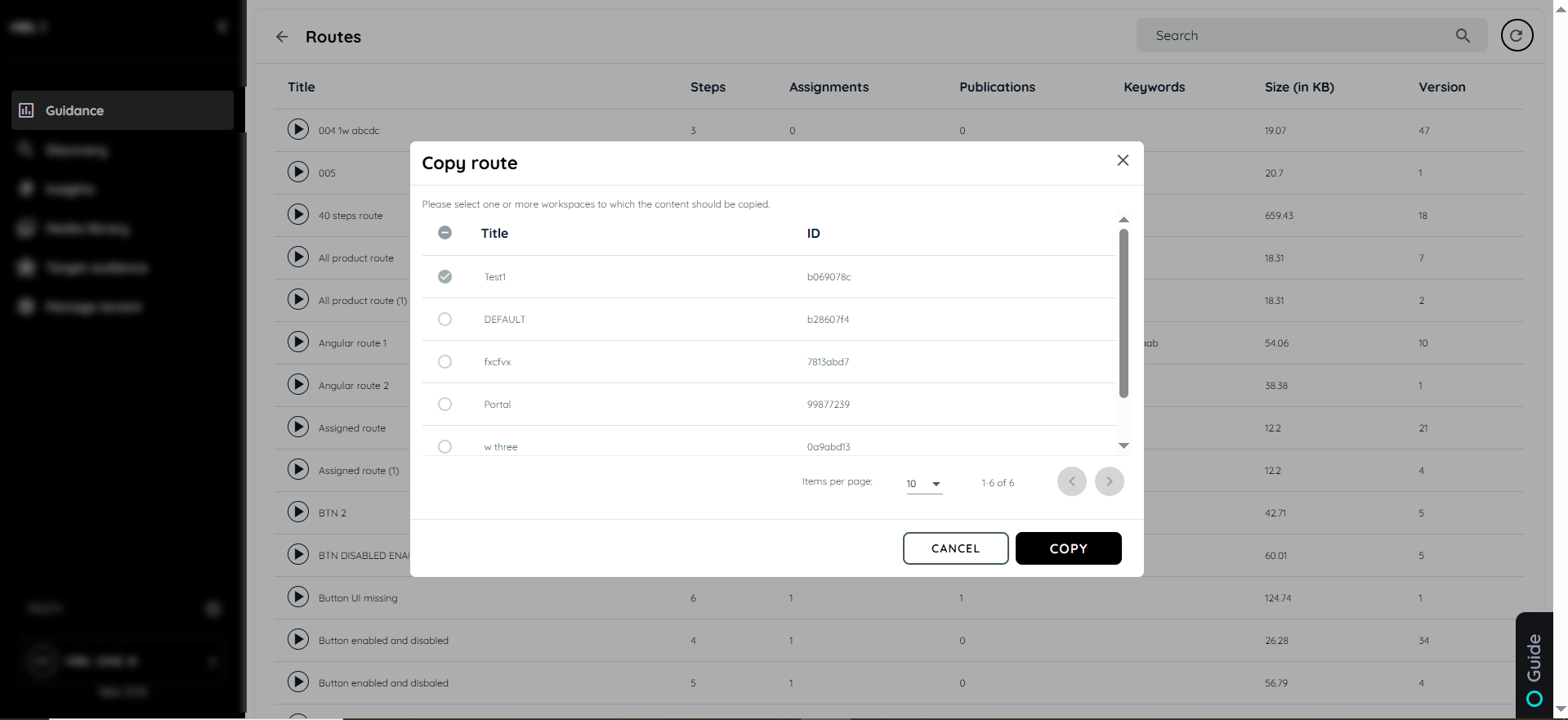
Copy Route to Another Workspace
When a Route is copied from one workspace to another, all existing tags associated with that Route must be retained during the copy process. If any of these tags do not already exist in the target workspace, they should be automatically added to the target workspace’s tag vocabulary.
This ensures consistency in Route categorization across workspaces and allows the same tags to be available as autocomplete suggestions for future Route creation and editing within the target workspace.
Avatar Filtering for Route Tags
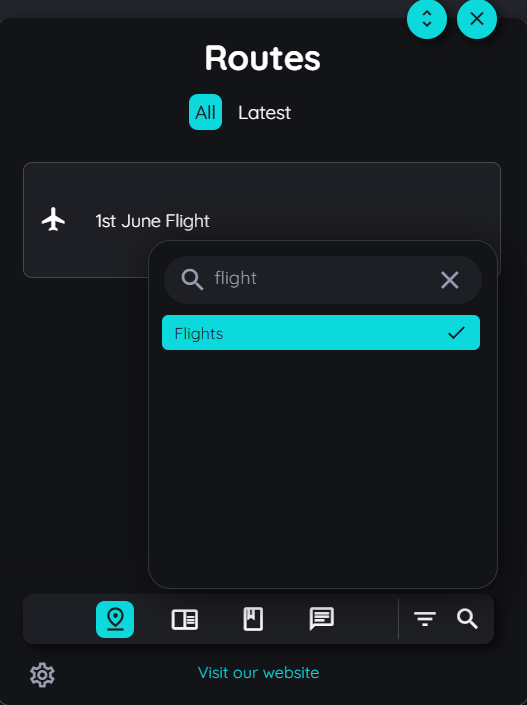
A new filtering option will be introduced in the Avatar UI to help users quickly locate relevant Routes based on assigned tags. A Filter icon will be displayed next to the existing Search icon, and this filter functionality will apply only to Routes within the Avatar interface.
By default, when no filter is selected, all available Routes will be displayed as usual. When a user selects a specific tag from the filter options, the system will display only those Routes that contain the selected tag. If the user clears the selected filter, the system will reset and display all Routes again.
Step Issues
The challenge for our search modes is to find elements within the target application which were captured today also in the future. Between today and the future things can change:
- Not you, but another user with a slightly different UI is using your system
- There were Updates in your system which changed the UI
- Your users are using different languages
Beside those cases, there are evern more - but still the element detection should work. So we have provided a bunch of settings which allow you to ensure that each element is found correctly.
Element was not found at all
In case the next step cannot be found, we need to answer two questions:
- Are we searching for the correct step?
- Is the correct step present in the page?
If both questions can be answered with "Yes", you can proceed with the following options. If you have now idea if you are searching for the correct step, you could Test Step before. If the step is found then, you are probably stuck in the previous step. So you might think that you are searching for the respective step, but in fact you are searching for the last one. In thise case the route did not recognize that it should have proceed after the last click. If this is the case you can Check Event Binding for one working event binding option.
If both questions above are answered with "Yes", then you could proceed with the following options. First we would recommend you to Recapture or add additional Capture. In any time this will do the trick.
If not you can Refine Properties or Change Search Mode. As last option you can Increase route reliability.
Element is sometimes not found
In case a step is found sometimes and sometimes not, it is very likely that the issue is related to the properties of the step's nodes. In this case you can Recapture or add additional Capture
Clicking "Next" in the tooltip is hiding something in your target application
Sometimes a click "somewhere" in the application will close some menu or some other element. If this is the case, also the click on "Next" inside our tooltip could trigger such an event. To prevent this you can Prevent PointerDown Event.
Next step is not reached
If you for instance click on a button or link within your application and AppNavi is not proceeding to the next step, you might need to Check Event Binding
Your target application navigates into nirvana
There can be a scenario in which you are starting a route (or clicking through a route) and at a certain step your target application is redirecting you to a random page. This page could be either some wrong page or some error page in the sense "this page does not exist".
In both cases there was a redirect triggered by the next step within your route.
Why? Reason for that is a feature called "prevent redirect". This feature can be switched "on" and "off". Depending on this feature, the users current URL is compared with the URL AppNavi assumes to be the correct one. This assumption is a combination of the target application's URL (defined in the profile of the application) togehter with the "relative path" of the respective step.
In case the "prevent redirect" is "on" there won't be any comparison. In case it is "off" and a difference is recognized, AppNavi will redirect the user to the combined URL.
Ideally this combined URL is exactly the correct URL where you want the user to be redirected. In case either the apps URL is not correct or the relative path does not match, you will be redirected to a wrong place.
In this case simply go inside the route planner and set the Prevent Redirect for this step to "on".
Your target application is looping
It might be useful to clear the browser cache and then do the resolution mentioned above.
Issue with Button Click in the Final "Click Type" Step of the Route:
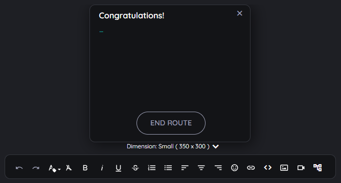
Occasionally, the action associated with a button or link captured in the final click step may not execute. This can arise when there's a rapid transition from the last click step to the route's final step. If an overlay obstructs the clicked element during this transition, the browser might interpret the element as being overlapped, leading it to disregard the click.
To mitigate this issue, consider the following solutions:
-
Bypass the Overlay: Add the following code to the "Congratulations" step. This ensures users can click through the overlay, preventing the browser from assuming the button is obstructed.
document.querySelectorAll(".an-overlay-tile").forEach(e => e.style.pointerEvents = "none");
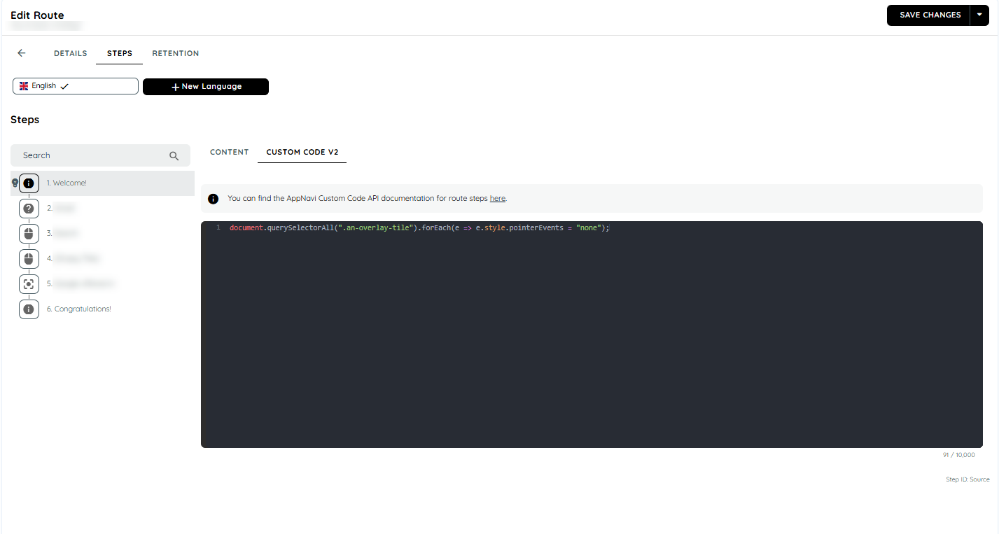
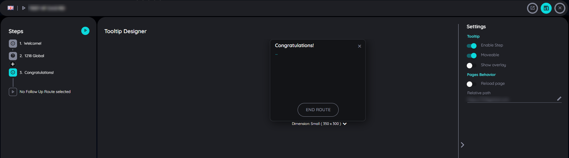
- Disable the Overlay: If the first method doesn't yield results, turn off the overlay for the "Congratulations" step using the Route Planner.
Pins
Pins allow you to highlight specific elements within an application and provide users with helpful actions such as starting a route, showing announcements, or displaying hints. This guide explains how to create, edit, and manage Pins in AppNavi.
Pins creation
Once you have successfully logged in, your initials will appear in the thumbnail of the menu and you will be able to use authoring functions such as adding Pins ("+" icon).
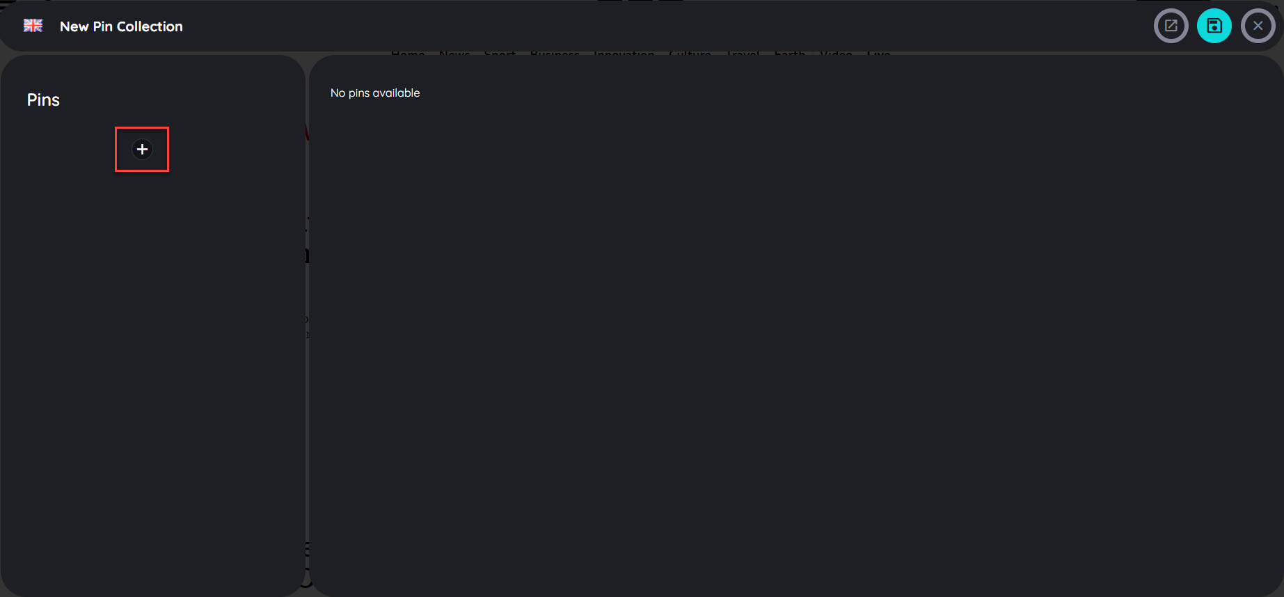
Pins are part of a Pins set. The Pins set can consist of any number of Pins within an application.
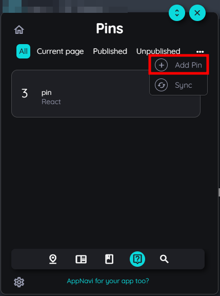
- After you are logged in click on the "Pins" icon in the AppNavi menu bar.
- Now click on the "+" icon to initiate the Pins planner.
Note:
The Pins icon in the AppNavi menu bar only appears while you are logged in as an author in AppNavi. This allows you to create and manage Pins. Users (they cannot log in) will see the Pins directly in the application, but not in the AppNavi menu.
In case you cannot see the Pins icon although you are logged in, you need to activate this feature first in the app within the customer portal.
Pins properties
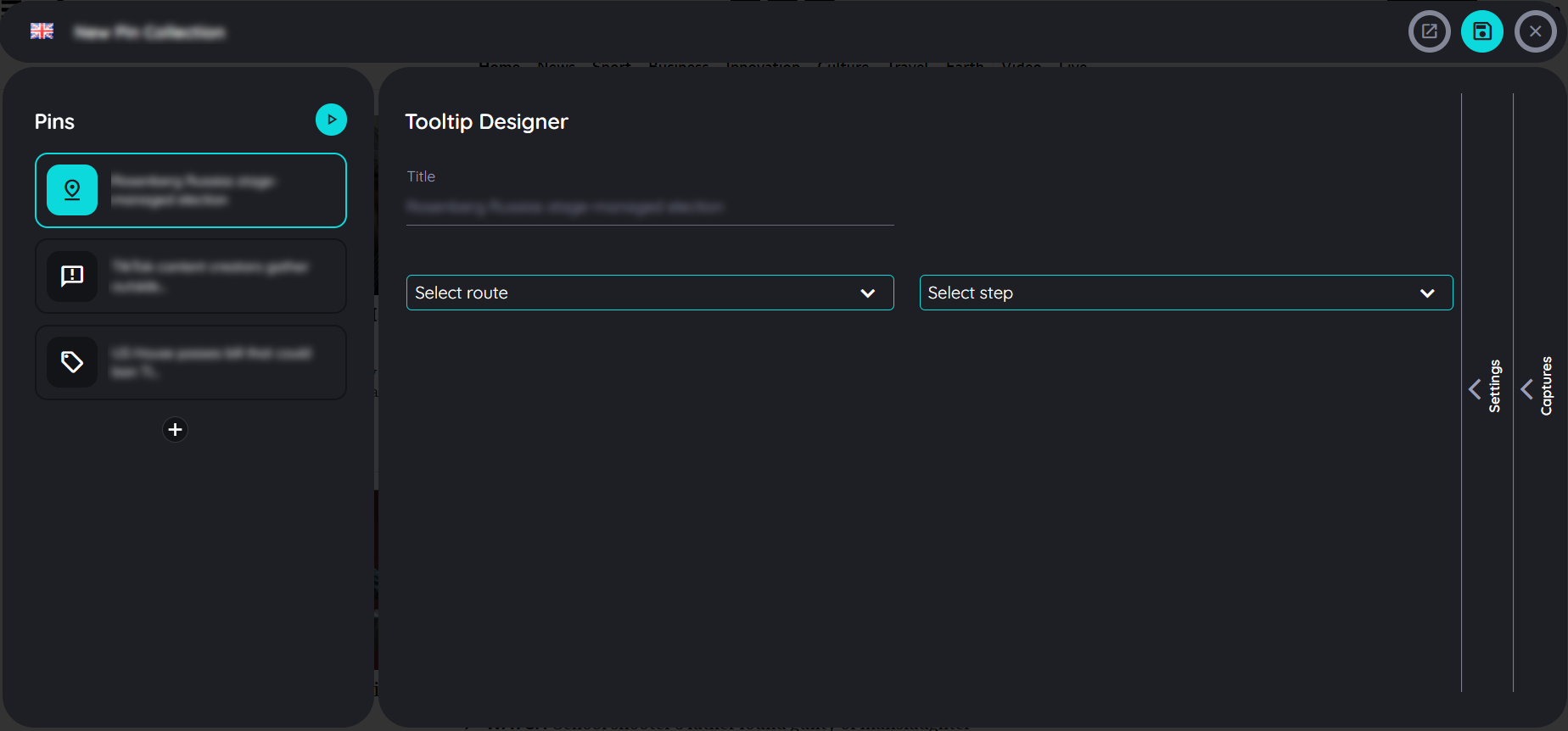
The Pins planner consists of 3 sections:
- General:
Information about the Pins set such as the language of the Pins set and title. - Pins:
List of all Pins that belong to a Pins set. - Details:
To edit the selected Pins in terms of headlines, texts, images, videos, links and iframes - as well as detailed settings on Pins level such as search.
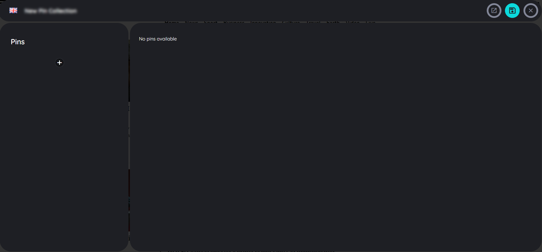
Now fill in the Pins set properties:
- Language:
Select the language in which you want to capture the Pins in that Pins set (in a later step you can translate the texts into any other language). The languages can only be added from the portal. - Title
Give the Pins set a very short, meaningful title. This title will appear in the Pins menu beside the respective Pins set.
The Pins menu now displays the Pins sets that have been created. The number of Pins per Pins set is displayed - as well as the options for editing and deleting a Pins set.
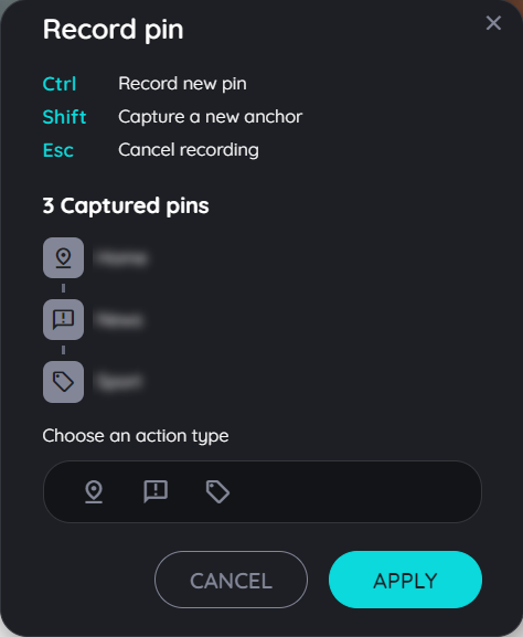
Initiate the Pins recorder
If you want to add Pins to your Pins set, you have to initiate the Pins recorder:
- Click on the "+" icon in the Pins menu.
- Click on the "+" icon in the "Pins" section of the Pins planner.
Now the Pins recorder will open in your application. Using the Pins recorder is analogous to using the step recorder in the route planner.
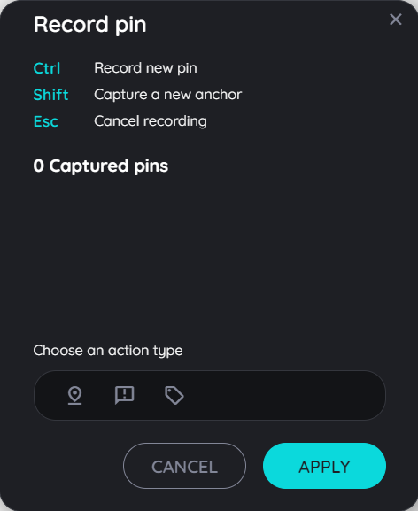
Select the appropriate type in the Pins recorder
You can drag-and-drop the Pins recorder to any place in your application so that it does not interfere with the capturing of your Pins.
Select any Pins (action) type from the menu by clicking on the appropriate Pins type icon.
- Start route:
Use this option if you want the user to be able to start a route at this point. - Display announcement:
Use this option if you want the user to see an announcement at this point. - Display hint:
Use this option if you want the user to see a hint at this point.
Capture Pins
"Capture a Pin" means, that the relevant element to which a Pins refers, is precisely captured. The intelligent AppNavi algorithm ensures that the element is still found even if the properties of an element change (e.g. search field is no longer at the top left but at the top right). The maintenance of the pin is thus reduced to an absolute minimum.
The capture element can be done in two ways: by pressing the CTRL key (default behavior) or by pressing the SHIFT key. The CTRL option directly captures elements without allowing you to fine-tune the captured path. With the SHIFT key, you can fine-tune the captured path as you get a detailed path which you can select from.
Capture with CTRL :
- Select the Pins type in the Pins recorder.
- Move your mouse over the application to the element you want to capture.
- As soon as a sea-color frame appears around the desired element, capture the element by pressing the CTRL key.
- The recorded element now appears directly in the Pins recorder. Assign a meaningful title to this element directly to simplify editing in the planner.
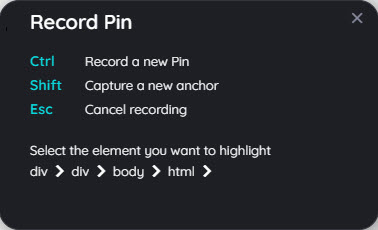
Capture with SHIFT :
- Select the step type in the Pins recorder.
- Move your mouse over the application to the element you want to capture.
- As soon as a sea-color frame appears around the desired element, capture the element by pressing the SHIFT key.
- A dialog appears with the different elements of the selected area: select any element which you want to capture (see image below).
- click on img tag to capture an img element only - or
- click on div tag to capture specific division of that element - or
- click body to select whole page - or
- click html to select whole html of that specific page.
- The captured element now appears directly in the Pins recorder. Assign a meaningful title to this element directly to simplify editing in the planner.
Cancel Pins capturing
You can cancel the creation or modification of a Pin at any time. The changes or additions made will then not be saved.
- Initiate the Pins recorder as described above.
- Select a Pins type.
- Move your mouse to the element of your application you want to capture.
- A sea-color border appears. If you want to cancel the capturing press the ESC key.
- AppNavi returns to the Pins recorder without capturing the element.
Adding more steps and editing
There are numerous ways to customize a Pins set: Pins can be tested, deleted or changed in sequence in the Pins planner. The step recorder just allows to delete the recorded Pins.
Edit in Pins recorder
- Click with the right mouse button on the desired Pins in the Pins recorder.
- Select the option "Delete" to delete the captured Pins.
Edit in Pins planner
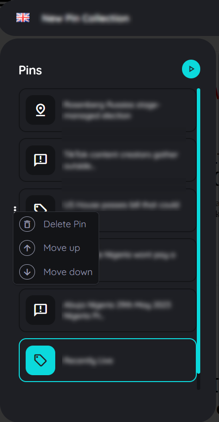
- Click with the right mouse button on the desired Pins in the "Pins" section of the Pins planner.
- Select one of the options that appear - or just edit the Pins in the "Details" section.
Pins options
- Test Pins
All Pins of a Pin set will be tested. - Delete Pins
The Pins can be deleted. Please note that the Pins are deleted directly after selecting the delete option without a confirmation prompt. - Move up
To change the order of the Pins the selected step can be moved upwards. - Move down
To change the order of the Pins the selected step can be moved downwards.
Add a step in the Pins planner
- Click on the "+" icon in the "Pins" section of the Pins planner.
- When the Pins recorder appears, capture Pins as described above.
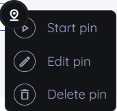
Editing a Pins right in the application
Besides the possibility to change a Pins in the Pins Planner, Pins can also be changed directly in the application.
- Click with the left mouse button on the Pins you want to change.
- Choose one of the options in the dialog that appears.
The following options are available here:
- Start Pin: The Pins are executed immediately (start route, display hint or announcement).
- Edit Pin: The Pins planner opens and the Pins to be edited are selected.
- Delete Pin: A security question appears asking if the Pins should really be deleted. The deletion can be confirmed with "OK" or canceled with "Cancel".
Note:
These options are displayed only to logged-in authors. If an end user clicks on a Pin, the corresponding action is executed immediately.
Save or discard Pins
As soon as you have captured a Pin with the Pins recorder, it appears in the Pins recorder. With the option "Apply" you can take over the captured Pins. The Pins planner appears and shows these Pins. If you want to discard the captured Pins, click on the "Cancel" button.
Configure "Start a route" Pins
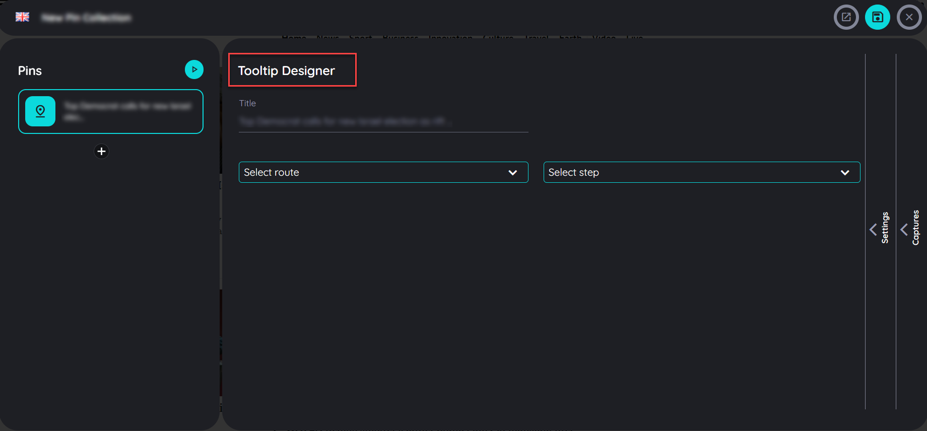
In the "Details" section of a Pins there are 2 tabs: Content (default) and Settings. While the "Content" tab is intended for the basic definition of a Pins, further, more detailed settings can be made in the "Settings" tab.
Content
- Title: Give the Pins a meaningful title.
- Select route: Select the available route that a user will take through when clicking these Pins.
- Select step: Select the step, where the route should start when a user clicks on that Pin.
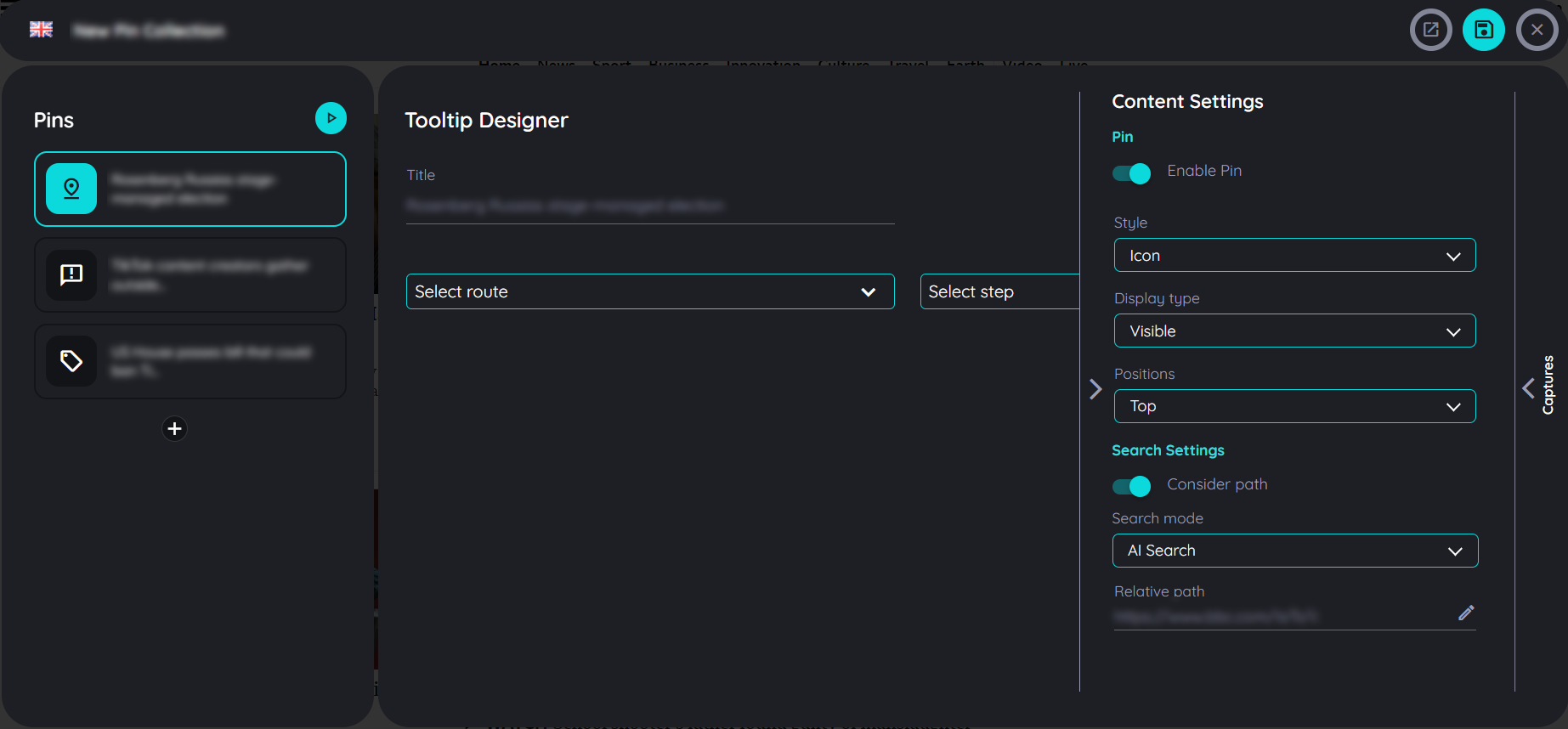
Content Settings
- Style: There are two Styles available "Icon" (default) and "Frame". Icon as the name suggests shows only the icon on top of captured element while Frame lets you highlight the captured element with a sea-color border.
- Display Type: This setting defines the visibility of pin in page. There are three types "Visible" (default), "Invisible" and "Hover". Visible always shows pin on the page. Invisible type hides the pin from the page (it will trigger the custom code events, but it will not start and track user interactions like starting a route when clicking). Lastly "Hover" the pin is only visible if we hover the captured element.
- Positions: define where the Pins should appear "Top", "Bottom", "Left", "Right".
Search Settings
- Consider path: This setting defines if the URL of the page will be considered or not. So in case the current URL does not match with the one when the Pins were captured, the Pins won't be shown.
- Search mode: "Ai Search" (default), "Fuzzy Search"
- Relative Path: Define the precise URL path for this step.
For more details of search, click here AppNavi Element Search
A Pin can be tested by clicking on "Test Pins". As soon as all settings are c
orrectly defined, the Pins can be saved by clicking on the "Disk" icon or canceled by the "x" icon (close).
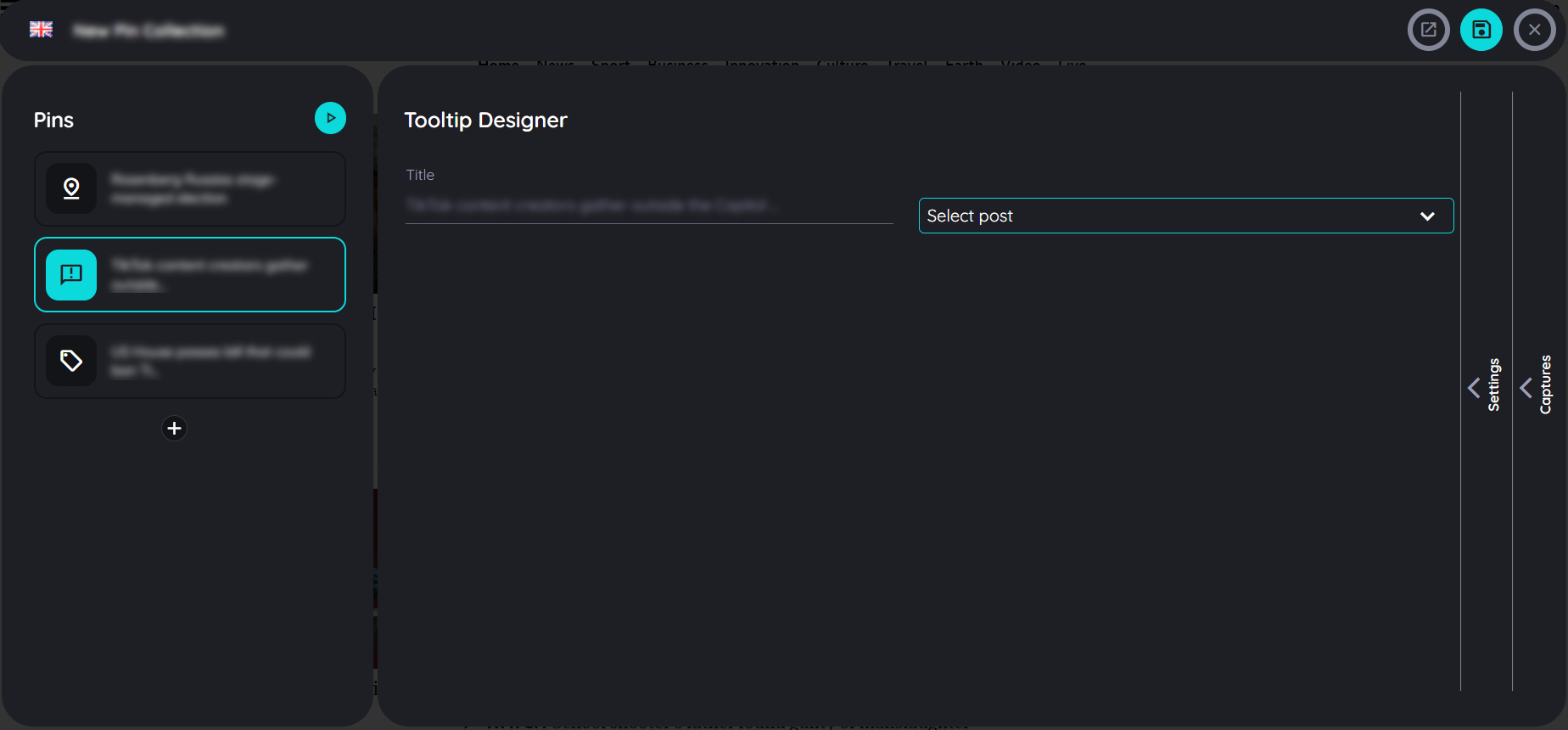
Configure "Display announcement" Pins
Content
- Title: Give the Pins a meaningful title.
- Select Post: Select the available news that a user will see as an announcement.
The settings correspond to the settings for the Pins type "Start route".
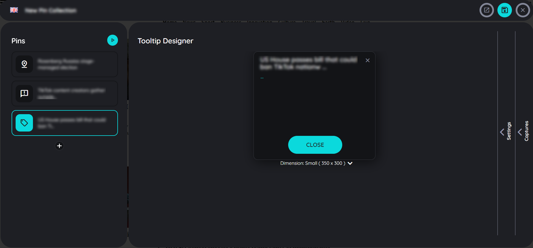
Configure "Display hint" Pins
Content
The creation of the tooltip for the Pins type "Display hint" is identical to the design of tooltips within the route creation. Create a route
The settings correspond for the most part to the settings for the Pins type "Start route".
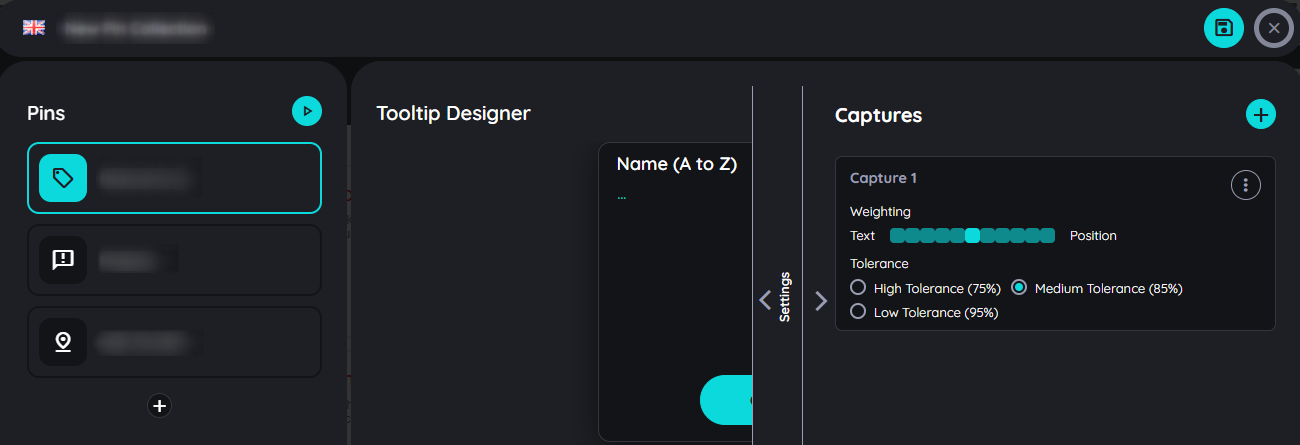
Captures Settings
Captures are a simple way to specify alternative display elements for a pin. If the main element captured for a pin is not found, the AppNavi algorithm searches for an alternative element. This mechanism is ideal for pages with responsive design, where the arrangement of elements changes with screen resolution. With AppNavi Pin Captures, the same pin can work across different designs on a page.
How Pin Captures Work
Follow these steps to manage captures for pins:
- In Pins Planner, select the pin you want to configure.
- Under the Details section, click on Search.
- Scroll down to find the section named Captures.
- Here you will see the main captured element for the pin along with three options:
- Add Capture (plus icon)
- Test & Train Capture
- Record Again (camera icon)
Add Captures
Click Add Capture (plus icon) to add an optional capture to the existing captured element. If the primary element is not found, AppNavi will move to the newly added capture element.
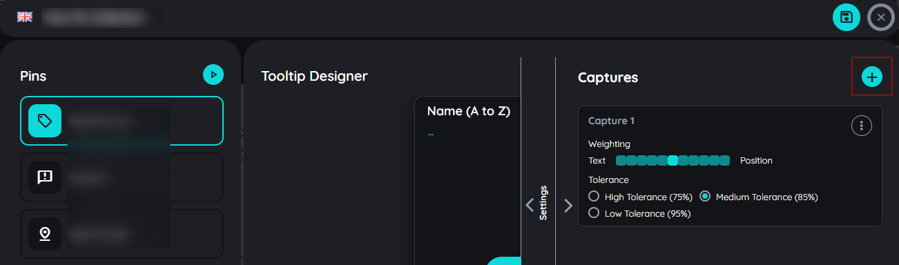
Responsive pages often adapt their structure based on screen size, causing elements to shift or disappear. In such cases, the same pin can still function by adding additional captures. AppNavi searches through the list of captures one by one until the correct element is found.
To learn about Deviation and Weighting, click here: Deviation and Weighting
Record Again
Recording the same element helps improve the identification mechanism for dynamic pages.
Case 1: If the wrong element was captured, use Record Again to overwrite it with a new element.
Case 2: If the page structure changes (dynamic content), Record Again allows you to re-capture the element without losing the pin details. The AppNavi Engine automatically adjusts attributes for both old and new elements. Check updates in the Element Properties window.
To learn more about Test and Retrain Capture, click here: Test and Retrain
Delete Capture
If there are more than one capture, user has an option to delete any capture which is no longer required.
Test Pins
After the Pins set has been created completely or partially, it can be tested before or after saving. The test can be performed on the entire Pins set - or only on the selected Pins.
Test Pins set:
"Test Pins set" can be initiated with the "Play" icon in the "Pins" section of the Pins planner. After the test is initiated, a window displays the test results.
Test results for the entire Pins set
Test a single Pins:
Select the desired Pins in the Pins planner, section "Pins" and click on "Test Pins". After the test is initiated, a window displays the test results.
Save or discard Pins set
Once all or part of the Pins set has been created, it can be saved. By saving, the Pins set becomes visible and modifiable for other authors of the same subscription. For end users, the Pins set becomes visible only after publishing.
- You can save Pins set by clicking on the "Upload" icon in the upper right corner of the route planner.
- If you want to cancel the Pins set creation or discard the changes, you can click on the "x" icon.
- If you want to open the pins on the portal then you can click on the context menu.
- A confirmation popup will appear asking to save or discard changes
- On selecting "Save" it will save the whole content.
- On selecting "Discard" it will discard all changes and will not save them.

Now it is a good time to publish your Pins set. The procedure is largely analogous to the publication, republication or un publication of a route.
Publish, republish or unpublish a route
Increase Pins Reliability
In SAP and other dynamic applications, elements can move to a different position after a page refresh. If a Pin becomes unreliable, retrain the capture and move the weightage slider towards Text. This helps AppNavi identify the element based more on its text than its position, which improves reliability when the element stays within the same parent container but changes position. For more information, please check AI Search
Collections
Collections in AppNavi are designed to group multiple routes into organised sets, making it easier for users to find and execute related processes. This feature helps structure guidance for various scenarios—such as grouping processes by department, application area, or business function—ensuring a more intuitive and efficient user experience.
What are Collections for?
For on boarding - or preliminary Collections
Collections allow bundling routes into logical groups. On the one hand, this can be used for the onboarding of new employees; on the other hand, it can also be used to map learning scenarios.
Optimal onboarding experience
Optimally designing on boarding is very important for a number of reasons: a positive on boarding experience maintains and increases an employee's attachment to the company. Secondly, a high level of efficiency and effectivity can be achieved much more quickly. To achieve this, App-Navi can be used on the intranet. There, routes for core processes can be summarized in chapters. For example, "Everything about projects", "Report absences" or "Orders". On the very first day, employees can execute relevant processes without having been trained for even 1 minute. This makes the new employee happy - and reduces the burden on colleagues for collections.
Preliminary collections for very complex applications
If very complete applications are rolled out, it may make sense to offer hands-on collections directly in the system. For this purpose, collections(chapters) can be created so that the user can experience and learn the application practically along a collections storyboard even before the actual roll out. The routes created for this purpose can be used in two ways: first, they can be referenced to a learning system and thus enable playful learning without changing real data. The same route can be assigned to the productive system - without further adjustments - and is then available for productive use in the "Routes" area. In order to keep an eye on the learning progress, a check mark indicates whether the route of a learning chapter has already been completed.
Functionality of Collections
This can be used for the onboarding of new employees, and it can also be used to map learning scenarios. If very complex applications are rolled out, collections(chapters) can be created so that the user can experience and learn the application practically along a training storyboard even before the actual roll out. The routes created for this purpose can be used in two ways: first, they can be referenced to a learning system and thus enable playful learning without changing real data. The same route can be assigned to the productive system - without further adjustments - and is then available for productive use in the "Routes" area.
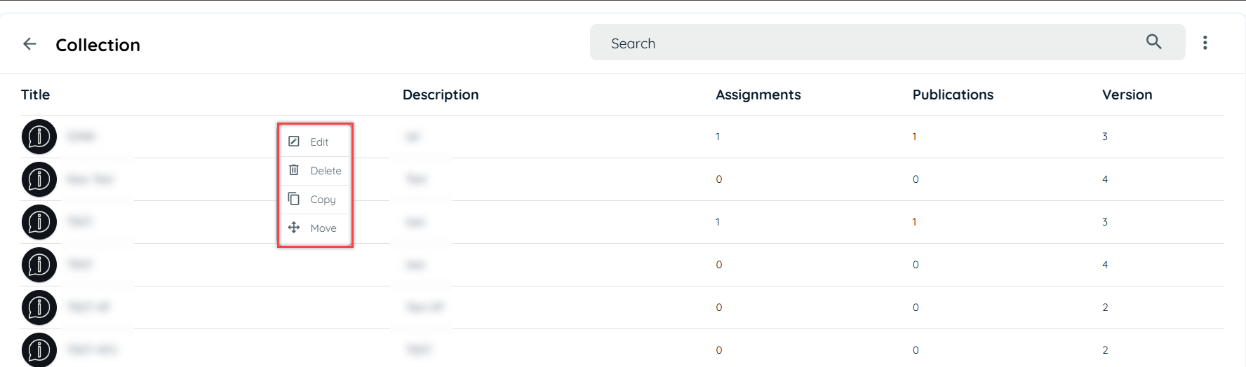
There are four basic functionalities of every content, so do its in collection. User can make changes in collection for e.g.: changing title, description and route assignment, delete collection, make multiple copies of collection and move collection to other subscription.
- Edit Collection
- Delete Collection
- Copy Collection
- Move Collection
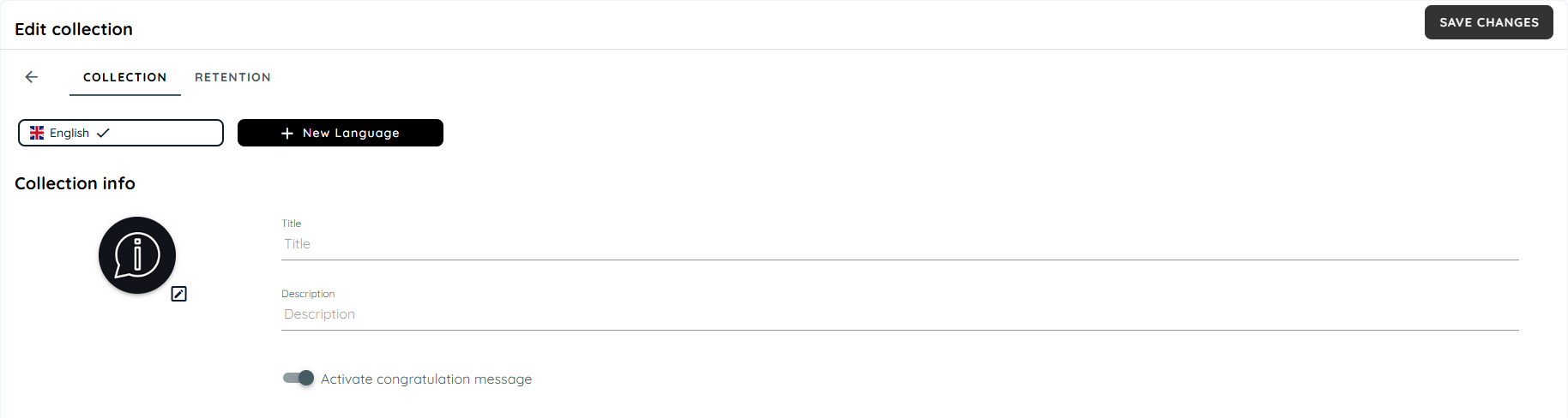
Create Collection
There are two ways to create collection.
- Portal
- Avatar (Client side)
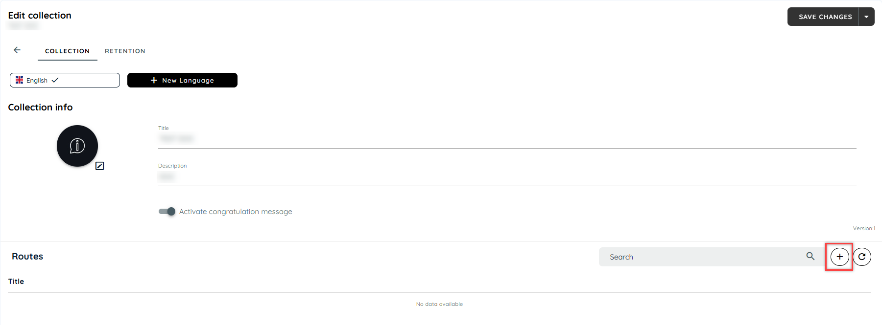
Steps to create Collection via Portal
- Login into portal
- Navigate to the Guidance tab
- Go to content tab under guidance
- Click on collection card to add a collection
- Click + Icon to create new collection from main card or from listing page.
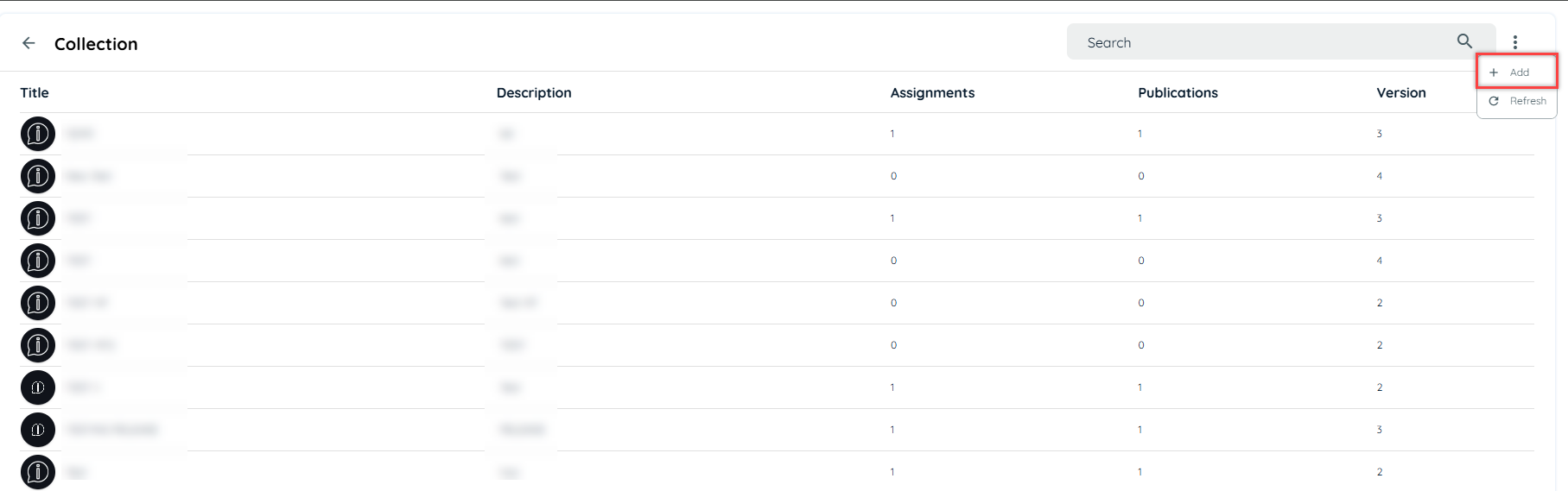
- Fill the Title field
- Fill the Description field
- Click save changes
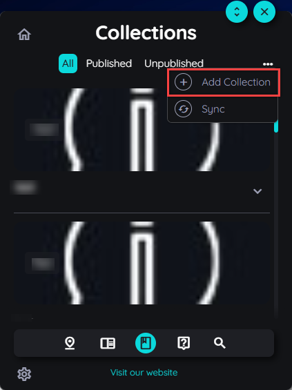
Steps to create Collection via Client Side
- Open Avatar
- Go to Collection
- Click context menu and select Add Collection.
- It will redirect to portal to create collection.
- Follow same steps, as mentioned above.
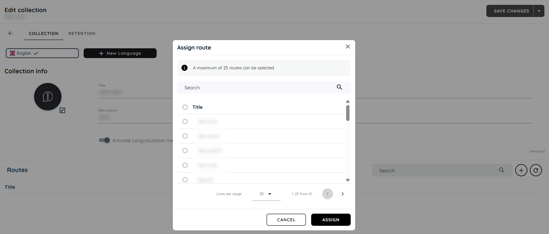
Steps to Assign Route
- Go to the Route section
- Click + Icon
- Select the routes, maximum limit is 25
- Click Assign
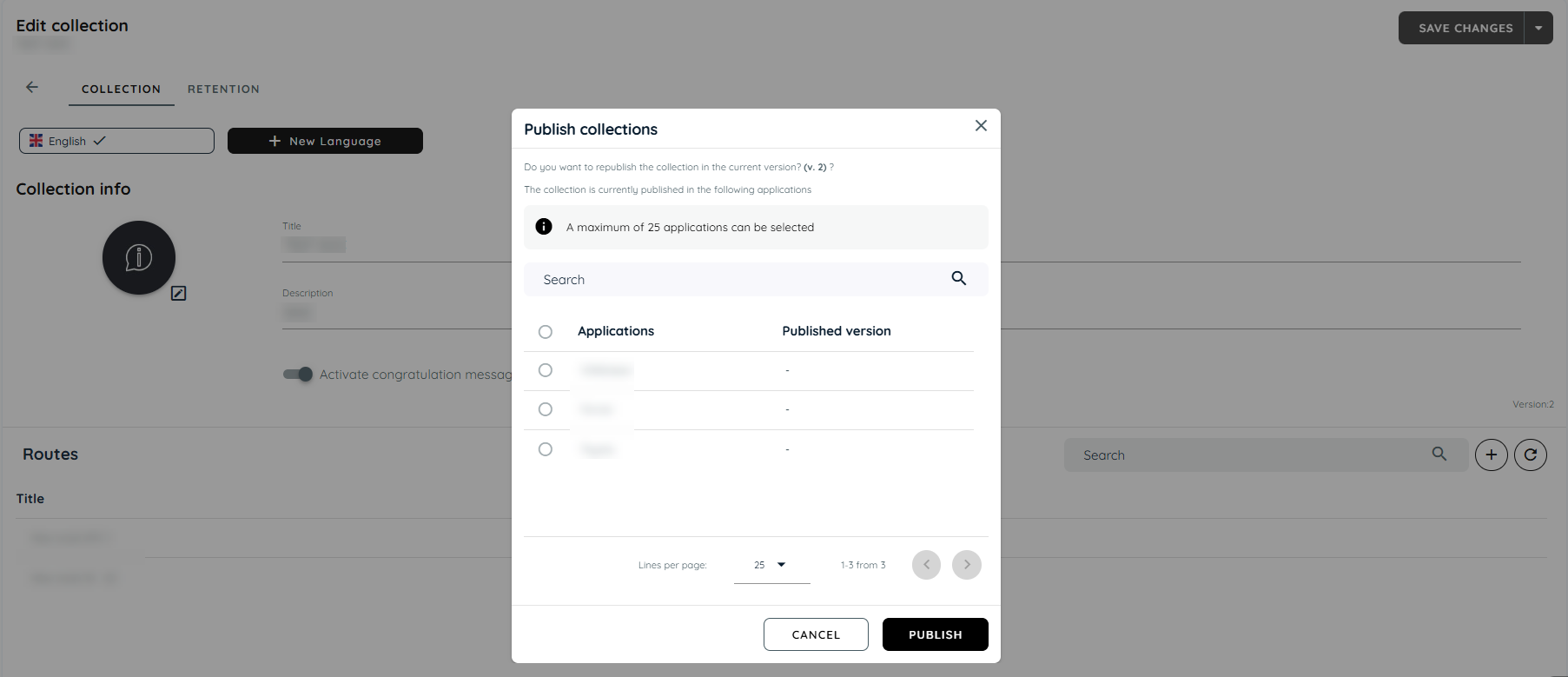
Assignment of Collection
Collections can be assigned to multiple applications, it will be visible to authorized user only if it’s assigned to any application, if a collection is published than it will be visible to guest and authorized user both.
Steps for Assignment of a collection
- Click the arrow adjacent to "Save Changes"
- Click "Save and Publish"
- A dialect will open, choose application.
- Click "Publish"
Collection at Client Side
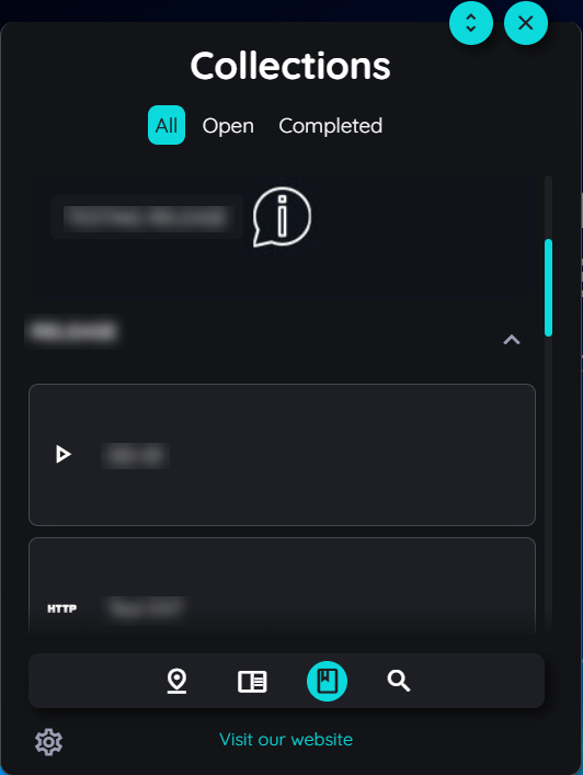
User can play collections at client side, through avatar user will select any one collection and play the route which is required. Collection will give details that how many routes have been played by showing a tick mark. It also notifies with a congratulations message, when user complete all the routes in the collection.
Translate Collection
User can translate collections into multiple language through translate option given in collection. User can select primary language and its dialect. For further information about translation, you may go through the following links.
Useful Link:
https://docs.appnavi.eu/docs/content-language-translation
Posts
With posts, information can be sent in a very targeted manner. If a user opens the AppNavi widget in an application, he only sees information in the posts area that concerns this application. Posts reach the employee at exactly the right point in the work process: at the right time, at the right place - and for the right employees.
Steps to create Posts
- Login into Portal
- Navigate to the Guidance tab
- Go to content tab under guidance
- Click on Posts card to add a post
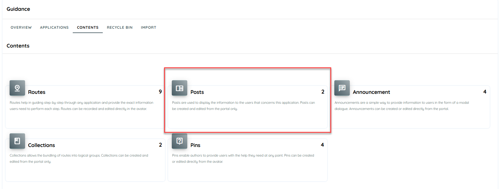
- Click on + icon
- Add Title, description
- Click Save
Post Translation
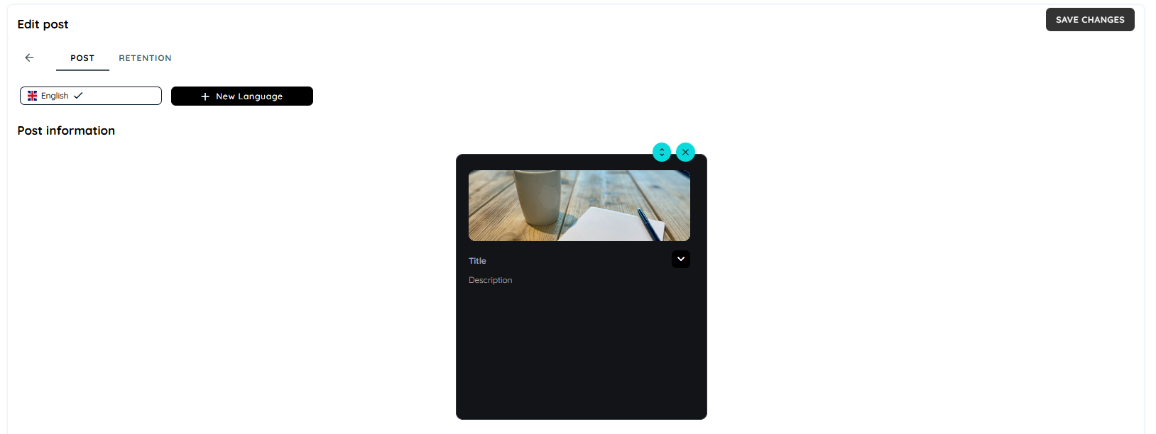
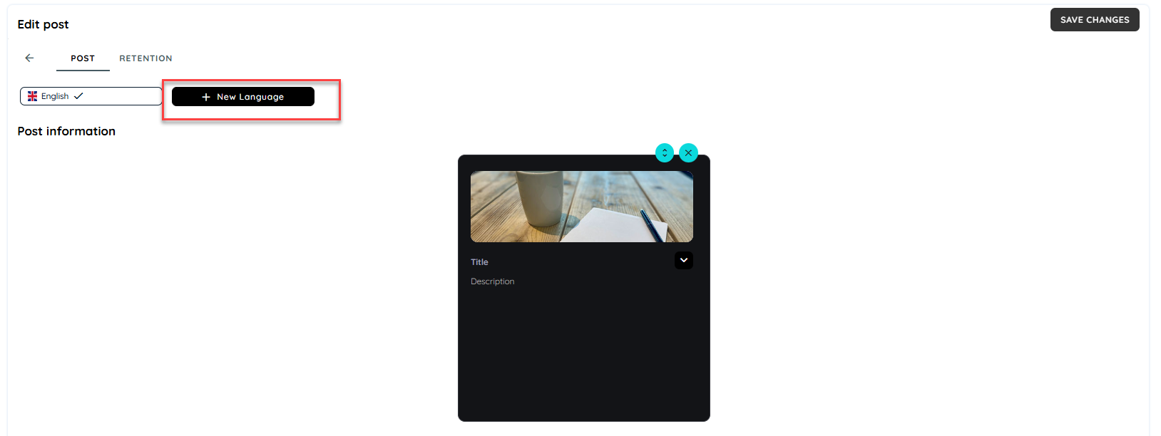
Posts can be translated manually or automatically. Manual translation allows translation into any number of languages. For automated translation, > 28 languages are currently available. Of course, automatically translated texts can also be edited manually. Primary Language is one with which the user has created the post. Users can select the option "New Language", to translate it in different languages.
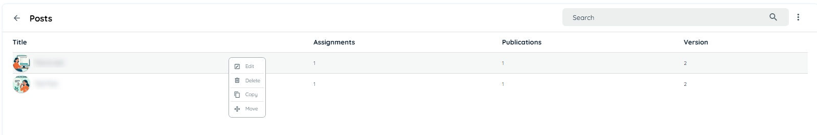
Delete Post
User can delete posts if its require to from post table through context menu.
Copy Post
User can copy posts to one or more work spaces through "copy" option from context menu in the table.
Move Post
User can move posts to one or more work spaces through "move" option from context menu in the table.
Post View Avatar Side
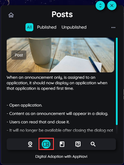
When post is assigned to an application, it should now display in avatar.
- Open application
- Click on avatar and login
- Click on Post icon, post section will open on avatar
- Here that post item will appear.
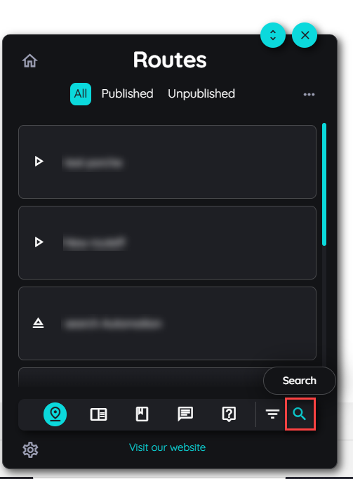
Module Specific Search Functionality
This feature introduces a module-specific search experience, where each module independently manages its own search functionality. The search icon is consistently positioned on the right side of the module UI, ensuring a uniform user experience across the platform.
The goal of this enhancement is to:
- Allow each module to handle its own search logic and data scope.
- Improve modularity, scalability and maintainability of the application.
- Ensure consistent UI placement of search across all modules.
Announcements
Announcements offer a user-friendly way to communicate important updates to users through a modal dialogue. These messages are informative posts that appear on-screen, helping teams to share news, updates, or alerts within the application environment.
Overview of Announcements
Announcements are displayed as modal windows and serve as short, informative messages or updates. They are visible only once per user by default, but this behaviour can be adjusted through the Manage Content Settings to one of the following:
- Once.
- Every time.
- Daily (once per day).
- Weekly (once per week).
- API call through custom code
When multiple announcements are available, they appear side by side within the same modal window.
Announcement Method
Steps To change the visibility of the content
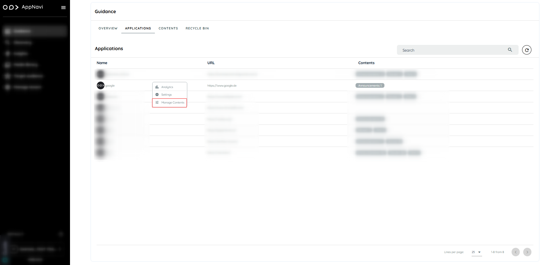
- Go to guidance tab.
- Navigate to applications tab.
- Select the specific application and click on manage content
- In the manage content all the section displayed e.g. routes, post, pins, Announcement.
- Select the content and click on the republish button
- .In the dialogue change the display rules.
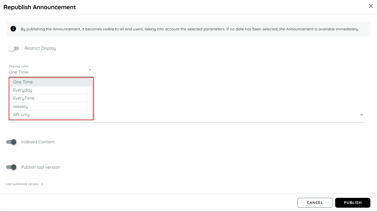
When is an announcement considered read?
AppNavi has an intelligent mechanism that registers when a user reads an announcement entry. If it is considered read, it is not displayed to the user again (exception is that a new version has been created). An announcement is considered read when a user has displayed the text of a post item for at least 1 second in the visible area of the announcement window.
Create Announcement
Announcement is created via portal, user can add a new announcement or assign already created announcement to an application. Here are the steps to create a new announcement
- Login to portal.
- Navigate to the Guidance tab.
- Go to content tab under guidance.
- Click on Announcement card will open a announcement page.
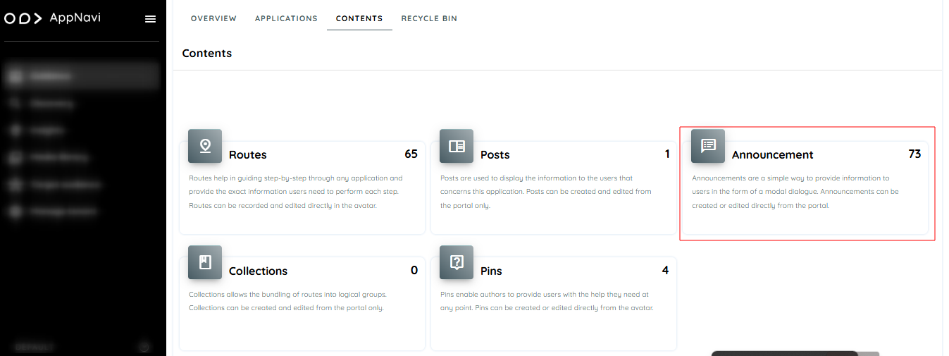
- Click on plus icon present on top right.
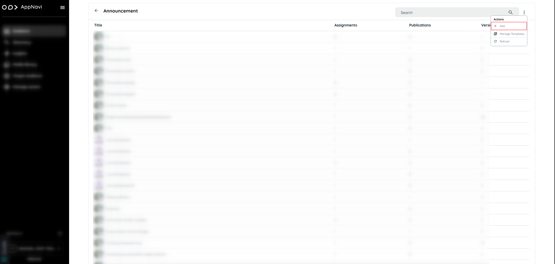
- Hover to the tile the plus icon will appear click on the icon will open the dialogue to create announcement instantly.
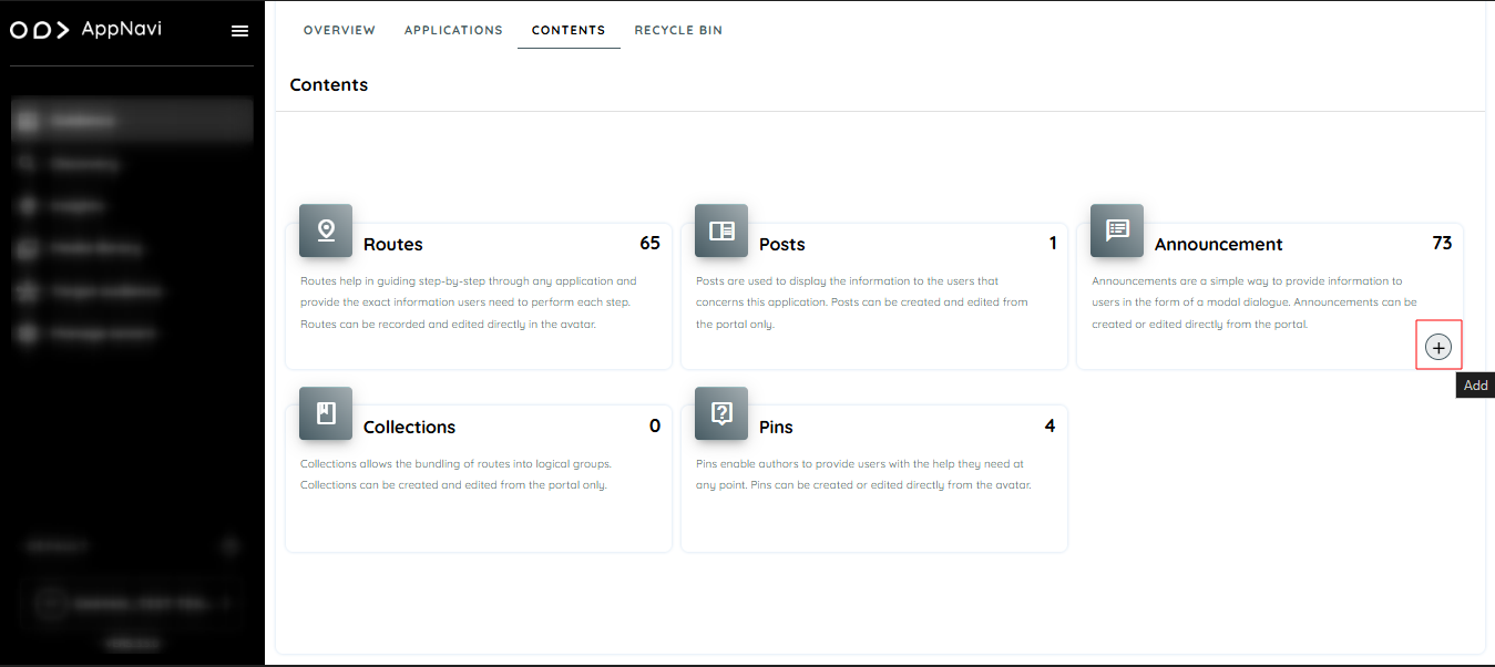
- In the dialogue User can create the announcement with the system design templates or create with scratch.
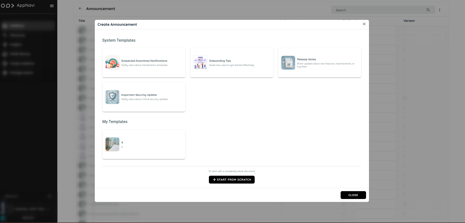
- Add content of your announcement and click save changes.
- Click on drop down arrow present on save changes button.
- Select save and publish.
- Select applications where User want to publish the announcement.
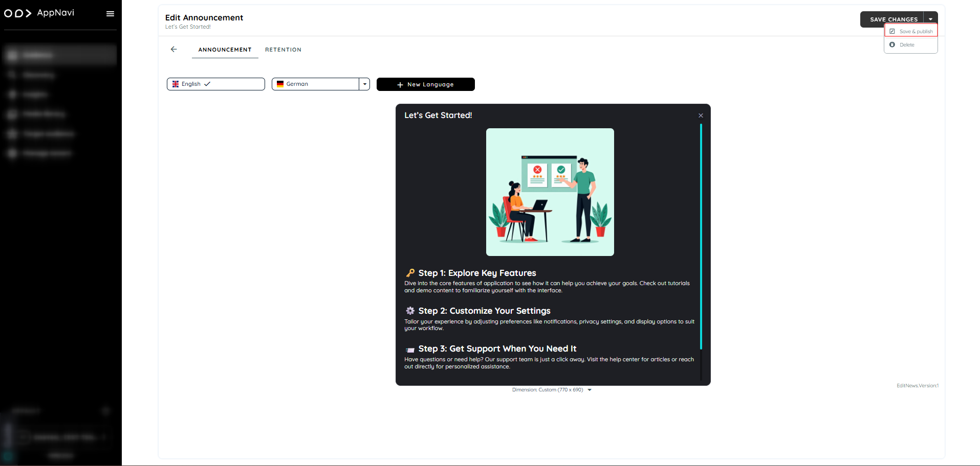
Announcement Template Gallery
The Announcement Templates feature enables efficient creation, reuse, and management of announcement content within the AppNavi portal. It supports both system-provided and user-defined templates, allowing consistent and rapid communication across applications.
Types of Templates
System Templates:
Predefined templates available globally across all tenants. These templates are editable but can be used as a base for editing and publishing announcements.
User-Defined Templates (My Templates):
Custom templates created and saved within a tenant. These templates are editable, reusable, and only visible to users within the same tenant.
Note: Templates are optional. If no template is selected, announcements can also be created directly using the Start from Scratch option.
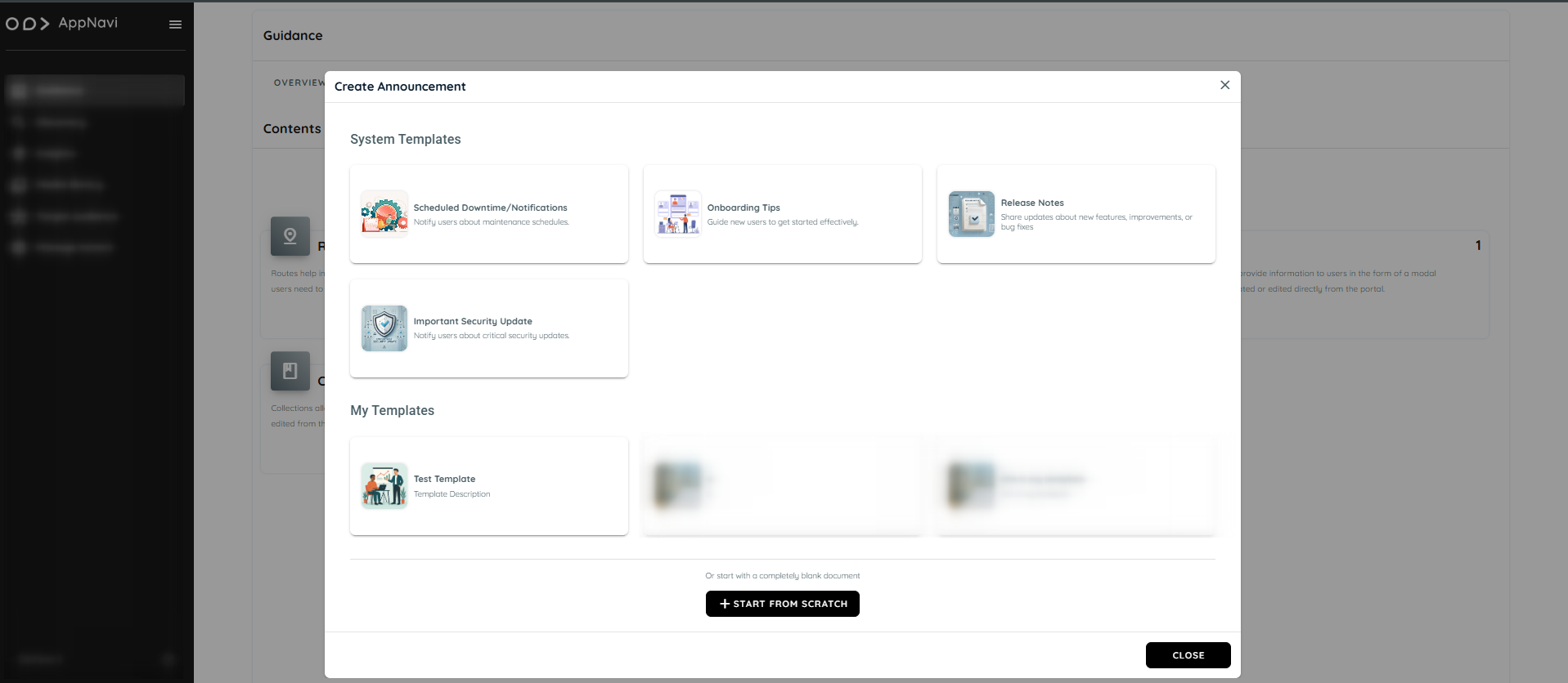
Accessing the Announcement Section
To access the announcement feature:
- Navigate to the Guidance tab.
- Open the Contents section.
- Select the Announcements tile.
- On the Announcement listing page, click the three-dot menu (⋮) to view available actions:
- Add – Create a new announcement
- Manage Templates – Open the template gallery
- Refresh – Reload the announcement list
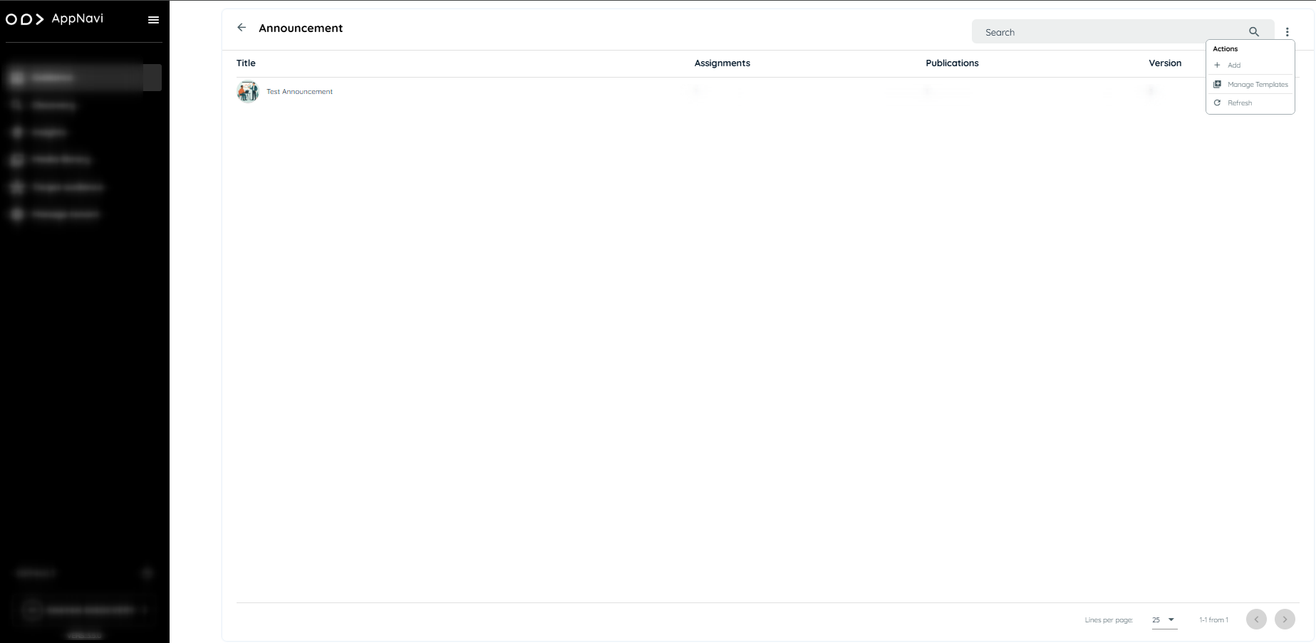
Creating a New Announcement
To create an announcement:
- Select the Add option from the three-dot menu
- A dialog box will appear with the following creation options:
- System Templates: Use a predefined layout
- My Templates: Select from previously saved tenant-specific templates
- Start from Scratch: Begin with a blank layout
- Selecting any template opens the Announcement Editor with pre-filled content.
- Modify the title, description, media, and tooltips as required.
- Images can be added using the Media Library or by uploading a custom file.
- After editing, choose to Save or Publish the announcement. Published announcements will appear within the associated application interface.
Announcement View
When announcement is assigned to an application, it should now display on application side.
- Open application
- The announcement published will be displayed

AI Powered Announcement Generation
The AI Powered Announcement feature helps users to create high quality, structured announcements quickly by using AI assistance while still keeping user in full control of the final content. This feature enables announcement creators to generate professional announcement text using AI.
Step-by-Step Flow
- Open the Announcement Editor
- Click on “Generate with AI”
- Enter optional custom instructions in AI content generator
- Submit your request
- AI generates announcement text (text-only)
- AI generates announcement with images if it's mention in instructions
- Review the generated content in preview mode
- Choose to:
- Edit the content
- Accept it
- Reject it
- All interactions are automatically recorded in the history panel - AI content generator dialog.
Custom Instructions
You can guide the AI output by providing additional context or instructions, such as:
- “Make this sound exciting”
- “Keep it short and formal”
- “Highlight key benefits clearly”
These instructions are combined with the system defined announcement context to produce more relevant results.
Conversation History Panel
A dedicated panel on the right hand side of the editor displays the last 5 interactions between user and the AI.
It Includes:
- AI-generated suggestions
- User's actions (Accept / Reject)
- Iterative changes and refinements
Example Scenario
User wants to announce a new feature release.
- User open the editor and click “Generate with AI”
- Add instruction: create an announcement for a new feature "announcement updates" with image
- AI generates a polished announcement draft
- User make changes in few lines and accept it
- The interaction is saved in the history panel for future reference
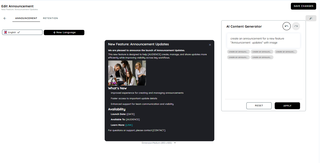
Managing Templates
Accessing Template Management
To manage templates:
- From the Announcement page, click the three-dot menu (⋮).
- Select Manage Templates to open the Template Gallery.
Creating a New Template
- In the Template Gallery, click the three-dot menu (⋮) and choose Add.
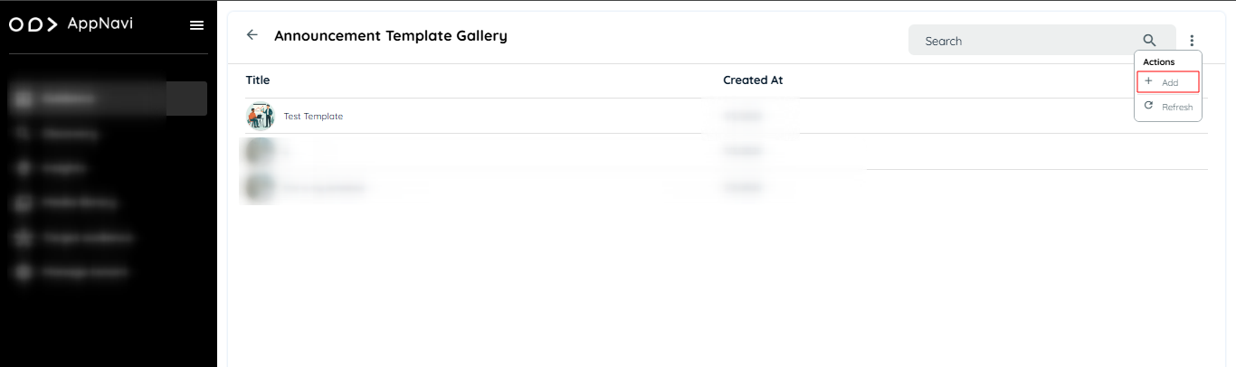
- The Edit Template view will open.
- Provide the following details:
- Template Title
- Template Description
- Preview Image (optional – select from Media Library or upload)
- Add content using tooltips, text fields, and images
- Click the Save as Template button to store the new template.
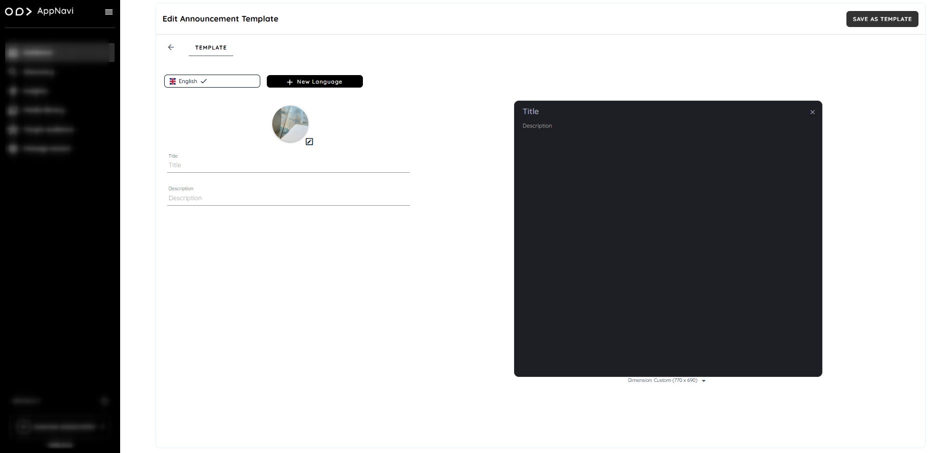
Editing or Deleting a Template
- In the Template Gallery, each template includes a three-dot menu (⋮) with options to:
- Edit: Open the template in the editor for modification
- Delete: Permanently remove the template from the tenant’s gallery
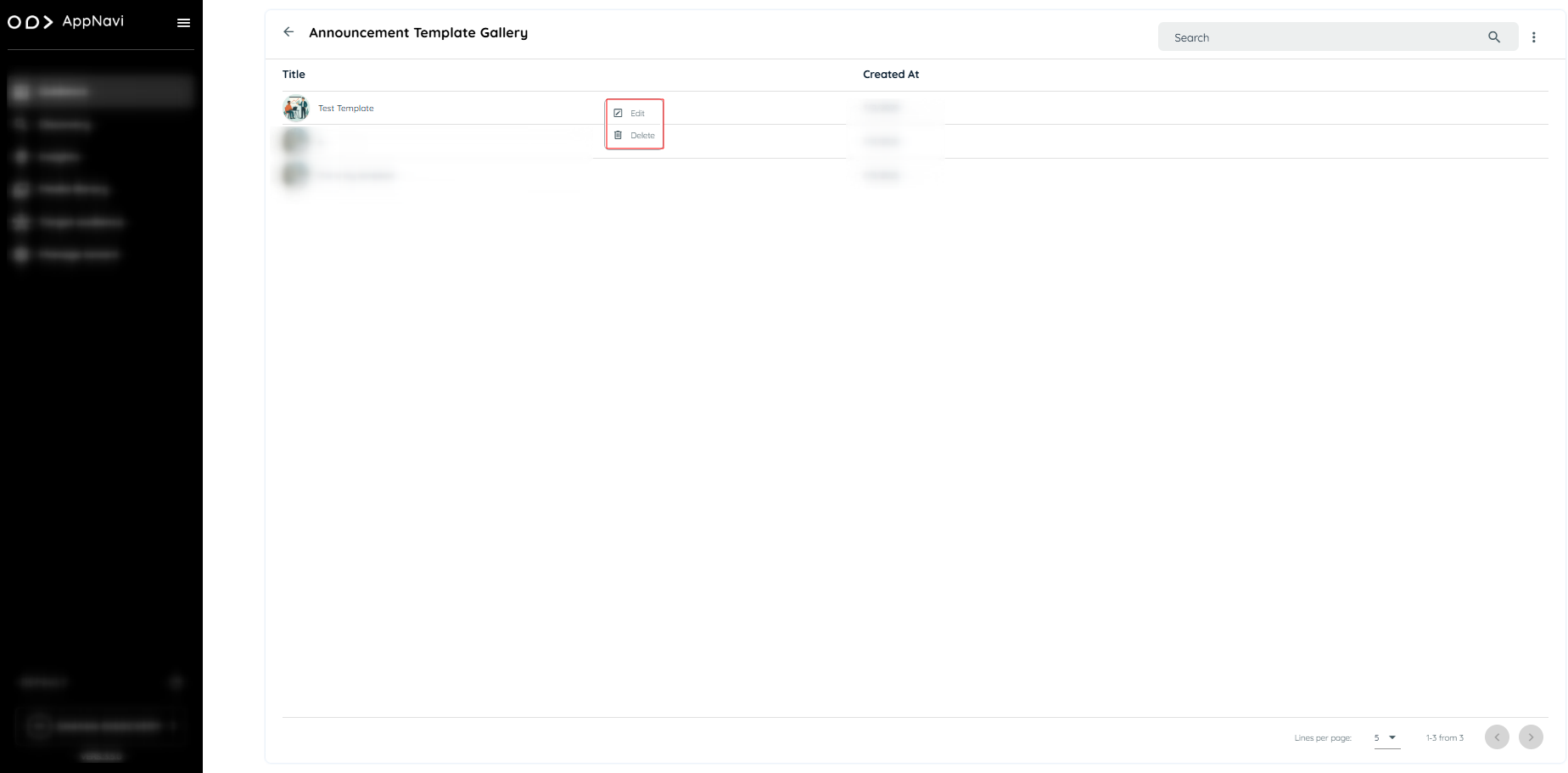
Important Notes
- System Templates are available to all tenants but cannot be modified permanently.
- User Templates are only visible within the same tenant and can be edited, updated, or deleted.
- Templates and announcements are independent. Editing an announcement will not affect the original template.
- Templates are stored in the system under a specific content type (announcement template Gallery).
- There is no retention limit for templates—they remain until deleted manually.
Announcement View
When announcement is assigned to an application, it should now display on application side.
- Open application
- The announcement published will be displayed
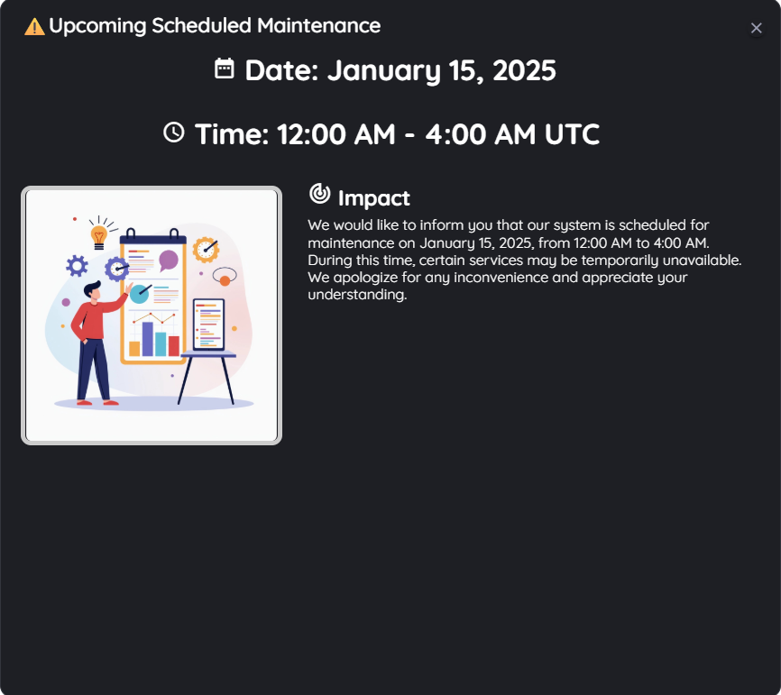
Republishing Announcements
It is possible to make changes to existing announcements. When announcement item is republished a new version is created. If the user has already viewed the original announcement, the change will still be displayed again with new version.
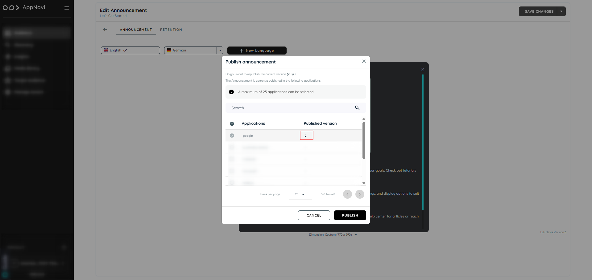
Connected Routes in Announcements
Connected routes can be used to connect routes with each other. Within each step the author can integrate possible connections to other existing routes. End users get the option to select from one or more routes they can jump to. Doing so it is not only possible to connect routes from within the same application – users can also jump to routes within other systems. This allows to provide a set of sub routines which can be combined in an intelligent way. AppNavi has created the possibility to create announcements including connected routes.
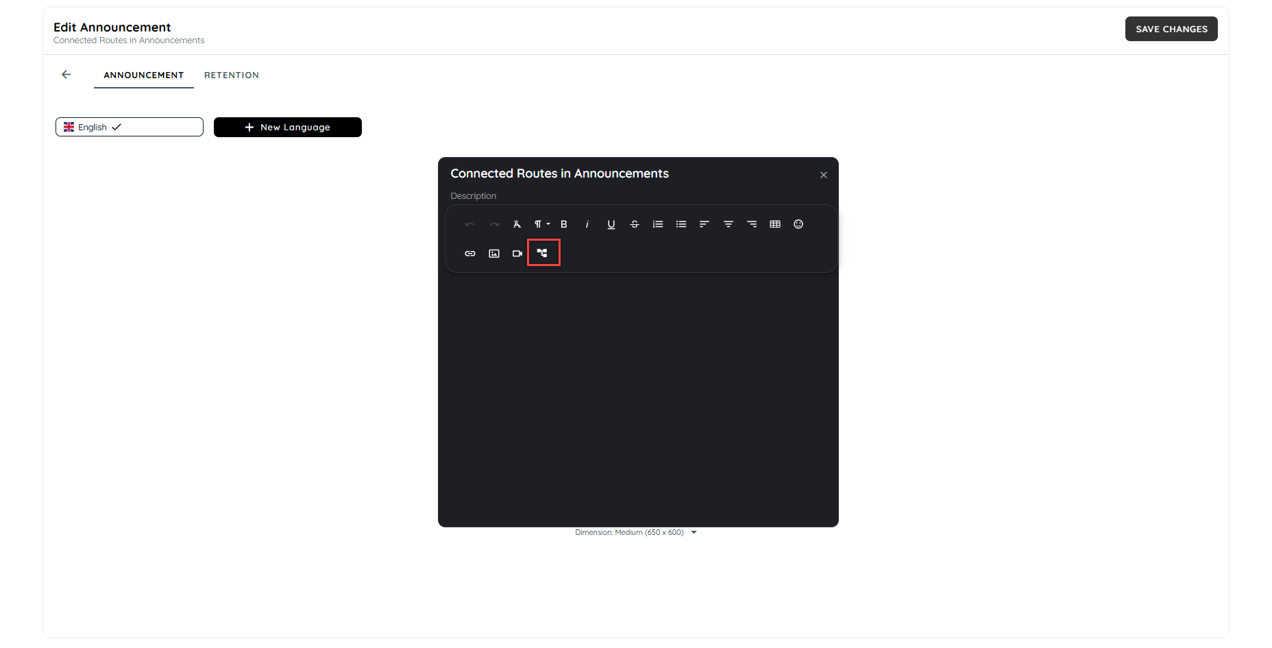
On clicking the connected route icon, a dialogue will appear to select the routes available on the tenant. Users can select multiple routes to add in the announcement.
On selecting the routes, the steps can be selected from drop downs. Users can select from which step the route has to be started.
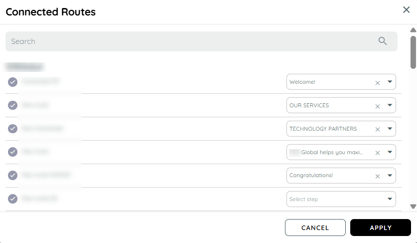
Preview of Announcements with Connected Routes
The routes added in the announcement will be added in dialogues. The routes can be sorted using drag and drop. The routes can be separated from the dialogue as well. The user can also change the width of the dialogues as per their design requirements.
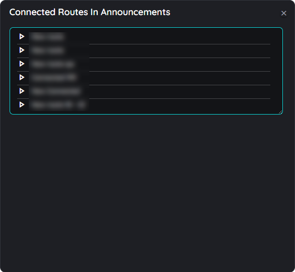
Add / Remove Connected Routes
In order to add or remove any connected route from the announcement preview, users can hover on the dialogue top right and a context menu will appear with a edit button. On clicking the edit button, the add connected route dialogue will open in which users can select or deselect the connected routes to add or remove the routes.
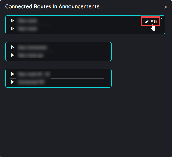
Check out more details for connected routes here.
Working with connected routes
Add connected routes to a step
Connected routes can be used to connect routes with each other. Within each step the author can integrate possible connections to other existing routes.
End users get the option to select from one or more routes they can jump to. Doing so it is not only possible to connect routes from within the same application – users can also jump to routes within other systems. This allows to provide a set of sub routines which can be combined in an intelligent way.
- Open the respective route in edit mode by hovering the route tile and clicking on the "Edit" icon
- Select any of the steps
- Click in the tool tip text area of this step in the "Details" tab
- Now click on the option "Connected routes"
- In the dialog that opens, the available routes are now displayed (grouped into the available apps).
- Select one or more routes. You can recognise the selected routes by the coloured "Check" icons.
- Click on "OK" if all appropriate routes are selected - or cancel the process by clicking on the "x" icon. Open the dialog for connected routes
- Select appropriate connected routes
Connected routes are displayed to end users

Sorting order for Connected Routes
The routes can be sorted according to any order using the drag and drop function present in the planner view above. Once the user has added the connected routes in a listing manner then they can drag and drop the connected routes in any order in the planner view and the same order will be displayed to end users once the route has been published.
For example the above connected routes added in this dialogue can be saved as New route 01 to New route 05 in ascending or descending order just by dragging the connected route upwards or downwards according to the users requirement of sorting.

Default Language for Contents
Overview
The default language for content creation is determined by the language selected at the Application level by going to application edit page and selecting language. This applies when users create content directly from Manage Content within a specific application.
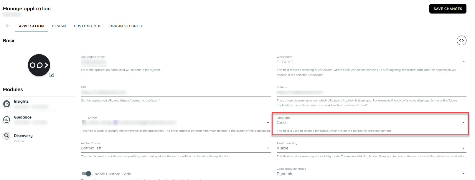
Language at Application Level
How Default Language is Applied
When a user navigates to Manage Content of a specific application and creates any of the following:
- Route - created from Avatar planner
- Post
- Pin - created from Avatar Planner
- Collection
- Announcement
The newly created item will automatically use the language selected in the application settings.
Manage Contents
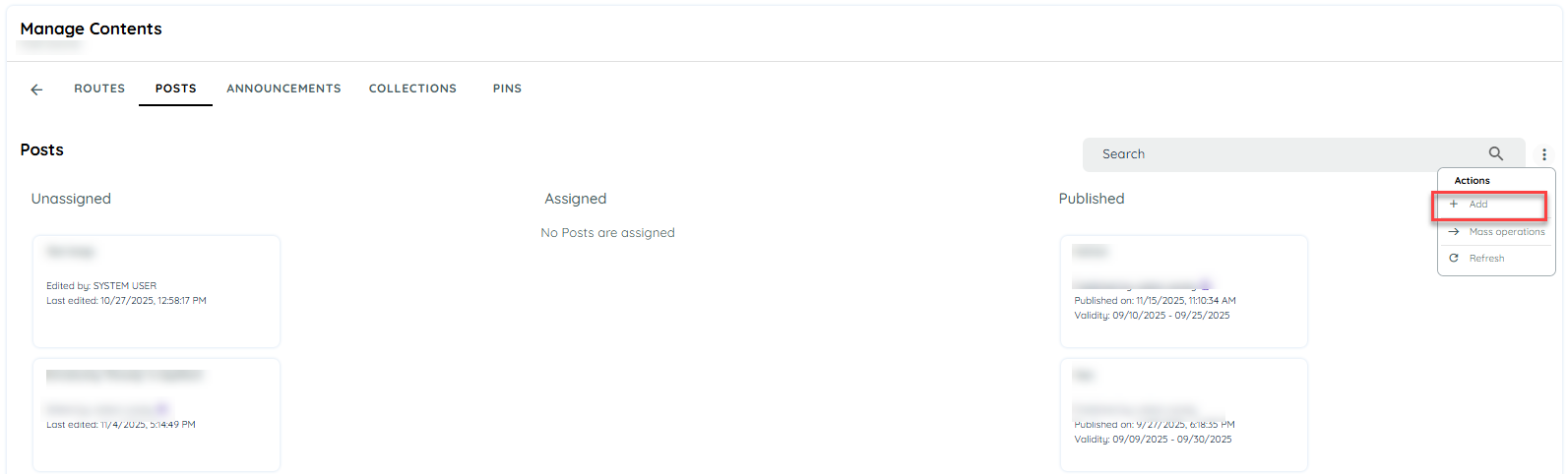
Creating New Content
Impact on Existing Content
The default language applies only to newly created content.
- Existing content is not affected.
- If a route, post, pin, collection or announcement is already saved in a particular language, it will continue to appear in that language.
- This ensures no changes or overrides occur on previously created items.
Announcements – Case
New announcements created from Manage Content → Start from Scratch , will only use the default language defined at the application level.
Important Note
The default language does not apply when:
- Selecting System Templates
- Selecting My Templates
These templates already contain predefined content and therefore retain the language they were originally created in.
Updated about 2 months ago